Eagle McMahon 2024 Team Series "Rebirth"

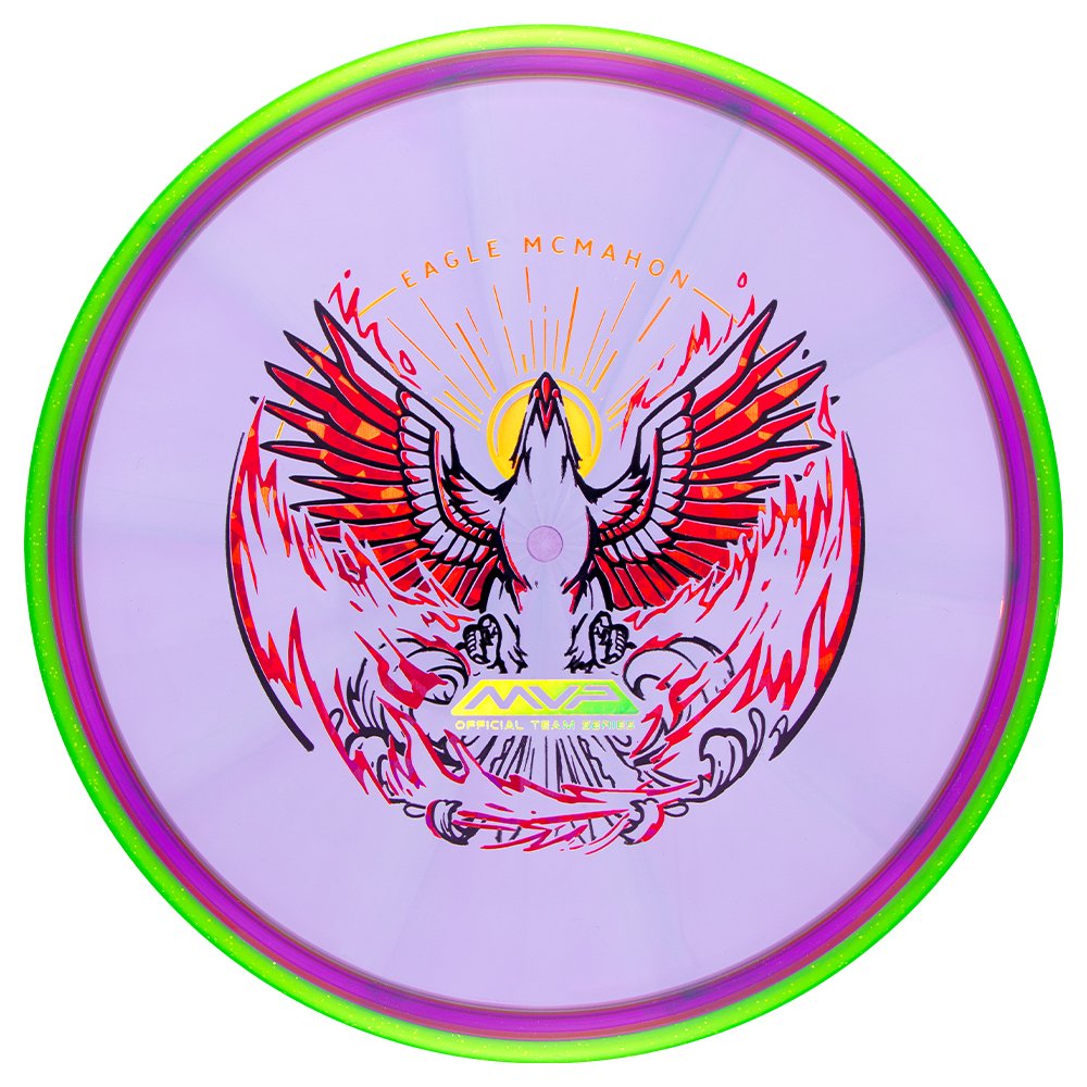
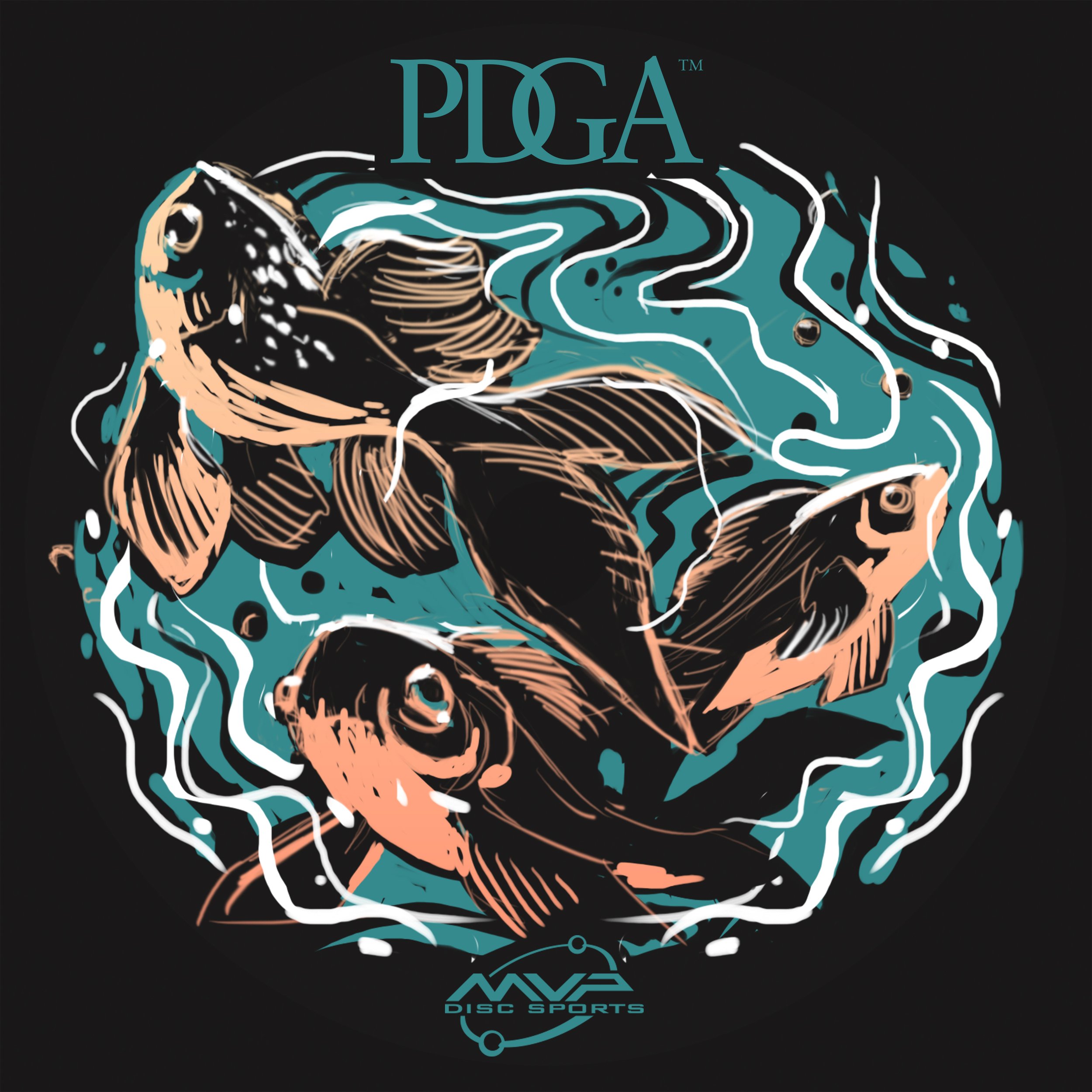
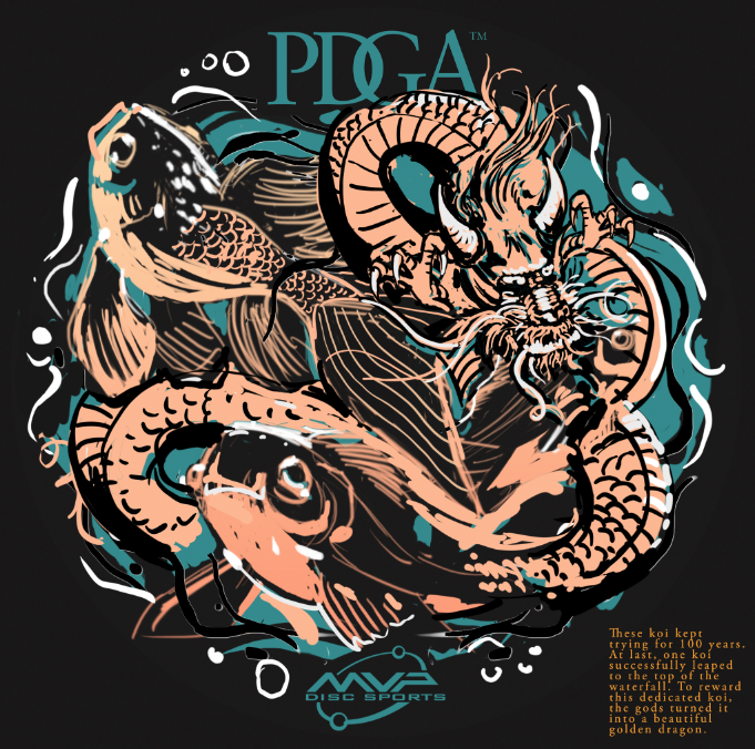
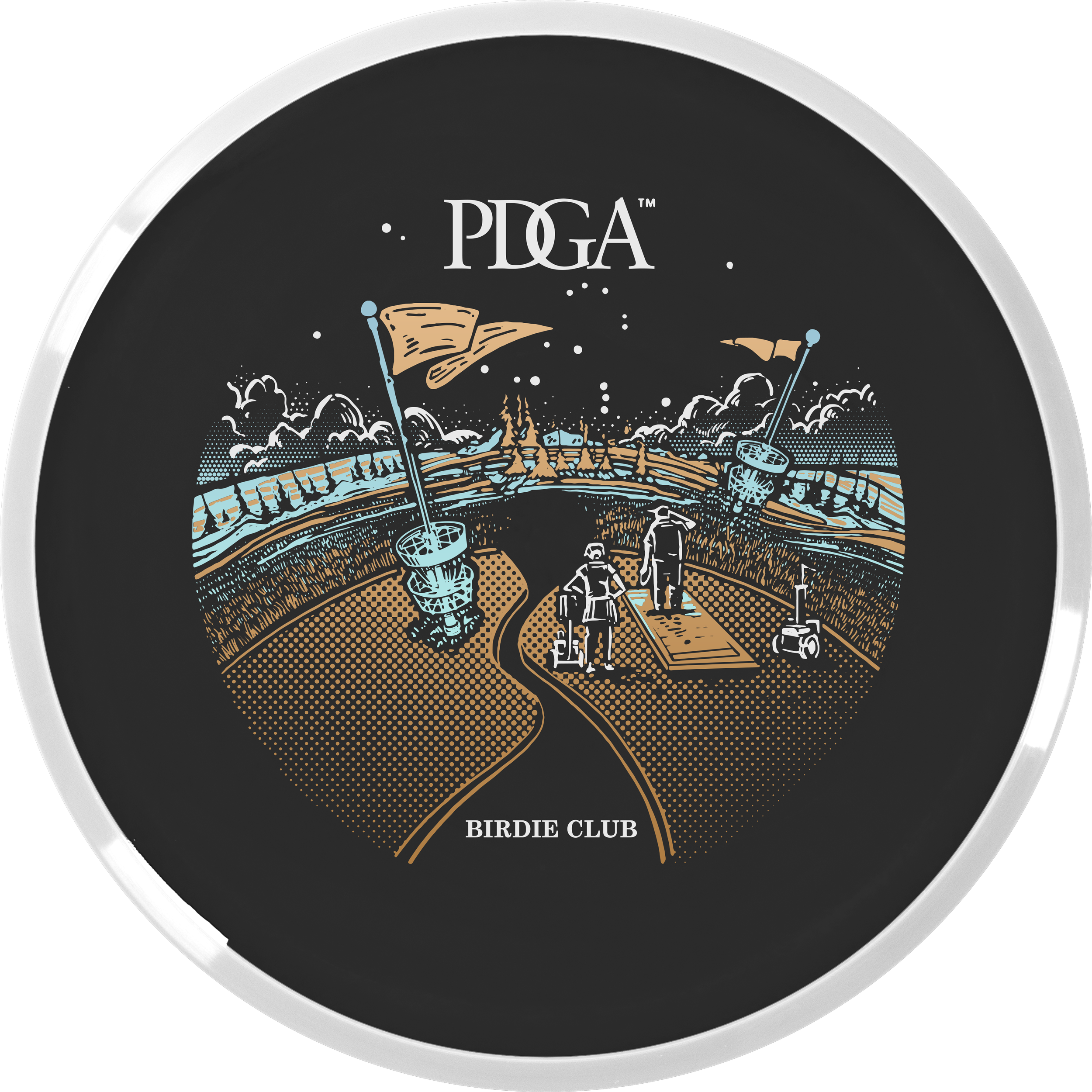
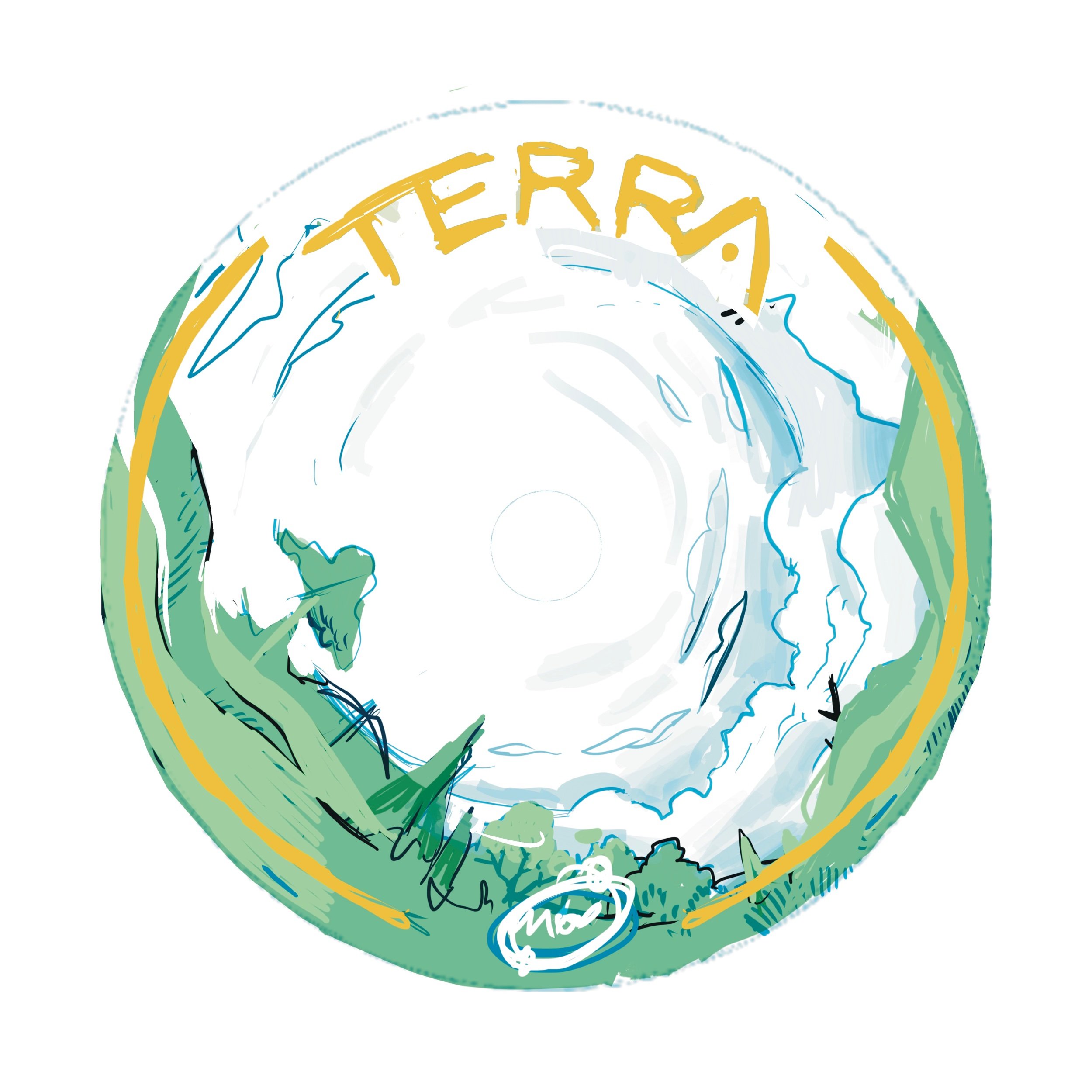
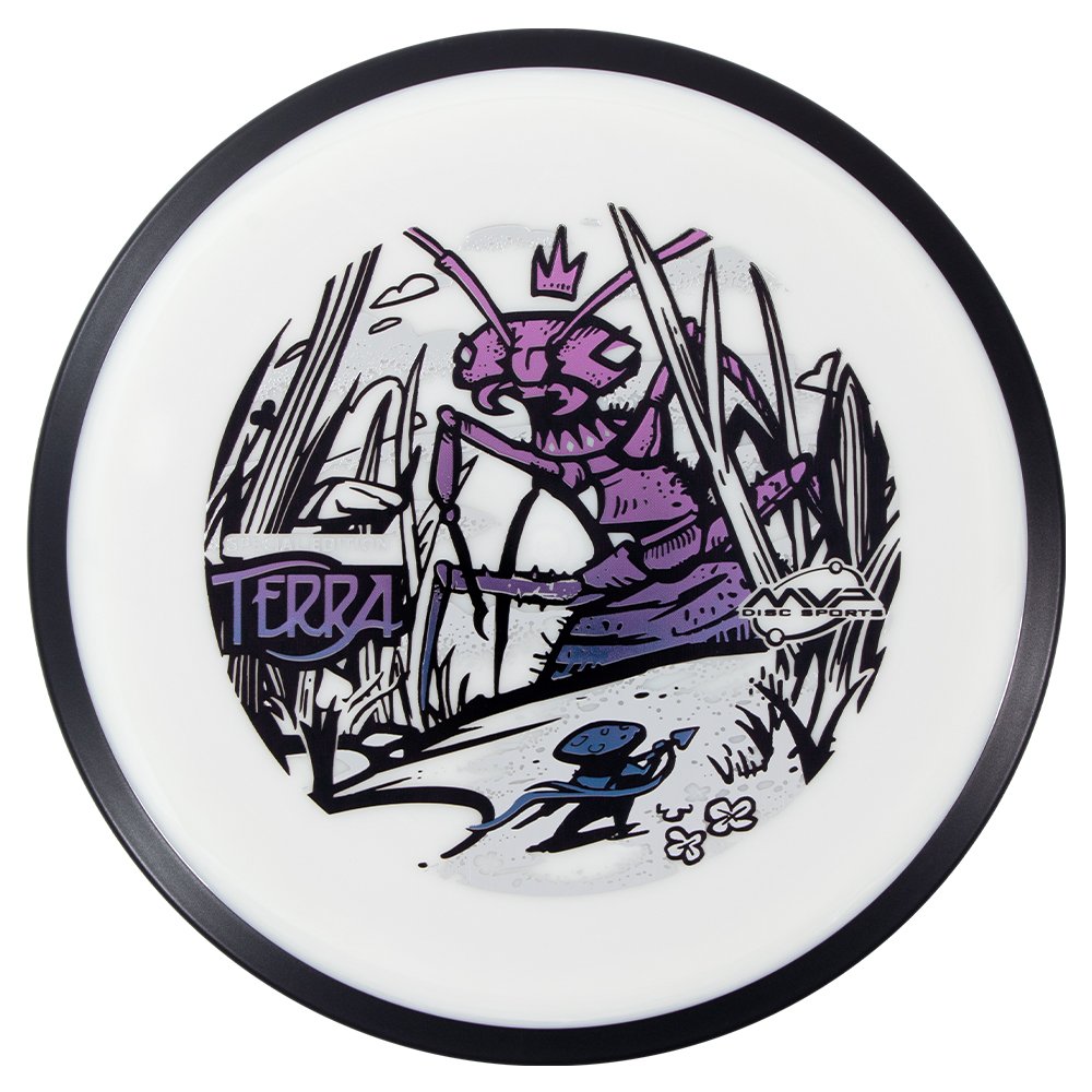
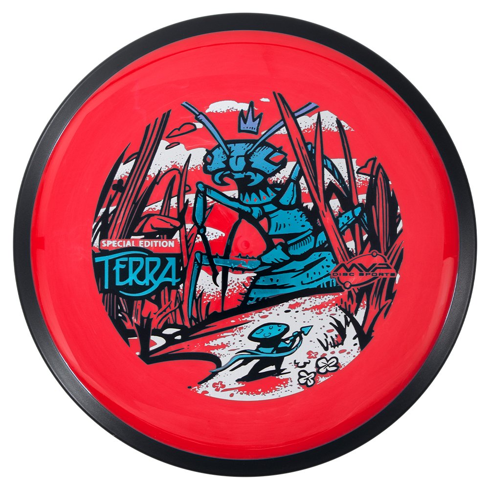
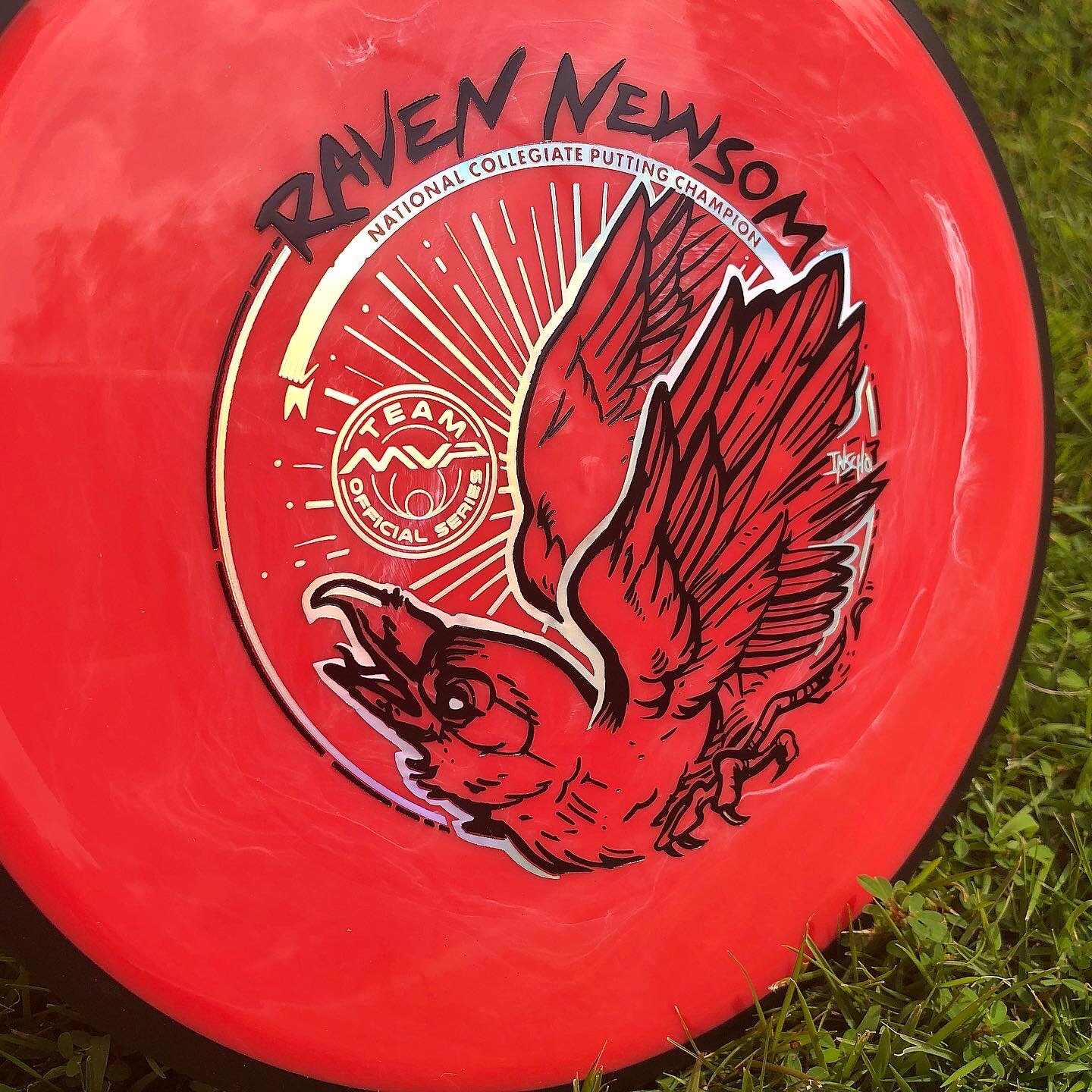
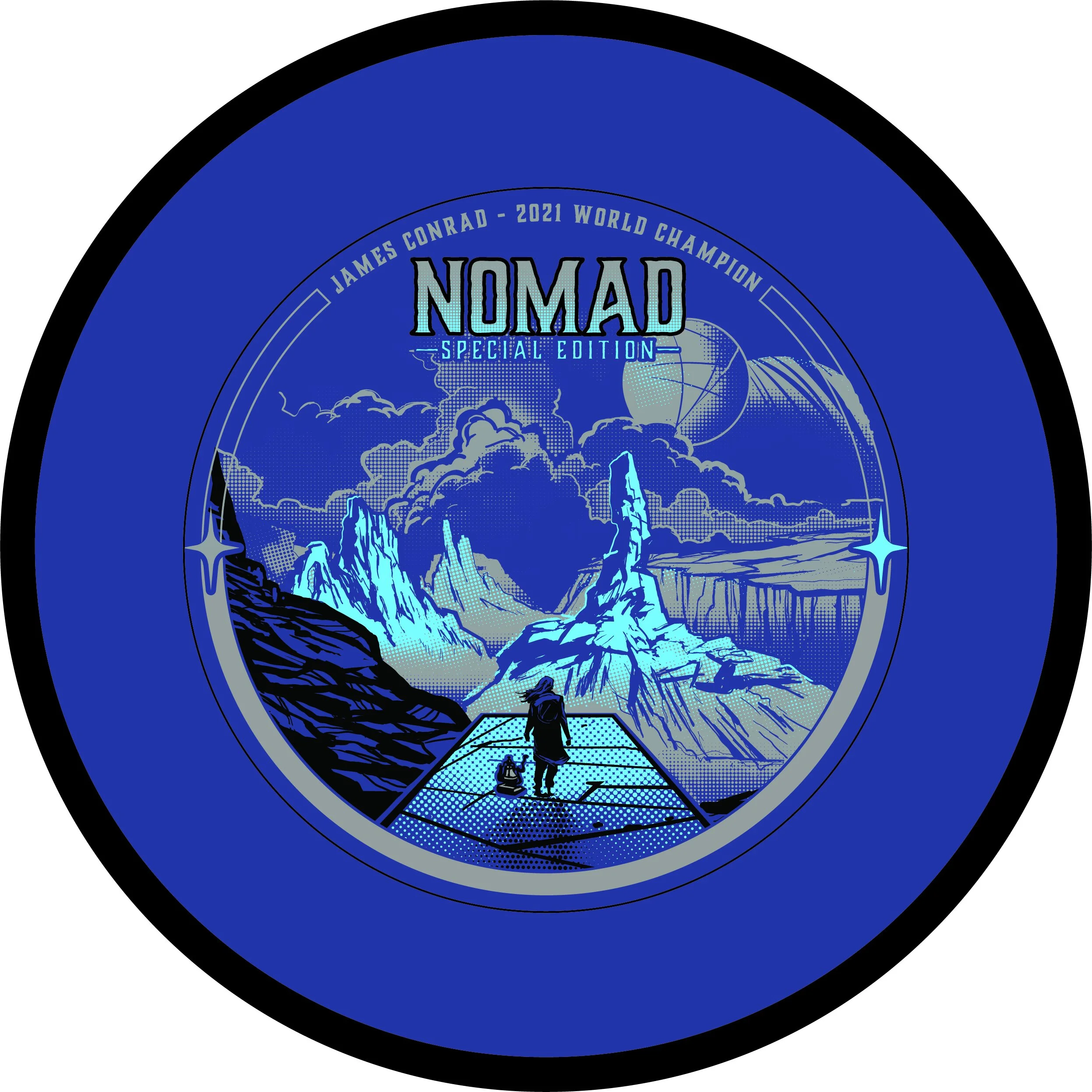
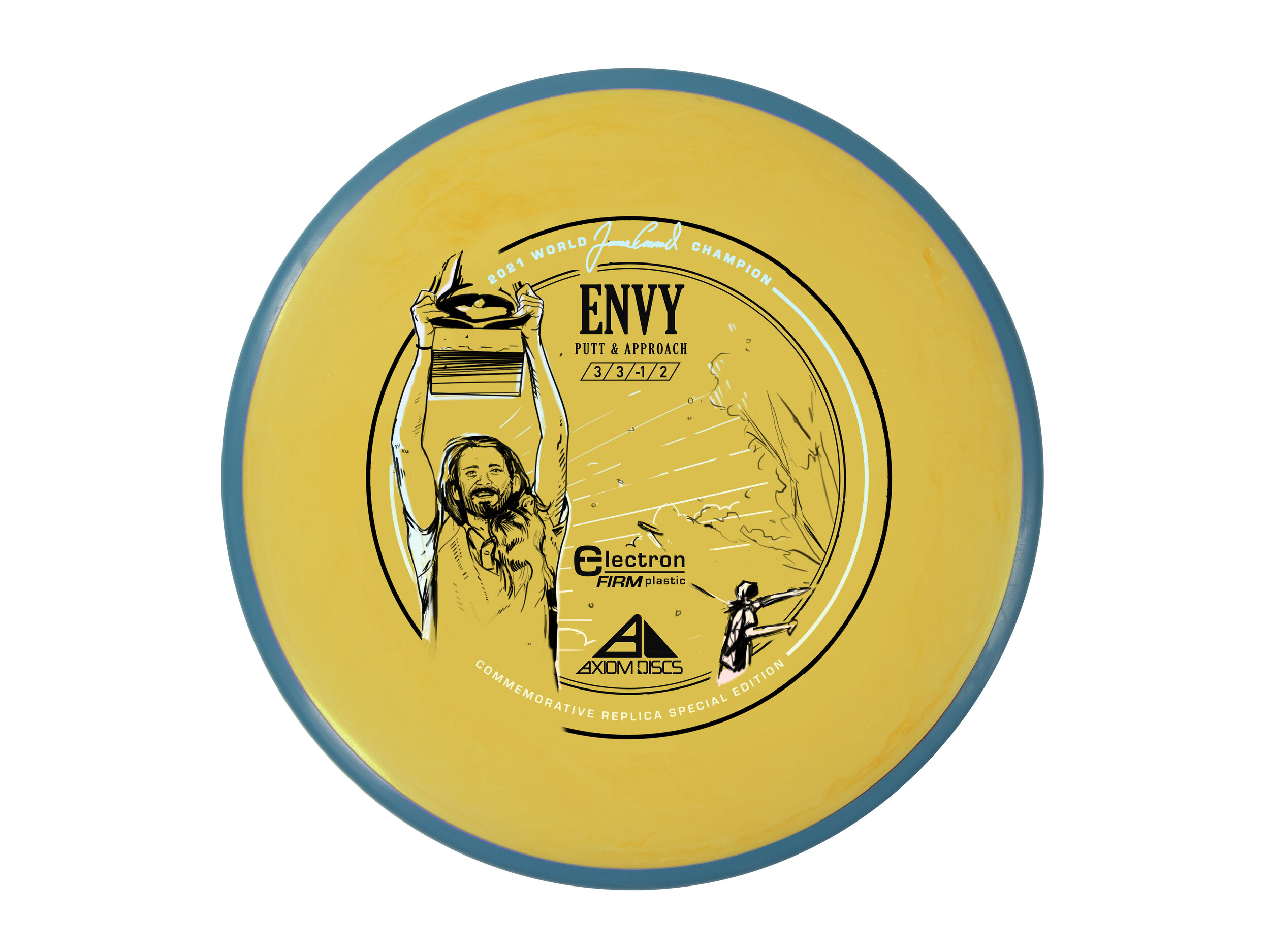
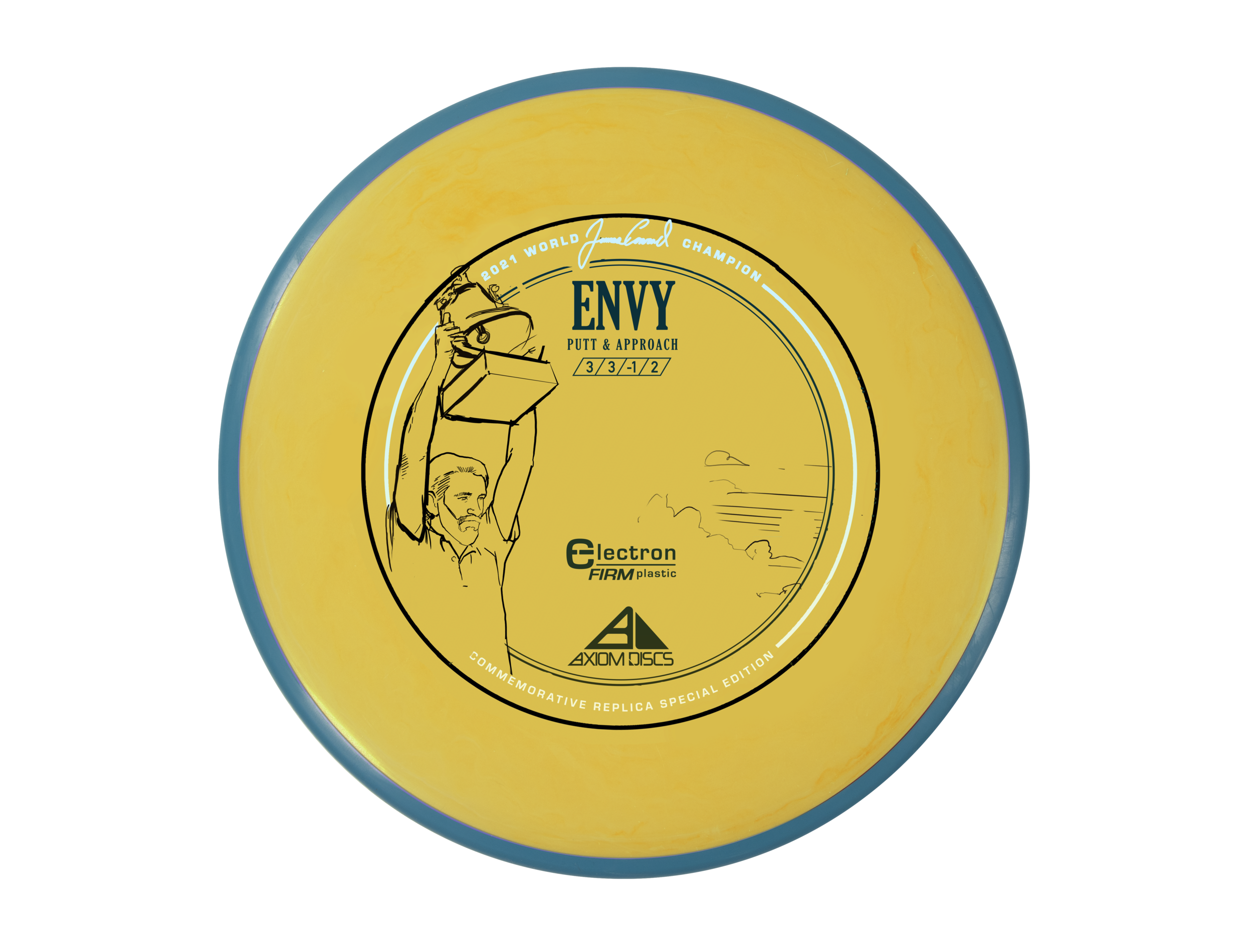
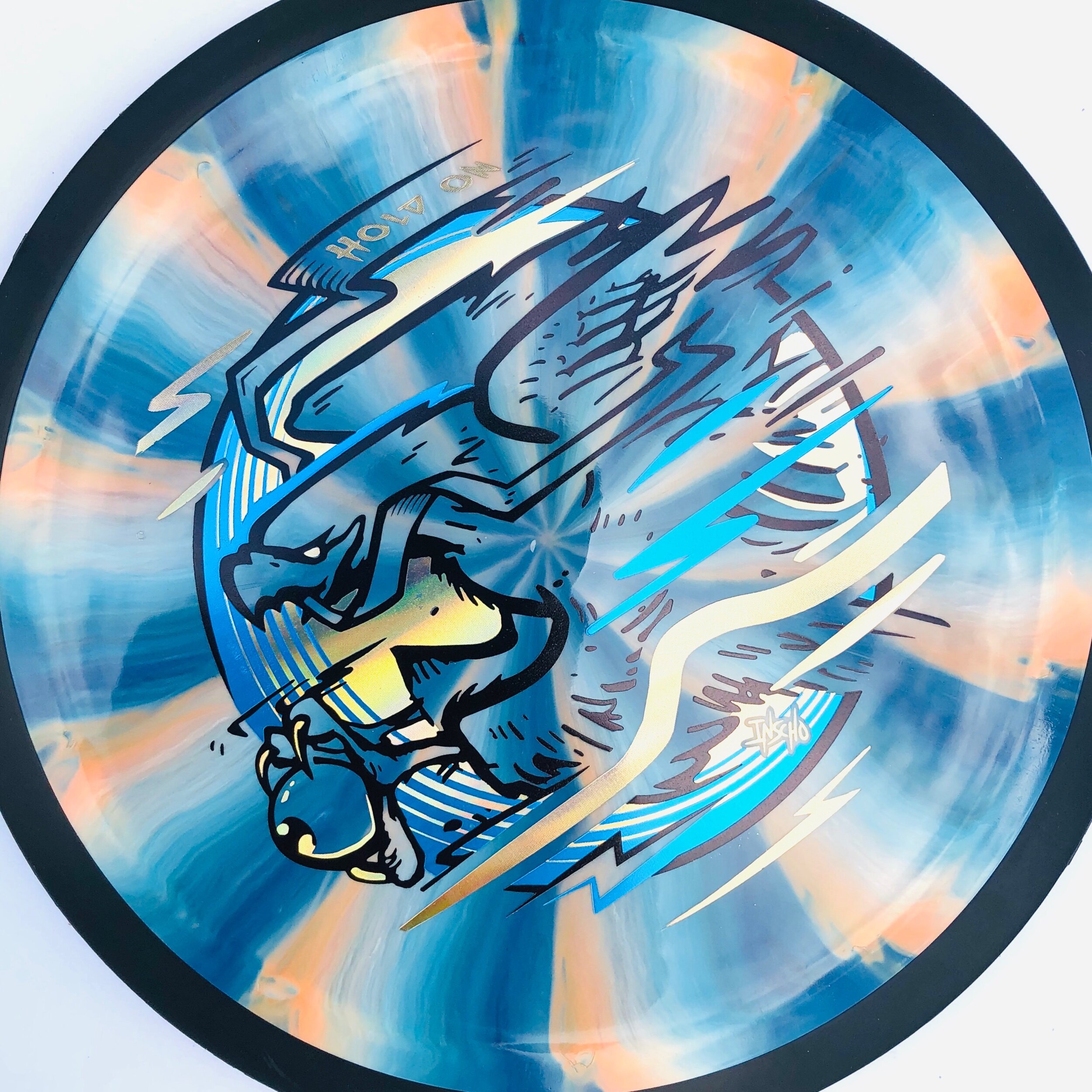
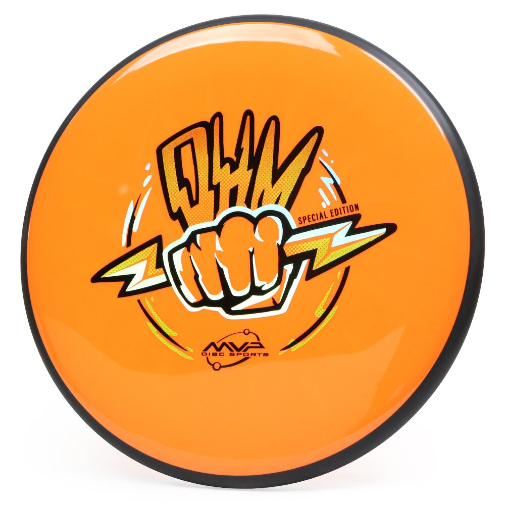
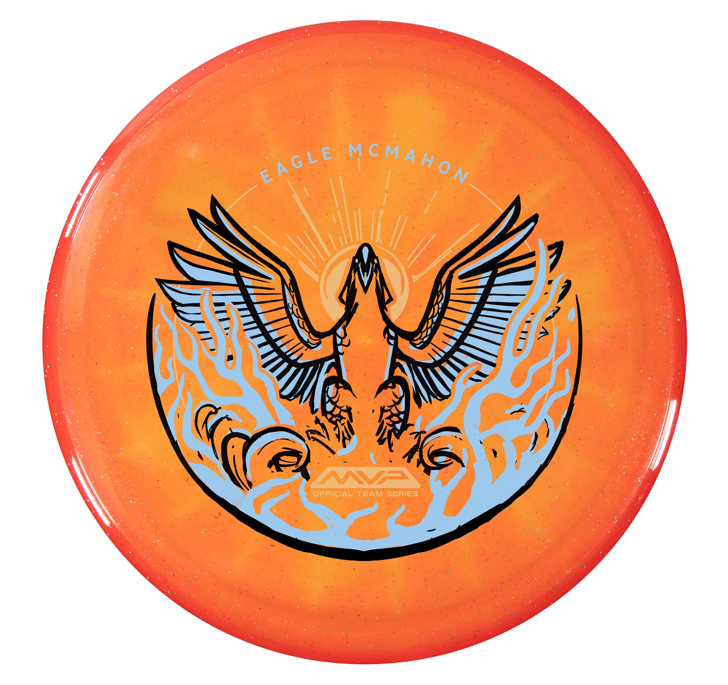
MVP Disc Sports is starting 2024 with some great Team MVP signings. One of them is Eagle McMahon! I can’t say this enough, but it was a team effort to design, film, edit, plan, and execute the Eagle McMahon recent news drop. I couldn’t be prouder to be a part of this team we have assembled. Eagle had requested in discussions that his Team Series disc be the Axiom Prism Proton Envy. Prism Proton is a combination of a Proton core with a Prism Proton rim. It differs from the standard stock Proton Envy with its Neutron overmold. It allows light to bounce through and create some remarkable results. The Envy is one of our company's most popular discs, and the Prism Proton Envy is easily one of the most gorgeous Envy’s we have ever produced.

Assignment:
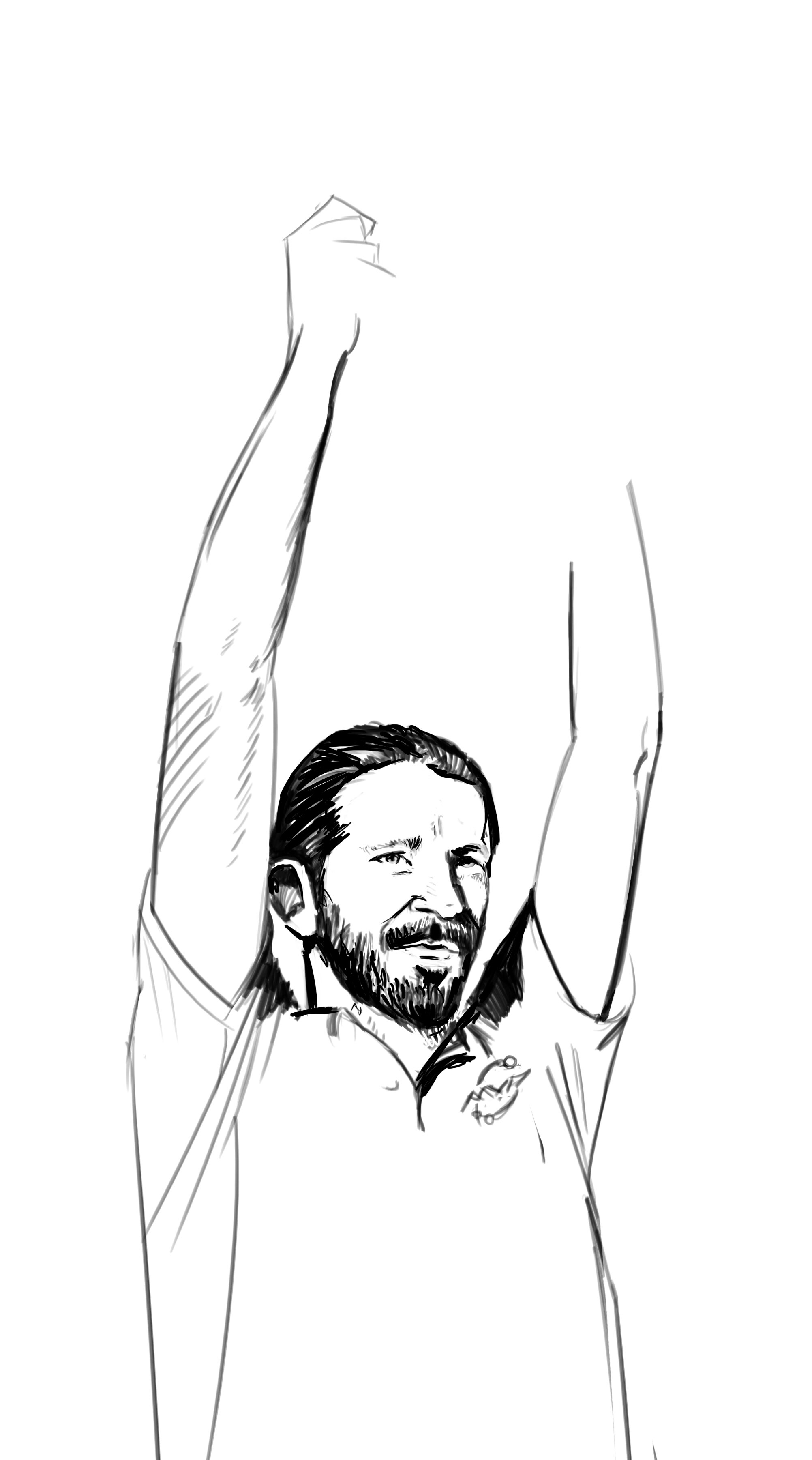
To provide Eagle McMahon with a triple-foil 2024 Team Series design and to have stamped product before Eagle’s arrival at MVP HQ. At age 25, firmly in his prime, He knew this opportunity was the start of the next phase of his career. Those conversations led naturally to the concept of a phoenix, or rebirth. It was the start of something new and exciting. While this was my priority secret assignment, I had to conduct my day-to-day operations as the Art Director of MVP.

Phase 1
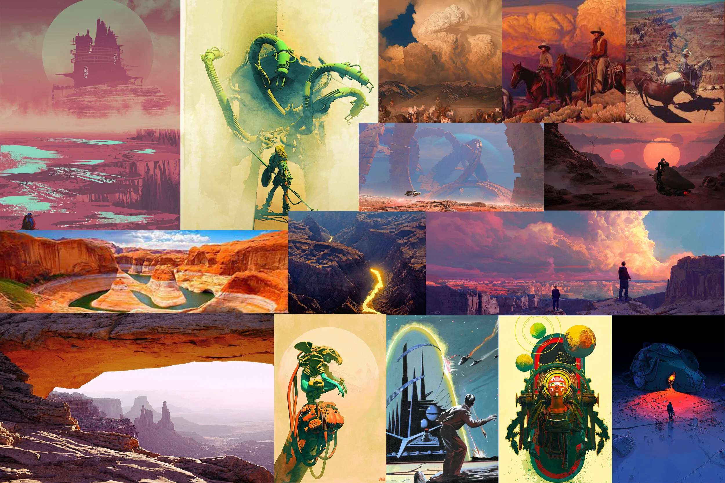
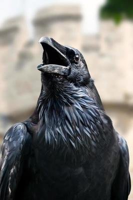
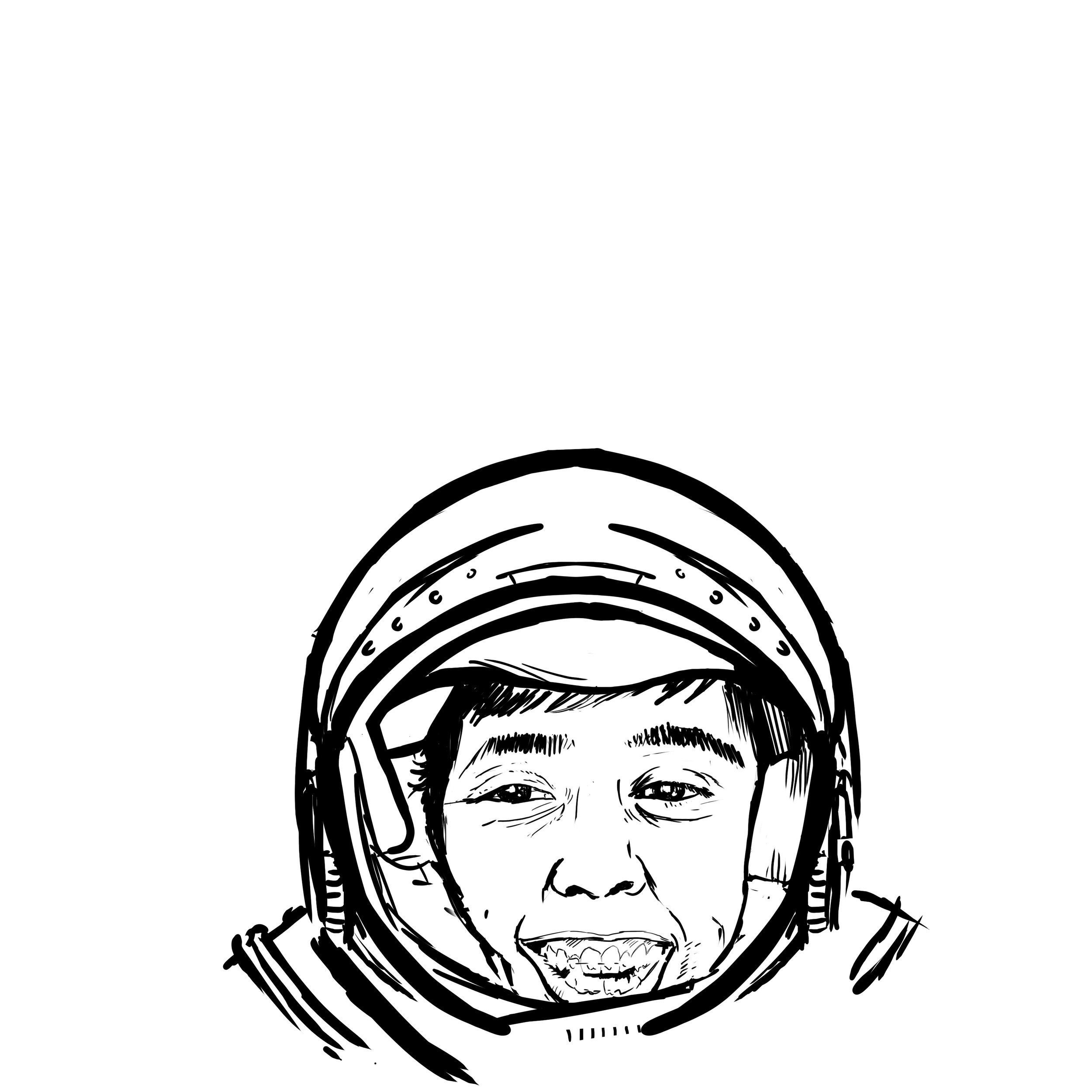
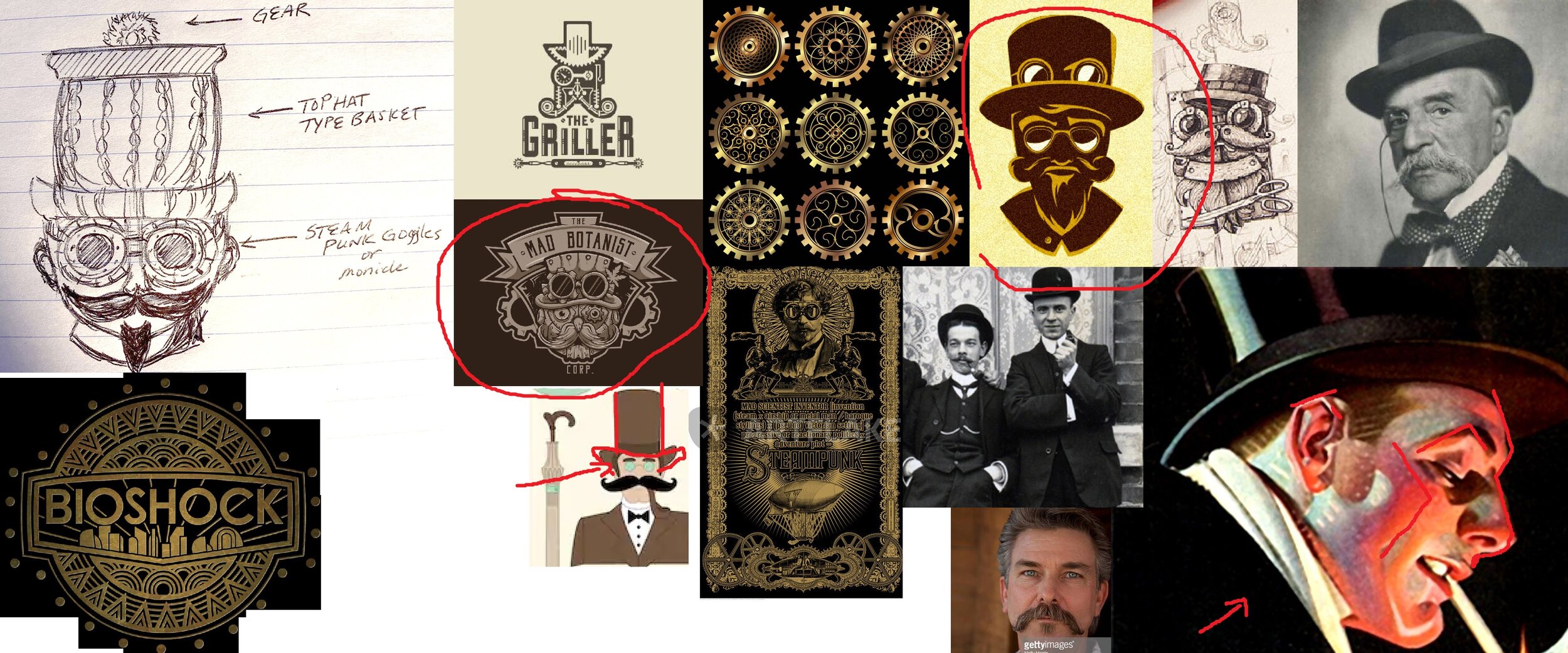
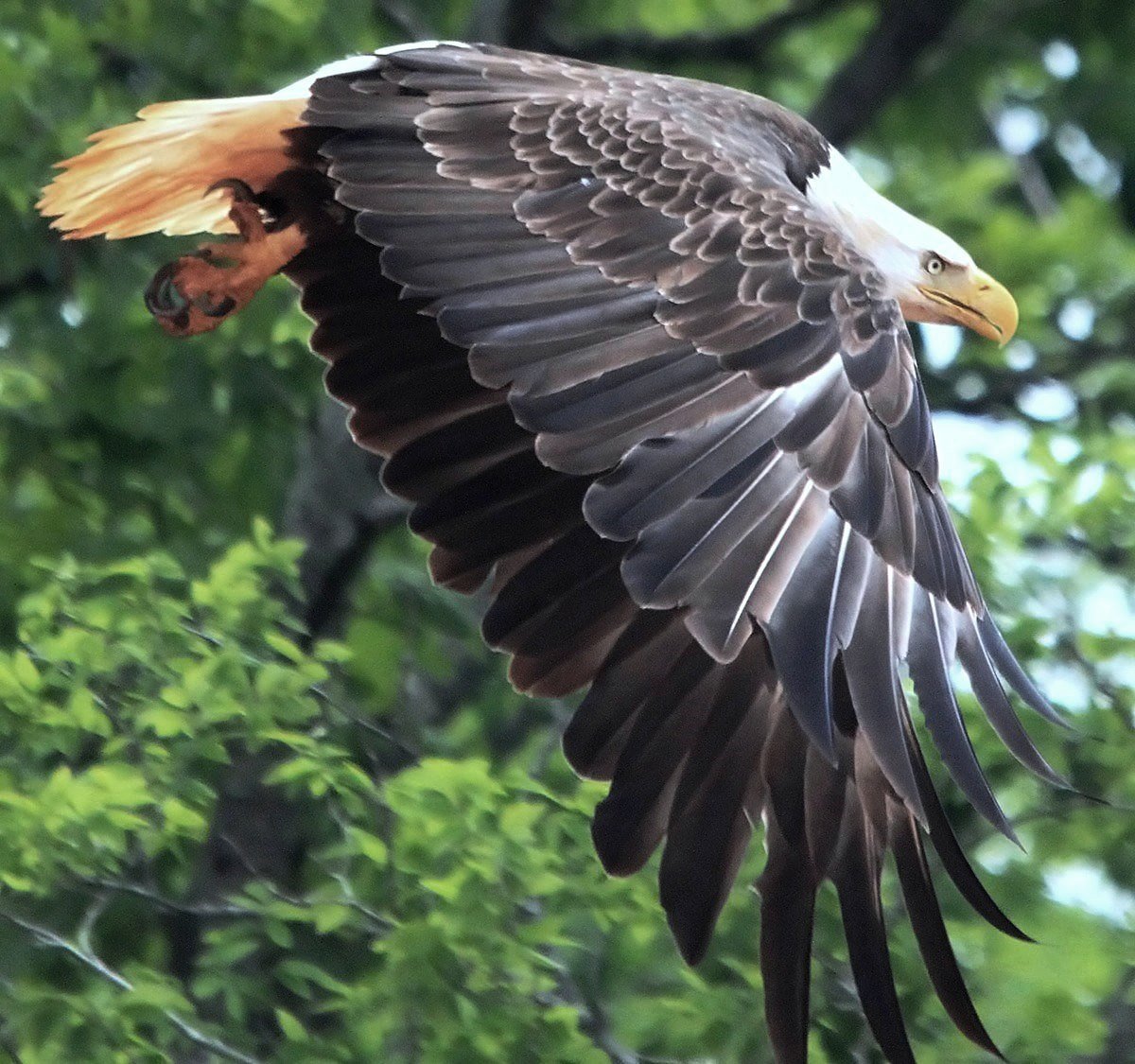
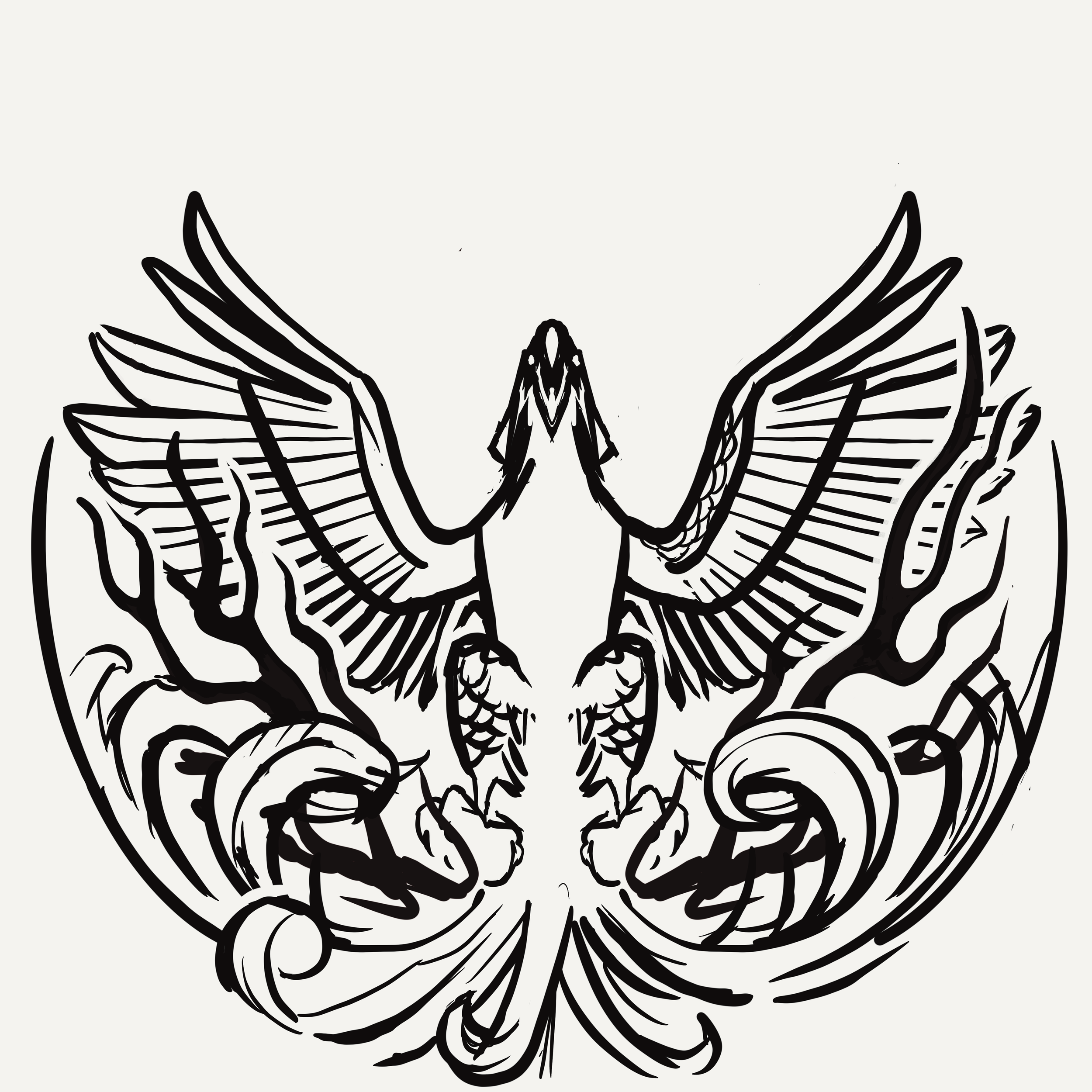
MVP/Axiom isn’t known to be a company to release anything bird-related. Where do we start? How can we work within the parameters of the phoenix lore and not create something similar to other disc golf brands? Cybernetic concepts? AI generation? The choice to use an animal has been made and redone countless times within the disc golf space. I relied on gathering references of phoenixes and eagles that displayed strong pose characteristics and unique silhouettes. While in the rabbit hole, I found references to an Eastern-style phoenix-like bird that steers toward ostrich/peacock comparisons. I felt there needed to be a sense of pomp and circumstance/elegance.
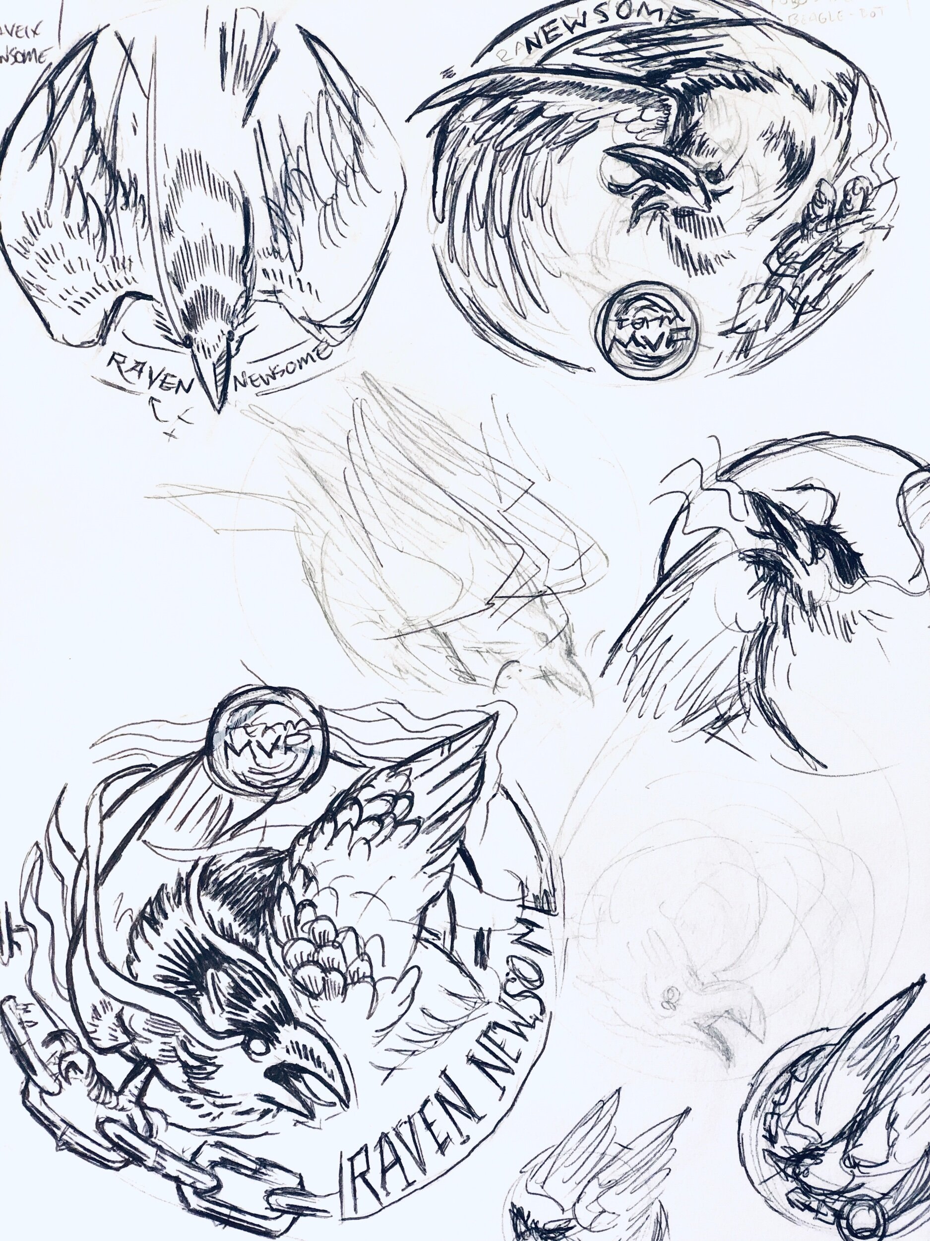
Phase 2
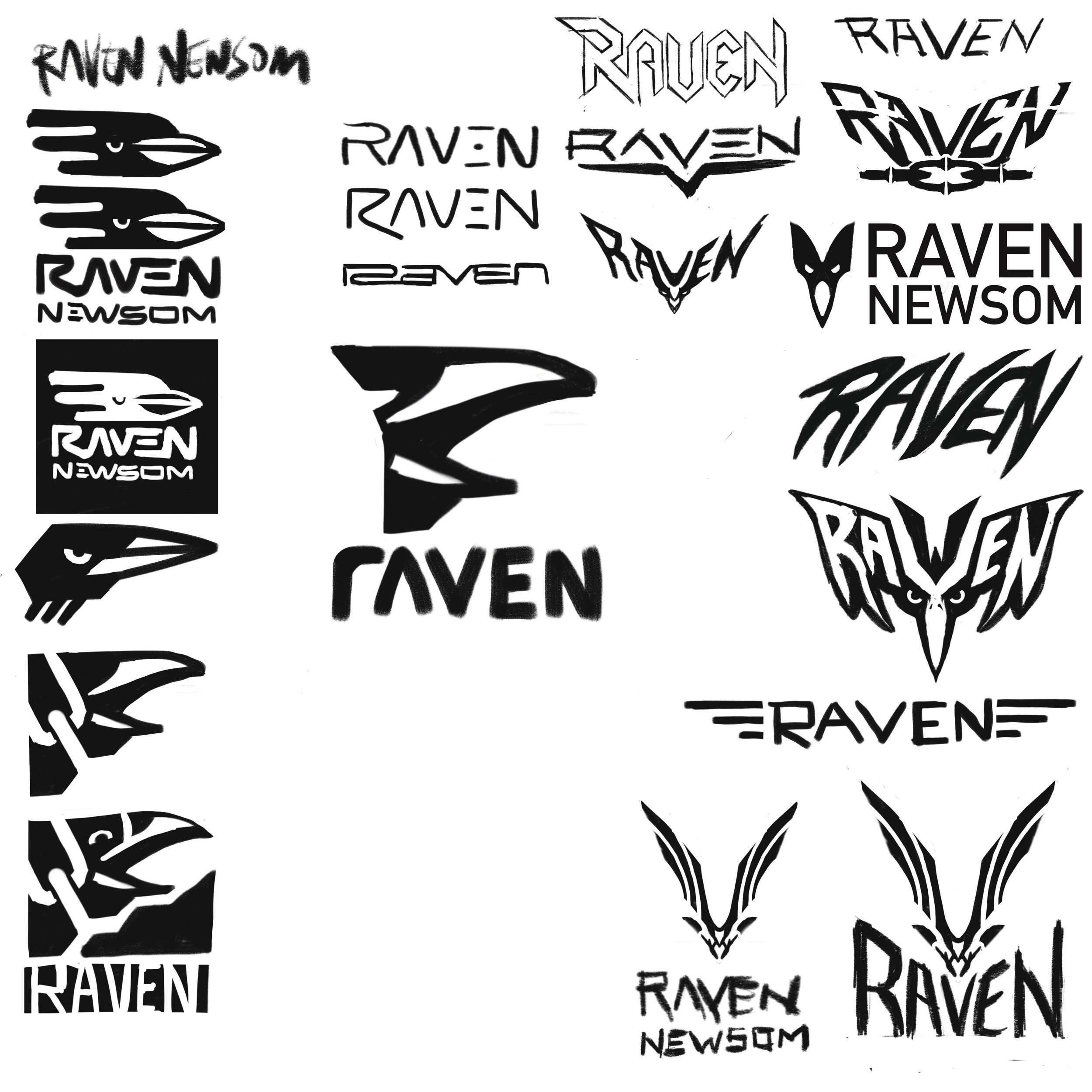
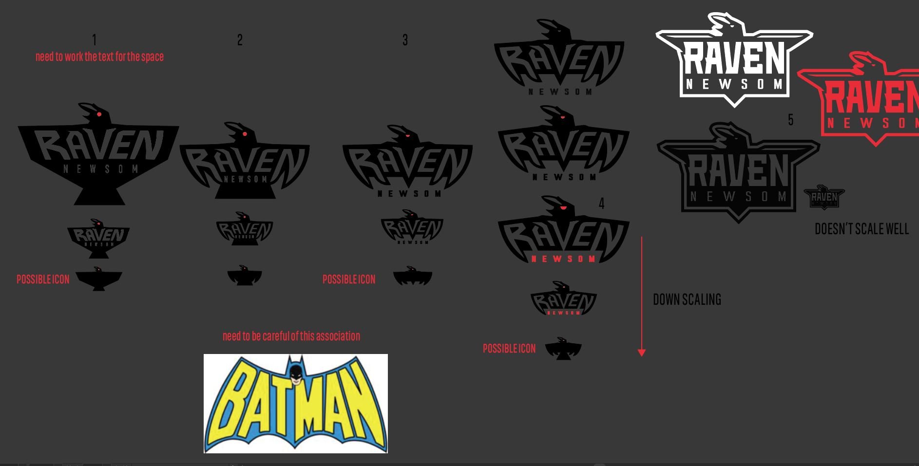
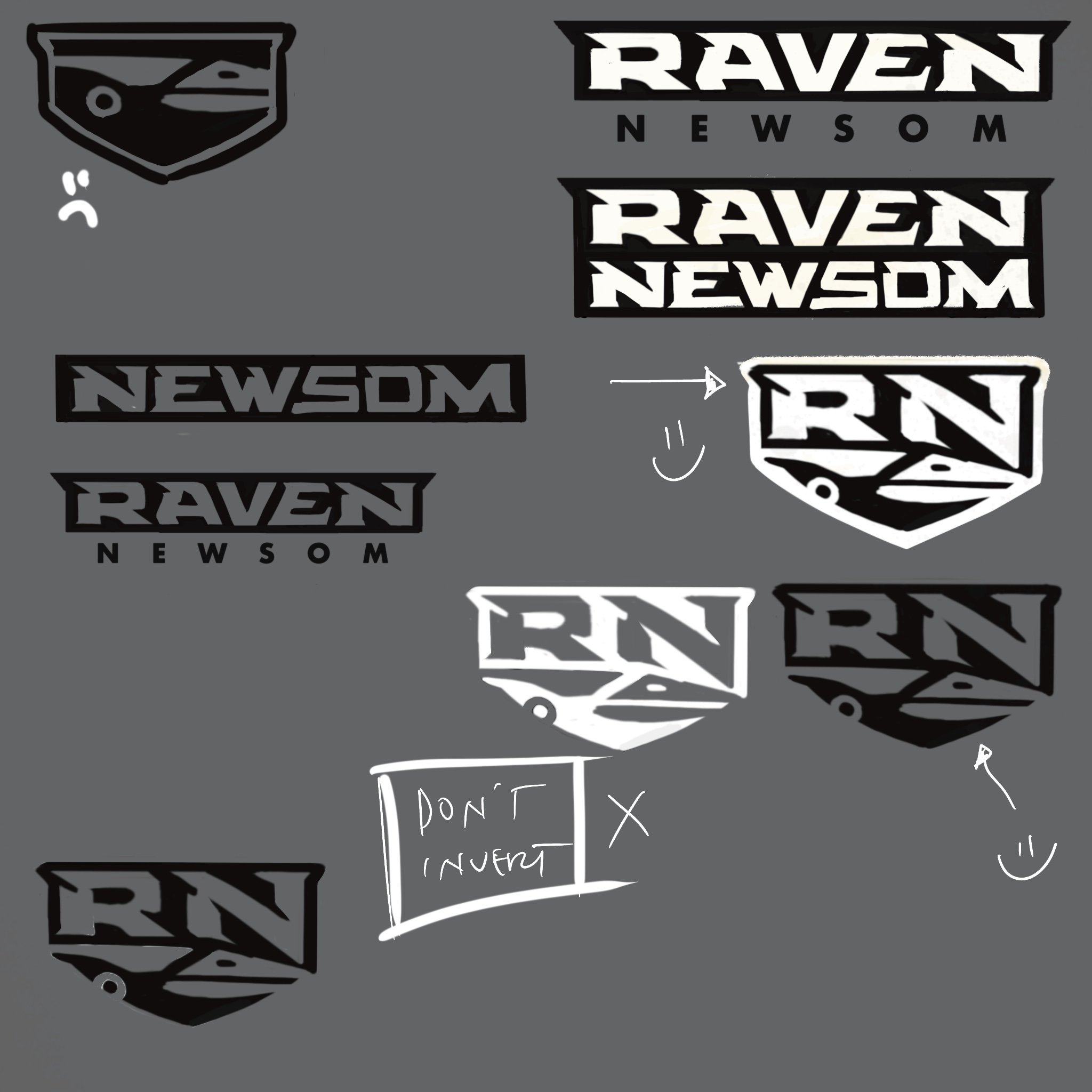
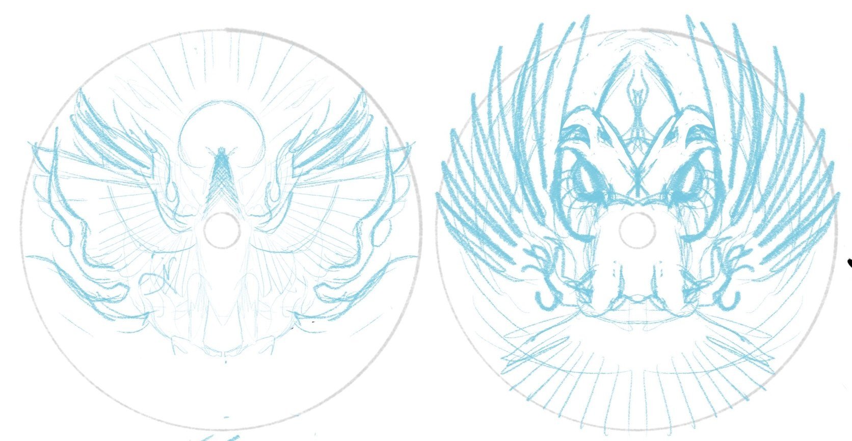
I got to work on a few sheets of thumbnails. Listening to feedback from the first thumbnail selection gave me more to chew on going into the second set of ideas. This sheet would land the bones/overall direction of the design moving forward. I brought a rough chosen thumbnail into Procreate and started to figure out bird, text, and logo placement within the stamp. There are standards for the Official Team Series seal with a minimum stamping size of 10mm tall, and I knew from the jump that those were must-haves. Going from loose drawings to idealized structure (mocked onto discs) helps show ratios and how the design feels with the characteristics of the plastic.

Phase 3
I learned a lot about Eagle during this first project. He wasn’t the biggest fan of his name taking up so much space as I initially thought we needed. We opted for a smaller footprint. The head facing to the right side offered the best silhouette value. Overall, leaving the head looking off to the side felt commonplace with the reference I’ve been seeing. Looking upward and straight on felt more engaging and powerful, so I continued with that mindset. We entered a more polished stage. I started thinking about all three foils. Eagle was pretty jazzed, and we all felt this was the final direction.

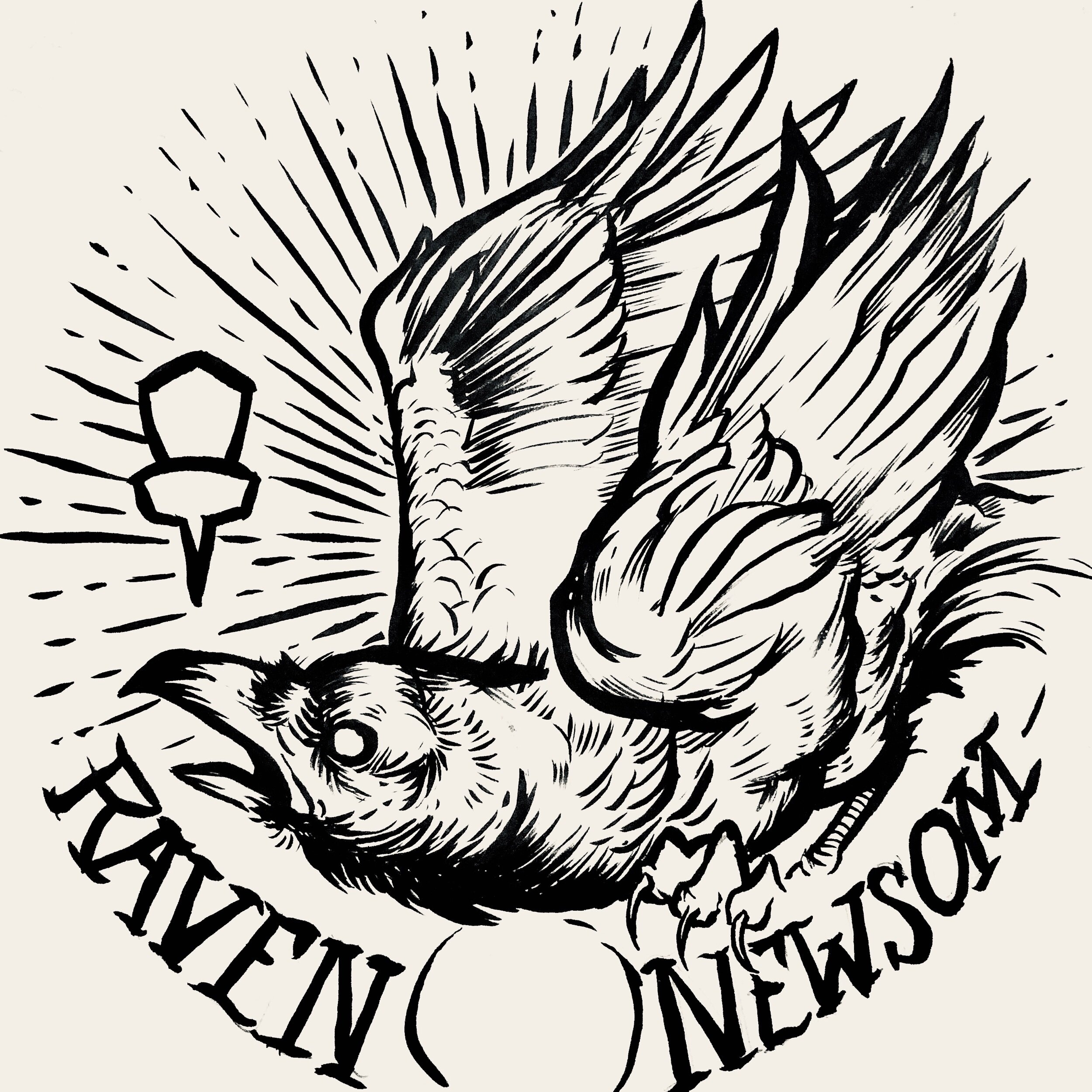
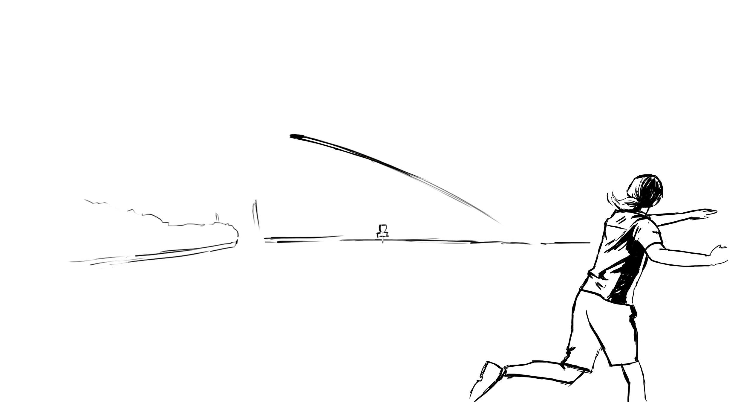
We were at the 80% mark when I felt the flames didn’t replicate the excitement/buzz going into 2024. In a traditional sense, the vibe fits more with the Eastern/traditional style fire. While working through the final ideas of the bottom stamp rocker, I realized that the airfoil caused by a bird rising from the fire would create a bit more disturbance. Adding more lateral energy helped add dynamics to the bottom portion tenfold.

The Final Phase
The last part to do was to finalize line quality, start placing the assets into the custom template, and work through final line detailing with stamping guidelines in mind. This design had to have little to no issues on the day they tested. It needed to work consistently for whoever was running the stamping machine at any point.

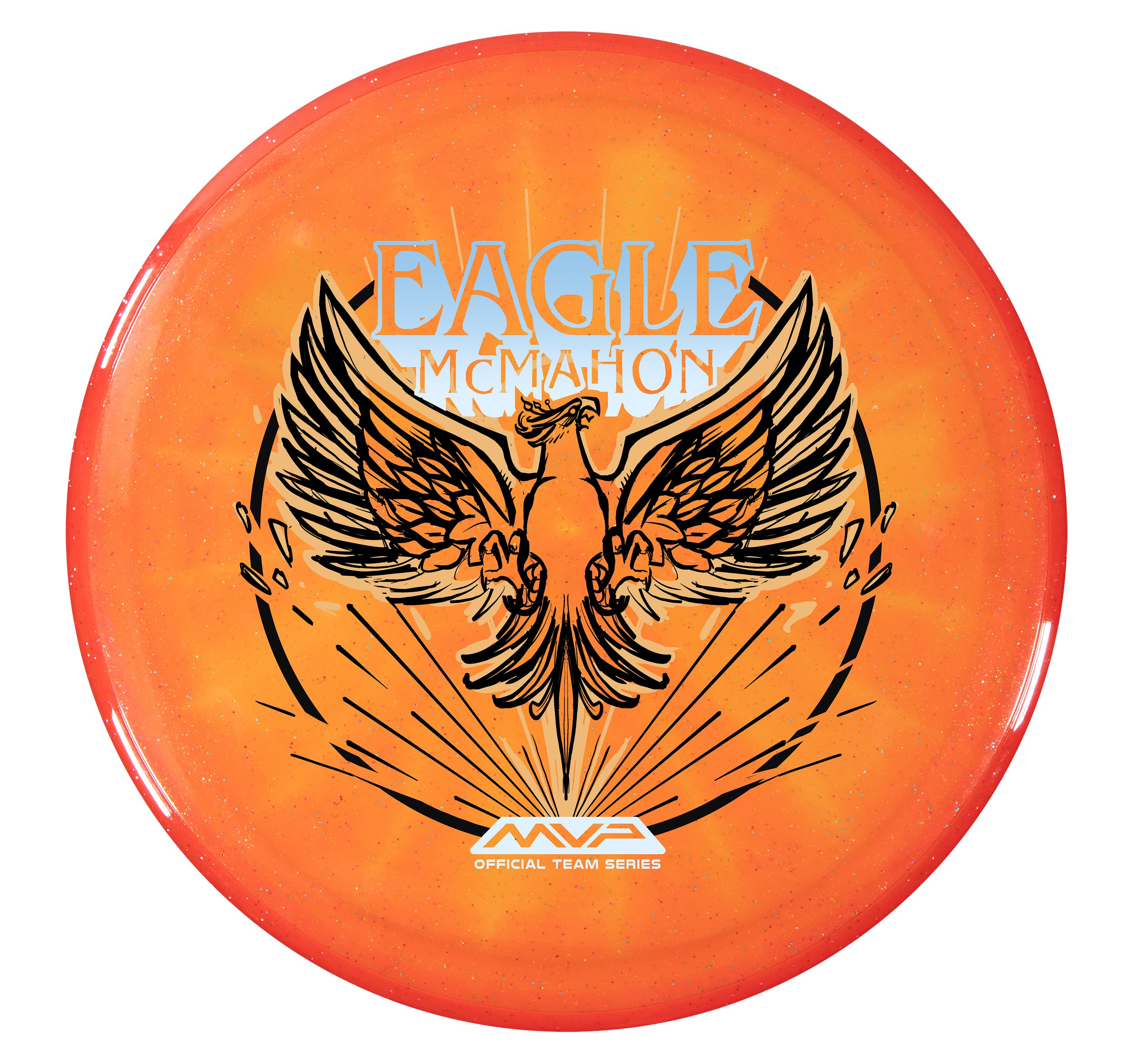
The Eagle McMahon “Rebirth” Team Series discs will include gold holographic foil, red holo foil styles (shatter, dots, and vertical holographic lines), and a black outline. I’d like to thank Eagle for his attitude and pure joy during this process. It aided in the extra hours needed to finish this. I’m beyond excited to see these out in the wild and can’t imagine what 2024 has in store for MVP Disc Sports. I hope you all enjoyed and feel free to ask any questions. Thanks!

Simon Lizotte - Leapin' Lizottl' 2023 Tour Series

Wow. Simon Lizotte signed a 10-year deal with MVP Disc Sports. I was shocked when I heard of the acquisition of such an elite player within the disc golf tour. It had been a crazy week leading up to the MVP announcement. I’m just really proud to be a part of these pivotal moments in MVP’s short history.

Besides the Glitch, the Hex is one of Simons’ favorite midranges. There were a few ideas created during the loose thumbnail stage that will be revisited in the near future. I sadly can’t show those just yet. I admittedly didn’t know too much about these axolotl creatures. Simon has a pet axolotl and I loved how they appear to be in good spirits all the time. I’ll admit that the initial open-air leap felt a bit disconnected in the concept. Bringing in the water brought him closer to his elements. I added the worm and a few motion lines to give him a reason to jump away from his comfortable habitat. Adding the GYRO wristband is a nod to the tight-nit and passionate MVP fanbase.

I’ve said this in other blog entries over the years of doing this but there’s something powerful in allowing a disc stamp design to breathe. With this being a potent Eclipse glow from MVP, I veered away from over complicating the background with detail. Axolotl jumping out from his comfort zone resonates with the kind of change Simon went through moving to a brand new sponsor and unfamiliar ground over this past year. I hope you all appreciated and bought the stamp to show your support.

Welcome to MVP, Simon.


2023 PDGA Membership Discs

In mid-summer of 2022, Vic Allen reached out to me to ask if I’d be interested in taking on the 2023 stamp. On the table were the Membership, Birdie Club, and Ace Club discs. These discs were slated to be stamped on black R2 (MVP’s recycled line) Craves. So with that in mind, you’ve got your black line layer on the flight plate which allows you 3 colors to accent that. It’s a different way of thinking with stamp design but a fun one.

I’d noodle in my sketchbook for about a week or so when Vic came back with an idea to possibly do a collaboration with John Dorn. John has been doing disc golf/ frisbee stamp design for decades. He had recently created the 2021 Relay Turtle stamp that went over really well. I jumped at the opportunity, hit up John Dorn on a phone call to work out the pipeline, and we got to work.

2023 PDGA Membership Disc: Koi Dragon

The Koi Dragon stamp started off as 3 fish swimming aimlessly in a fish bowl. After passing off this thumbnail to John, he added in the dragon and explained the story of how a Koi fish turns into a dragon. I thought this was awesome and definitely gave a jolt to this concept. John passed the concept back and it was my turn to dilute some of the noise and chaos happening and to bring this illustration home into 3 foil form. It took a bit to do that. The dragon was giving me fits. I probably redrew the dragon 2 or 3 times until I was happy with it.

The last edit going into the final phase was adding the important disc golf element. To do that, we came up with the solution to use a basket silhouette within the koi and include chains within the watery mix. I think this design turned out great!

2023 PDGA Birdie Club:

John started off with a super strong line drawing thumbnail for Birdie Club. When we passed off our designs, my first objective was to get this on a black background and start figuring out how this was going to work with foiling. I used gradients to John’s strength. He has a printing background and uses a halftone pattern fill for heavier parts of a design. I thought this could be a great way to blend the stamp into the dark flight plate. I thought that while the visual landscape was interesting; we needed characters navigating the course. That excitement of playing a disc golf course you’ve never played before. This felt very much like a dreamscape to me.

2023 PDGA Ace Club:

This Ace Club design started with a pretty strong photo from the known photographer, Beth Moon. The reference pulls from a dragon’s blood tree from Socotra Island. I love the umbrella-like silhouette and rigid shape of the canopy. It’s from there that I ventured away from the reference and put a more massive trunk like a very old oak tree. A combination of two ideas. John took then took my thumbnail idea and placed the basket and swirling root/ whimsical touch in the foreground section. We moved away from the gigantic mushroom because we didn’t want to show any psilocybin/ drug references as a PDGA offering. The absolute biggest hurdle with this stamp was the clipping area around the tree. Using the black R2 core to help with coverages and getting the correct foil gradients to do that work for us.

I just want to finish this by thanking Vic Allen for giving us the opportunity. It was a rewarding experience working alongside a disc golf design legend, a specific dark core color, and having to think about foil properties early on in the development stages. It helped us solve a lot of those issues before the Rough/ final phase of the artwork was to be addressed. A few stamp tests had to be sent to the PDGA before the final foils were chosen. I want to personally thank Ian Palmer for handling those logistics and collaborating to make sure we have the best foil represented on these. If you have any questions, feel free to ask below! You can actually purchase a Membership disc with your PDGA Membership renewal for $20!

2022 Gyropalooza Total Eclipse Proxy

The 2022 Gyopalooza brings something pretty exciting. We had a new Total Eclipse glow technology in the lab awaiting its release. The Proxy is outfitted with both an Eclipse™ Glow flight plate and Eclipse™ Glow Rim. Colors vary from white, aqua, green, blue, and purple with a multitude of different combinations.

The Idea: I had this image in my head but instead of being an intimidating alien species laser-stomping everything in sight, they were dispatched to broadcast exclusive MVP content and news to the Gyronaut masses! All of this sounded great but the important goal from the get-go was not to hinder the glow properties. I think it’s important to design stamps with disc plastic in mind. If the glow is an important draw, why would you cloud it up with foil? Lastly, by setting up a two-point perspective grid, it gave me a great base to lay down that looming presence of the tall beings. There are still a few MVP iconic themes scattered about.

I wanted some of the TVs to engage with the local disc golfers. It was a good placement for “2022”, discs, and a Brad/Chad silhouette we’ve come to know so well these past digital versions of Gyropalooza. Lastly, the last and most important icon located on the far right represents a huge love for all of our fans who’ve stuck by us from the very beginning through the years of rapid growth. I love to infuse emotive characteristics in robots. Allowing robots to have a bit more life and curiosity like our human race. Lastly, I wanted the center alien bot to have its glow casting on the disc golfers underneath. I used a line screen in the background to enhance that particular element. Doing that for every TV would’ve clouded up where I wanted the focus to go.

Hot Stamping Foils: I’m a sucker for white pigment foil because of how bright the Eclipse glow plastic is. It allows some of that color to seep through and gives the glowing state a bit more depth. The accent color is a classy nod of brushed gold that allows it to pop off of that core plastic color. Again, it’s important that the accented foils work alongside the others during the glowing state.

Can’t wait to get some of these in my hands. MVP took their industry-leading glow and just made it better. I don’t get out and play glow rounds very often but this disc makes it tempting. What are your thoughts? Excited to see these in the wild? You can get your 2022 Gyropalooza pack from any reputable MVP dealer. Included will be this Total Eclipse Proxy, a Prototype Eclipse Color Glow Envy, and Lab Second discs for a pretty good price. Thanks for tuning in!

Neutron Terra: Special Edition

I had an amazing opportunity to continue the Special Edition stamp from the Electron Nomad landscape. The first stab at thumbnailing wasn’t a success. I had this idea to do a type of spherical projection and had a few concepts based on that. James Conrad had a stamp release previously that someone on the Media Team pointed out that essentially ended that direction. It was time to pull out the wildcard idea that I painted on my iPad and realized it probably wasn’t going to fly. The concept got a positive response from the rest of the team and with a few tweaks, had me sent in a direction on the new set of thumbnails. I wanted to include an anthill monster, the same shrunken protagonist, and a tense moment in the exchange.

During the reference gathering/ idea stage I remember writing down “Terra/ dirt” and it instantly reminded me of Honey I Shrunk The Kids when they see that Oatmeal Creme Pie on the lawn. Choosing gritty texturing for the dirt helped to enhance the scaling. About halfway through, we realized it was hard to distinguish the large ant hill and I chose to accentuate the ant to be the bigger feature in the art. I relied on nuggets from Andrew Johnson our Team MVP Manager to help personalize this Special Edition a little bit more in that final stages.

The artwork was methodically split up to where she, the warrior and “Terra” name were the isolated accent. We chose a nice vertical color transition and it worked really well. The gritty shading layer was allocated with a brushed silver foil to help it work on any core color.

This was one of my favorites from 2021! I had a blast and was super pumped that James was stoked to see it too. I’m glad he trusts us with his signature line to break out of the technical shell sometimes. Since these were special editions, you can find them in the wild. Either online sites like eBay or your local disc golf MVP hub.

Raven Newsom - 2021 Tour Series

Raven Newsom officially went all-in on the 2021 season. He’s toured and pretty much played every National Tour and Disc Golf Pro Tour event that was on the calendar. I started early and before the holiday season of the previous year to get something geared up to help his touring efforts.

Raven made the process super easy. He trusted my design skills and let me come up with a few ideas to ponder over. As you see for the very early stages, the raven was refined and some of the heavy linework from my brush pen was slimmed down a bit. Everything was bold and it didn’t allow your eye to rest. I felt it was chaotic and the bird seems way out of shape. It took some more reference gathering to really started feeling better about the bird, its outstretched wings, and the overall ability to add in “Collegiate National Champion” with a bit of class.

With the worldwide COVID-19 pandemic; it’s been tough getting this design to the masses with only one or two small releases up to this point. Keep a lookout for more runs coming from Raven. I want to thank Raven for giving me this opportunity. If you have any questions, please hit me up or leave a comment!

MVP Nomad - James Conrad Special Edition

The MVP James Conrad Nomad Special Edition was a unique one. This project kicked off a bit earlier than most people realize. We had James Conrad’s Signature Line Nomads in production before he hit the biggest shot in disc golf (IMO). With that event happening and the surge and interest solely on MVP and their debut of James’ first designed putter; We shifted gears just before going into final stamp design.

First off, this design from the get-go was a collective agreement from the MVP Media Dept. that it should be a cohesive nod to the stock Electron Nomad stamp that was also debuting at the same time. With that, I was able to dial in on the “traveler/ nomad” aspect and reach down into my science-fiction/ dystopian love. I’m one to do extensive research before going into the thumbnail stage. Grand Canyon/ desert paintings from the incredible minds of Mark Maggiori, Pablo Carpio, and Pascal Blanche helped dial in a smooth style with the rock formations and overall composition.

With this project; I knew I wanted to push the limits of our Election stamping capabilities. Although nervous, I knew our MVP HQ stamping team could put their best into making sure these came out successful. It took quite a bit of value painting work to figure out the half-toning fills. I worked back and forth with the inclusion of black within the stamp and found a great compromise of subtracting the would be black line work from the background.

In the end, i’m glad this art was in preproduction before James Conrad flipped MVP on its head. I was able to adjust on the fly and include the Worlds nods relatively easily. I’m glad this went ver so well with James and the pro players he showed during his warmup rounds. That meant a lot.

What did you enjoy most about the Nomad Special Edition?

Firm Electron Envy - Special Edition

James Conrad. What a performance!! If you’ve been living under a disc golf rock, here’s the final round of the 2021 PDGA Disc Golf World Championships. That shot propelled MVP and Axiom Discs to run its first custom colorway since the early Axiom Artist Series releases. It’s been a little over a year since that day but I’ve finally told myself I should probably post this before the 2022 World Championships. We wanted to truly honor the win while also acknowledging the sheer interest in the Electron Firm Envy that he threw in from 257 ft to force the playoff with 5x World Champion, Paul McBeth.

This is up there with some of the most prolific design jobs I’ve ever done in the disc golf space. I knew going in that getting and sorting through all the media from that weekend was going to be the task at hand. We had boots on the ground with Team MVP Team Manager and Marketing Director, Andrew Johnson following James and getting some insane footage. We also had PDGA and Gatekeeper Media content at our disposal. It was important for us at MVP to celebrate “The Shot” but to also put the viewer in the exact moment James raised the trophy. He’ll remember that particular moment for the rest of his life. I think the decision to create a replica yellow core, blue rim Electron Firm Envy was decided on just a few days after everything went down. MVP HQ wanted to make sure that was something they could facilitate both with plastic availability and machine time.

I had already made a mental note that most likely that was probably going to happen and started tinkering on editing the stock stamp created by Zachary Kelbaugh with some tasteful and clean Worlds win text. I wanted the stock Axiom Electron putter stamp to remain as much as possible while facilitating the celebration. While in the quick and dirty thumbnail phase, my gut said something had to go. The tightly wound audio waveforms representing the plastic firmness around the outside were extracted. I began working on a few inking pieces based closely on references of James that I paused from video footage. I’ve watched the shot 100+ times and probably in slow more for a majority of those trying to find particular moments. I remember the amount of pollen floating in the air, the time of day, and the sheer amount of sunlight beaming down on Hole 18 during the final approach. The grandstand, the crowd, the line, and the commitment around that right side tree. All of it. I put as much as possible while keeping it mostly uncluttered.

If you notice from the images I’ve shared below, we almost used the front-facing James shot from the award ceremony. I felt the rawness, the immediacy of the trophy raise near the water carried the energy from that thrilling playoff hole and favored that idea. With that finally decided, I went back and tightened up the Hole 18 grandstand, backhand throw, sunrays, and pollen around the Axiom and Electron Firm logos. This was a fast-paced project but I felt the ability to rush something out in a day or two just wasn’t the greatest idea. We wanted a classic design centered around James’ first PDGA Worlds win and something that acknowledged and represented the absolute insanity of the final round.

The Special Edition Firm Envy is out in the wild. Please be sure to ask your local retailer if they have any left in stock!

2021 Axiom Insanity Halloween: Special Edition

This year’s Axiom Eclipse Insanity design was absolutely a step out of my comfort zone. After the year and a half MVP HQ has had with dealing with the pandemic and keeping up production; it was a relief to know exactly what the disc and plastic-type were going to be at the start of this project. I would say the main priority was expressing polarity between structured design and chaos. Trying to find an impossible medium for someone too far gone into the “insane” realm.

There is a complete clashing of styles in this design that was influenced by psychedelic surrealism, traditional tattoo, and gritty shading using small spray paint stippling. The ultimate goal was to design a stamp that had a light enough footprint to allow our highly-touted Eclipse 2.0 plastic to really shine through. That’s a challenging feat in itself but one that’s truly satisfying in the end.

I discovered an artist by the name of Afarin Sajedi that really gave me the confidence to jump off the deep end and go for it. I love her use of strong contrast and surreal ideas. Her compositions were really interesting and would aid in me thinking outside of the standard diameter confines and more of the pill shape that you see. The gaze of the figures in her paintings is just haunting. Other influences were surprising the Dumbo dancing elephant animated scene, Alex Grey’s spiraling elements, and that vintage carbon copy texturing against clean line work. Using my past experience with the Marie Curie Eclipse Reactor design; I was able to really dial depth through the different foil properties. White pigment backed by a strong glow allows it to penetrate through the foil creating different shades at night time. I’m thankful for our stronger glow plastic that really allows artists to design and plan in that sense.

As MVP HQ and I were testing final foil preferences, I had an idea initially for using purple or pink as one of the supporting accent colors. We initially decided on a blue metallic but I would come back shortly after and go with my gut choice of the lighter purple metallic. It aids in the play of funky weirdness/ stark death/happy skull contrast. It’s an uneasy design with the full intent to be just that. What do you think? Drop me a comment or tag me on Facebook with your Eclipse Insanity Special Edition out in the wild. Thanks for tuning in!

Cameron Beck 2021 MVP Tour Series

Cameron Beck is an avid climber and Team MVP member. He approached me this off-season with an idea to marry his love of rock climbing, eco-friendliness into his first official tour series stamp. Some of the proceeds would go to a local course but also support him for the 2021 touring season. I knew just by following Cameron that he spent some time over in France for a short period. Our initial thoughts on the design were to feature the cliff rocks from Étretat in Northern France. That arch is insanely beautiful and the fact that they climb with water below really got the gears going in the thumbnail stages.

I took some time to R&D but I couldn’t get enough reference of someone in the act of climbing that particular location. From there I went to a few ideas that I thought could make for a compelling stamp. The idea of this climber reaching toward a disc golf basket perched high above. It would allow me to encompass disc golf and his love of climbing into one stamp. The thumbnail sheet gave him 3 different approaches we could go with that idea. In the end, we both thought #2 had a creative solution around the center no art zone. It also featured sharp diagonals and great negative space underneath the climber to show the suspense and danger that comes along with sport climbing.

The design, shape, and placement of the rock face allowed the great vertical read from the basket - climber - down to his name in the lower 3rd of the stamp. I really liked how this stamp turned out and appreciate Cameron giving me the liberty to put something together for him.

Marie Curie Eclipse Glow Reactor

I’m working my typical day and the word came down that MVP HQ is experimenting with a new & improved Eclipse Glow blend of plastic with overmolds. With the recent success of the Reactor mold; both ideas hit me at once and we pitched the idea to try Reactors & see how they would mold up. The initial idea for a Glow Reactor Special Edition came in the form of glowing toxic material and powerplants.

Some say it’s not always good to roll with your first idea. We marinated a bit on the qualities of the plastic and used them to our strengths. The natural look of the Eclipse 2.0 blend in the daytime gives off a milky white/greenish appeal. I felt using this opportunity to honor the late Marie Curie and her life as a scientific pioneer. She would be the first woman to win multiple Nobel Prizes in both sciences. She’s also the first female featured in MVP’s Limited and Special Edition scientific line of stamps. We use this platform to give nods to some of the notable humans that have contributed to the world of science. Her magnificent and intense story led MVP down the path to honor her in this stamp.

While diving in and reading about Marie Curie; I jotted a few notes that would aid in design cues and decisions while building the vector art. Marie and Pierre found and named a new element called Radium that was 4x more radioactive than Uranium itself. Long story short, She and Pierre would take the next 4 years to process an incredible 10 tons of pitchblende down to 1/10th of Radium Chloride residue. She was able to give an atomic mass of Radium of 225.9 (226) and place it correctly in the Periodic table. I thought that was a pretty significant number that took an immense amount of work to arrive at. I would later use that number of radial lines from the discs’ center.

I used a variety of images of her from both her early years as a college student and those of her later years to compose a set of thumbnailed ideas. There are era-appropriate shapes and symmetry to really help merge the unique plastic color. MVP stamping and marketing worked in conjunction to test and make the transparent foil worked with the artwork. The molecular compound of Radium is featured as a clear holofoil backdrop that appears a muted grey when illuminated in the darkness. The new 2.0 Eclipse is so bright that the white foil we used allows light to soak through giving even more depth in the darkness. Marie’s pose is intense as in her work. Time is not wasted. Electrometer and infamous MVP shaped beaker are placed behind her. In her lower pocket is a glass tube of Radium. She was known to carry it around in the lab; as she wasn’t aware of the effects of radiation.

In the end, it’s the overall goal to honor a legend in the science field with tact and class. Use the plastic qualities as we did in the 2018 Am Worlds ”Queen Charlotte” and make it feel like it belongs in the lineage of MVP stamps created to honor those featured. We felt as a Marketing Department that this stamp did just that. These Special Edition Marie Curie Eclipse Reactors will be available at most major MVP Disc Sports dealers for a small amount of time. Be sure to inquire about them before they’re gone for good!

Dan Fairhurst Loki II

Dan Fairhurst has been an awesome client and teammate over the last few years. I’ve been fortunate enough to be able to throw a round or two with him. With the success of last year’s initial Loki stamp; we’ve returned to the drawing board to expand and improve upon it.

There were two ideas up for decisions and one of those will be something carrying over to Loki III. Both Dan and I really loved the fierce nature of the initial stamp. I wanted to simply open that up and show a bit more of his features. Doing a 3/4 head stamp shows just enough progression and left the center open for stamping purposes. Some of the biggest hurdles were the fact I don’t do too many characters so 2 major things needed to happen to make it feel like this is a continuation:
1. I need to keep the likeness of the first stamp.
2. I had to refer and get feedback from a few artists to realize a few things were out of perspective.

Loki’s right horn was definitely one of them. I had to shift that over and ax his front chrome helmet shading. Coming down to the final stretch; it was a figuring out where the secondary foil would highlight. I felt like pulling attention toward the accentuated chin and nose gave him a very similar Green Goblin vibe that I wasn’t going for. Pulling out some of those highlights and tastefully doing just the eye’s kept it balanced.

I can’t thank Dan enough for wanting to continue his Loki series in 2020. I don’t sit down and practice life drawing all too much so it’s a new challenge every time. You can reach out to Dan Fairhurst here to support his disc golf tour schedule:

https://www.facebook.com/dfairhurst1

2020 MVP Halloween Special Edition

I can’t say enough about how weird of a 2020 this has been for everyone. The Cosmic Neutron Tesla from MVP Disc Sports would be the featured mold for this year’s Halloween release. This is a big deal because up to this point since 2014; no manufacturer owned by MVP other than Axiom Discs has had their share in the limelight.

This idea for the Grim Reaper came pretty easily and was chosen out of 3 solid ideas (2 of which may be saved for future Halloween’s down the road). While the Cosmic Neutron swirls pop, it’s extremely tough to get something to work alongside it. I felt like the reaper really had a strong composition that would help it stand up to the beauty of the plastic. Using bold foil choices would help aid it to stand out even more. If you look close to the rough and final design; I honored our marketing team and select MVP HQ employees with their own headstone. Everyone from the stamper himself to our social media guru, Will Davis. Toward the end, I saved pressure on the flat silver layer by removing the fill of the headstones. I like there’s a nod but I wanted the swirls to hide that small nod within the plastic qualities.

While I know the reaper has been done aplenty for Halloween festivities; I feel these small gestures and nods put this on its own plane. I hope everyone bought and enjoyed this year’s Halloween Special Edition. You can most likely find them at your local dealer that sells MVP/ Axiom/ Streamline Discs.

Jordan Castro "Castronaut" 2020

Jordan Castro is a new face to the MVP team this year. I was very fortunate to get a private message from him asking if I could help him out and get a stamp ready. Not knowing Jordan personally; I kept asking questions. What is he about? What are his passions? I went to down on a few ideas that would work within the disc template. Let’s just say I didn’t get off to the greatest start for his first Tour Series disc. Jordan is extremely humble, humorous and has an incredible work ethic. I wanted to take some of those traits and relate them to the artwork.

Shortly after the first/second round of ideas, we went back to the drawing board and Jordan hits me up one day and says “Castronaut! Can you work with an astronaut theme?” From then on we were locked in and the project really got rolling. We were lucky that one of the first one or two thumbnails nailed the direction. This straight on astronaut suit seemed to fit the easiest circular composition. I didn’t fully love that his helmet would be stuck to the bottom area of the stamp but you’re limited in some areas because of template restrictions. This layout really opened up the top to celebrate the “Castronaut” title and minimum Team MVP seal standards toward the top of the stamp.

Nailing the likeness of Jordan was extremely tough. The thumbnail gave more of a caricature feeling and I wanted the audience to instantly recognize. It took shades/ no shades/ and a few photo mashup’s to get the eye's and overall expression where I had envisioned it to be. The last phase was polishing up the Castronaut wording and framing by using the Illustrator 3D text tool and adding star bits and filigree to the top portion of the stamp.

All in all, this took a bit more development than I had anticipated. Jordan was awesome the entire way through this process and helped with reference photos and gathering resources where he could on top of his busy schedule. I hope this stamp starts a successful series for him and his years with Team MVP and MVP Disc Sports.

You can contact Jordan Castro on his tour fundraiser discs here!
https://www.facebook.com/jordan.castro.90

"Hold On" Self-Portrait

Wow! Where do I start with this one? Michael “Sully” Sullivan and I have worked numerously on other projects. I was able to help him with his personal Team MVP stamp and multiple Gyroscope designs for the local events he runs with MVP discs. Mike came to me late last year with the idea he had of recruiting artists and just letting them do their thing. Drive home what’s important to them, their particular nuances and inspirations, and seeing what manifests from the idea. Soon enough, Michael was off and running and had me in mind for one of the first chosen artists. I simply couldn’t resist. To have that kind of trust to allow the artist to roll with what inspires them has so far been an idea paying huge dividends.

Why eyeballs and feathers?: I have a deep admiration for my father. He was very young at the time that he and my biological mother split ways. He worked long hours and with the help of my grandmother, took care of my sister and I. You have to be selfless as a parent and I’m learning those things rather quickly. At a very young age; I’ve seen numerous eagle imagery and have been inspired by some of the graphical posters/ tapestries on the walls of our home. While birds aren’t exactly easy to draw, they tend to create some really dynamic and interesting shapes. I enjoy that there are numerous ways to shift the head, body, and talons to create something unique. I chose a bald eagle because of my upbringing, & military service to my country. While it may be some hard times right now for a lot of people in the world and more specifically, within the U.S; I feel the eagle idea hit both a personal side and an aid to a more hidden message of resiliency, being present and educated with what’s going around you. This particular eagle doesn’t have its wings out to slow his movement. They’re fully back allowing less drag. I use these wind tunnel-like lines to accentuate it. This eagle is very much in control.

But Mike… eyeballs?: Eyeballs. What can I say? My love of Rat Fink, skateboard art, counterculture, and the weird. That’s why I love drawing and using them in my personal and professional work (when it fits the project). This eagle could very much rip this fleshy ball of goo with ease but he simply isn’t. I wanted a story and adding tension between the two elements was a starting point. There really aren’t any boundaries except the ones you create for yourself. I love that the most when creating in this style.

Is there a story?: This idea wasn’t there from the project kick-off. It just sort of clicked when pushing the final thumbnail phase. The eagle can symbolize the all-seeing eye. In my piece, the eagle aids the eye to look at the world from above. It would later set the hierarchy for the composition itself. I very much had in mind to bring in Western NY hidden elements. I’m a die-hard Buffalo Bills fan. Having nothing really stopping my personal aspirations, everything sounded like an awesome idea! I relied heavily on my past hot stamp design experience to pump the brakes. All of those elements simply weren’t going read well so they were scrapped. While the project was fully in my hands to do whatever I please (within acceptable reason), the rules of composition, read & graphic nature kept the stamp from becoming a total mess.

The ultimate goal was to create something people would visually gravitate to. While polishing up and choosing, the idea of this giant bird allowing the human eye to see the world from its view, spoke to me. We are still dealing with the COVID-19 virus, inequality, and a country very much in a shaky situation. Is it acceptable in disc golf to talk about these things? Why not? We’re individuals with our own views and ideals. This stamp definitely doesn’t tell you what to think; it says to pull back, look at the world from a different angle. All in all, this project was a lot of fun and something I definitely looking forward to doing again in some compacity. I can’t thank Mike enough for getting it rolling.

Luckily, there are still a few available after the initial pre-order time. Be quick but you can order and support my Self-Portrait by reaching out to Mike Sullivan here:
https://www.facebook.com/Sully68783

Fission Wave Special Edition

A new mold in MVP Disc Sports’ Fission™ plastic debuts and it’s the ever-popular Wave. Fission™ plastic bases its technology by considerably lightening the center core and increasing the outer weight in the overmold. You’re able to get a more gyroscopic flight.

I was tasked to bring an idea to the table. Instead of reinventing the wheel, the team and I looked back to a bunch of different ideas from previous MVP specific Special Editions I created that weren’t used. A lot of them had potential and it was a mix of an older MVP Limit thumbnail in combination with an idea I can’t share right now that really got the Marketing Department’s excitement up. When I’m pitching these ideas to the department, I’m trying to show them my linear progression in decision making. Once I shared the solid previous idea; interdepartmental conversation really helped to meld the two solid ideas together.

I’ve done some small reading on human resonant frequency in the past. I pictured this character having the gift and future technology to harness and magnify those vibrations into an auditory superpower. Sort of the same concept of pulling all of that weight to the outside rim of Fission™ Technology. Throughout the progression of the stamp; I battled with having a background to reinforce the story. I tried bolts and linear waves but felt the “WAVE” text and visor elements needed that space on the right side to breathe. So much was happening with the helmet and cable hair. Detail on this stamp was selective and when dealing with MVP and it’s history of Special Editions; it was an effort to keep this design clean and precise. From the rough to final draft, you see that it stuck really close to the original concept. With the help of female profile references to cyberpunk, & retro wave influences; I was able to create something that hopefully puts a positive look onto MVP and their multi-stamping abilities.

Get your hands on the Fission Wave arriving in stores, August 14th!

MVP Ohm-Special Edition

The Ohm Putt & Approach disc gives customers the glide, feel, and flight of the popular Streamline Pilot but in an overmold form. I feel this disc is going to be a favorite for years to come. Approaching the design for the Special Edition, I ventured to amplifier tubes and how Ohms relate to the temperament of amplifiers and the management of current. Since Ohm’s deal around a concept, that difference between two points is directly proportional to the resistance of the circuit; We shifted gears and went away from the amplifier tube idea.

From the jump, I wanted to have a sense of energy within the bolts and stay clear from the expectation of yoga and “oohhhmmmmmmmm”. I felt that idea was too easy and not really fitting within the MVP brand. Using my love of illustration within concert posters; I was able to rough in that staggered jolt. It was the second round of ideas that steered us to the fist/ hand concept. It’s a simple visual that represents current flow and the resistance that the fist creates.

I’m a firm believer that nothing comes easy. It took some churning to personally bring the best idea forward. All in all, to step back as a marketing department and reassess the direction of this design, seemed like the best thing that happened. What do you all think of the Special Edition design? How are you liking the MVP Ohm in general? Thanks for stopping by.

Amanda Melwiki - 2020 Team MVP Tour Series

I’ve been working with Amanda Melwiki over the past few years on her Team MVP Tour Series discs. Her pup Charlie would now be the center of focus and Amanda and I welcomed the change-up. The theme for a few years prior has been “Robokitty” and initial thoughts were how to make the larger than life hound, half robot. Amanda was great to send me videos and photos of Charlie. What really sealed the deal to keep it full pet was a video of Charlie playing in & around a sprinkler.

Dealing with a hound type of pup, I wanted to accentuate the ears and jowls. That in combination with that “zoom” effect that dogs get where they run around expelling a ton of energy. They look at you daring you to take the toy from them with a wide-eyed look.

Once the design was in vector, a few hurdles arose that I didn’t see would be a problem in the rough. One instance was where I planned for the center sprue point of the disc to land. This template requires that center area to be clear of any art. The right side just under the nose was going to be that landing area. Doing so in the template left the design to be smaller than desired. To combat that, I had to clear out the left side detail just a bit and compromise on the dynamic overlap of the outer stamp & move the Team MVP seal toward the bottom.

Overall, I think Charlie got the real estate she deserved. Allocating a foil behind Charlie gave the disc color a chance to shine through the pup and evened out the 3 different foil types. In closing, I’m very grateful that Amanda reached out again this year to ask for my help. Her trust and instincts in these designs are really what makes this project fun every year. What did you think? Did I succeed in the playful nature of Charlie? Please comment, like, and share!