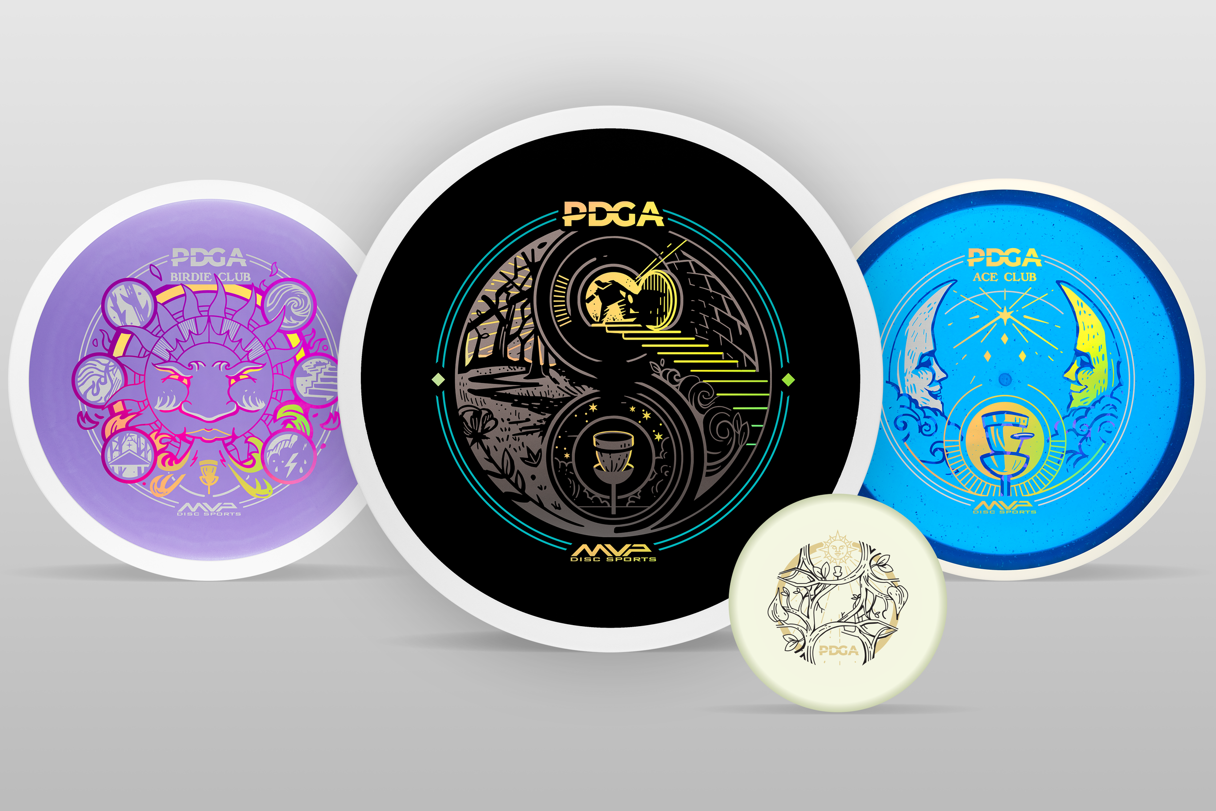
2027 PDGA Member Discs
Vic Allen, Professional Disc Golf Association (PDGA) Membership Manager, reached out to me in mid-to-late April to start a dialogue about the 2027 Membership Disc initiative. With the recent teaser announcement, it’s a fantastic time to dive deeper into the creation process. It takes a lot of hard work and coordination from both parties, and I’m excited to share that journey today. I’ll break this down in the most logical order for an article, but keep in mind that all three designs developed along the same timeline.
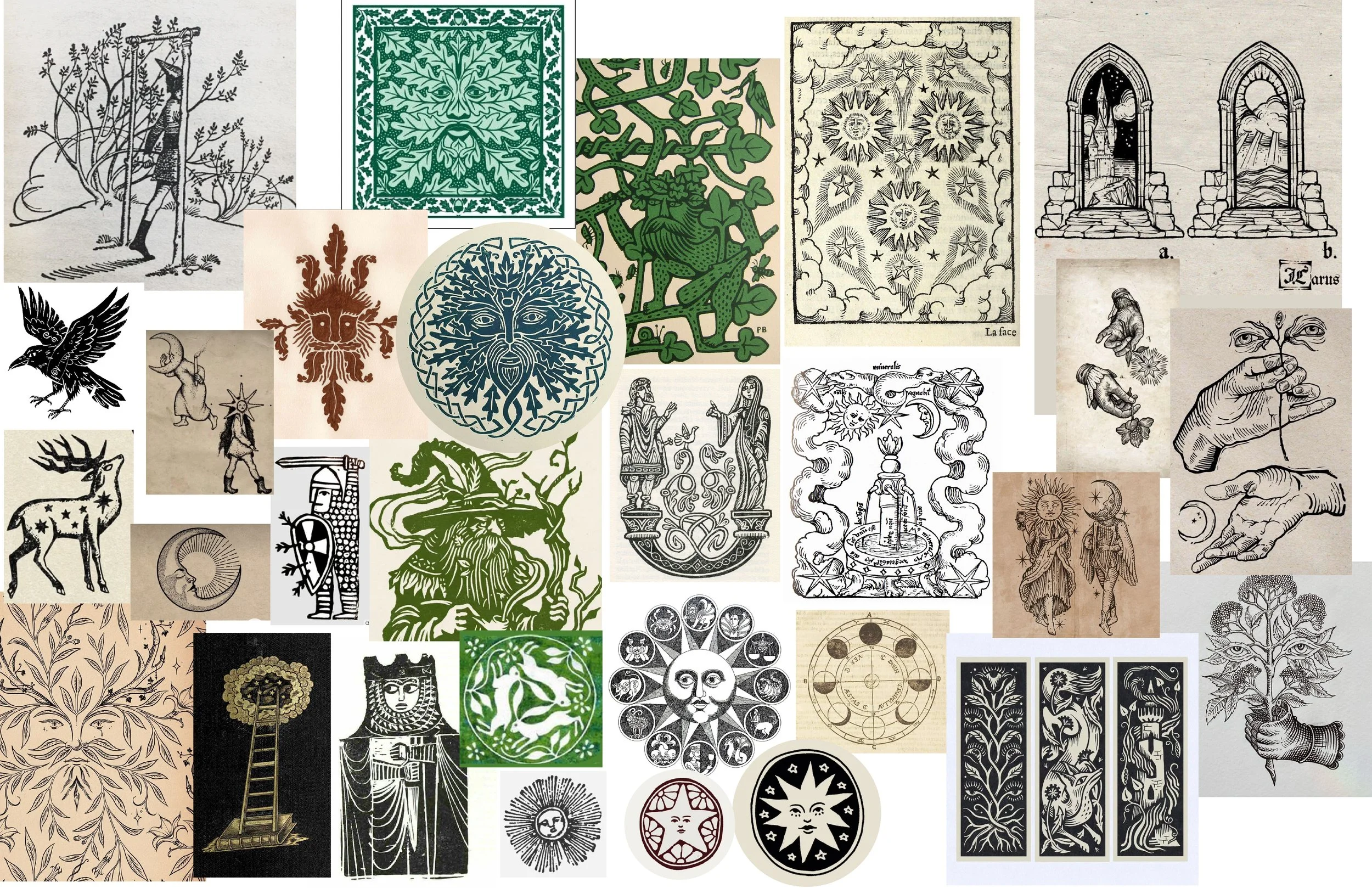
Vic, Kaitlyn Sapone, and I began by discussing this year’s theme and outlining the general direction around late April. They wanted to explore the unseen side of disc golf, drawing on mythology-inspired folklore and the spirit of the game. What brings you to the course? The work should feel handmade and hand-drawn.
To develop this tarot-inspired theme into a cohesive lineup, I reference the Waite-Smith deck, known in the United States as the Rider-Waite deck. Illustrated by Pamela Colman Smith in 1909, its cards are iconic for their masterful craftsmanship and composition. They became one of my main sources of inspiration as I entered the conceptual phase. Kaitlyn’s curated ref sheet kept me from going all in on Pamela’s card style. I had the ref sheet and my wife’s deck of tarot in front of me as I started doodling in my iPad. I wanted to be fully surrounded by ideas and inspiration to get the juices flowing.


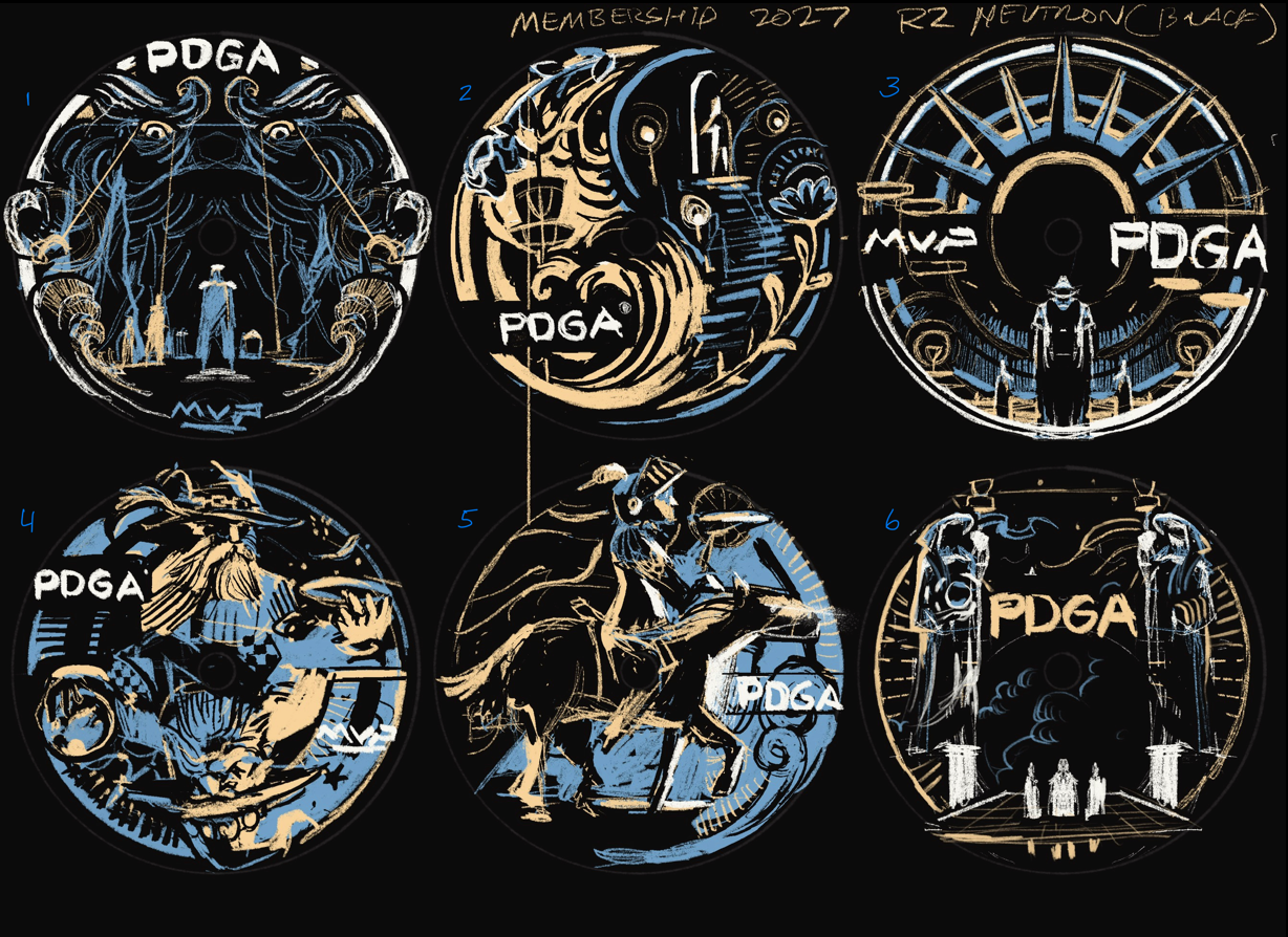
2027 PDGA Membership Disc:
I can’t express enough what a joy it is to work on a project when you already know both the plastic type and core color from the start. One of the things I love most about this project is that many of those details are thought through before I even pick up a pencil. Even if they aren't 100% set in stone, I have a solid foundation to build upon.
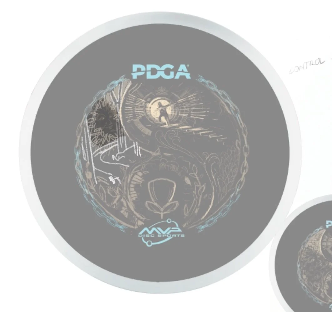
When starting, I always keep in mind that these stamps need to work across all plastic blends to cover my bases—you always need a backup plan! These initial thumbnails were a lot of fun, and great compositions in the mix. At the thumbnail stages, it’s about capturing flow and emotion. Yes, at the start you know those logo elements need to be in there, but don’t let it completely slow down your looser drawings. Ultimately, a Yin-Yang motif similar to previous PDGA Membership discs stood out. The stamp is abstract enough to mean something different to everyone. The eye of the beholder, if you will. Is it escapism? Is it the moment of discovery?
In the refinement stage, I reduced some fine detail to increase overall boldness. The thumbnail had that punch and contrast. I accidentally diverted from it for the left-hand side and focused too much on vegetation and folklore elements. We had so many ideas we wanted to include, but factors like minimum stamping requirements and readability meant making a few sacrifices:
The Green Man: He made it into the initial rough draft. I wanted this connection from the left and right sides of the composition. However, to achieve the contrast and balance necessary for the Yin-Yang composition, he had to go. I felt it was too much detail to try and fit in.
The Winding Trail: In his place, I added a winding trail through a wooded scene. This shift allowed me to lean further into the physical woodblock print style I was aiming for. This one is a personal preference of the artist. One of my favorite things about wooded courses is long holes with mature trees. Sun hits those large open areas, and it’s one of those moments I stop to take a mental snapshot.
Border Element: It started small and overly detailed. I then moved to a large and bold chain. Both attempts ultimately took away from the artwork. The Light Blue metallic around the frame added that 3rd foil & allowed the logos to contrast against the Black R2 Neutron.
I really love how this Membership disc turned out!







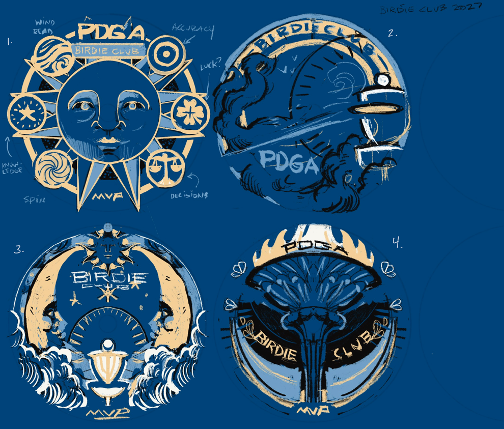
2027 PDGA Birdie Club:
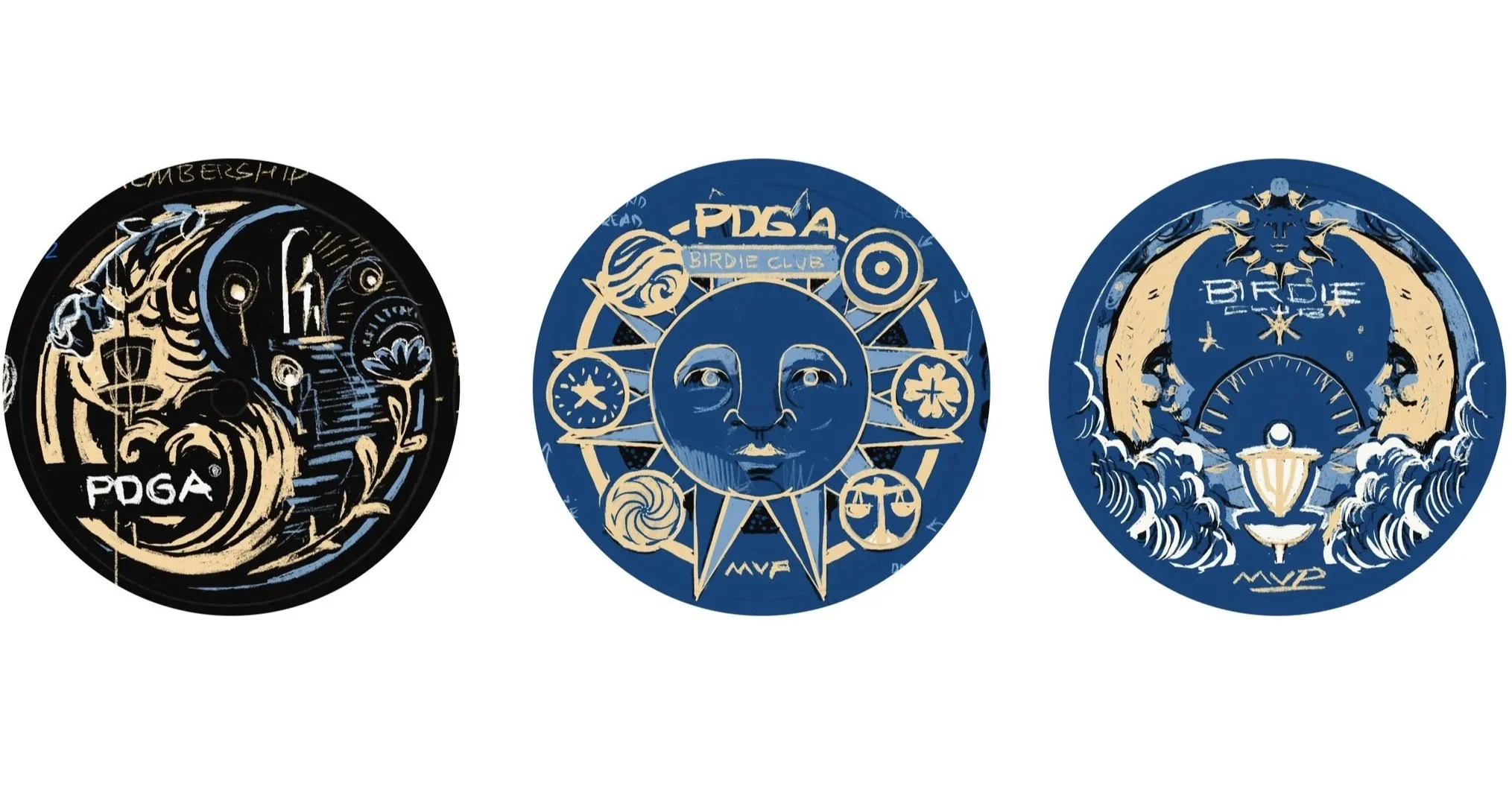
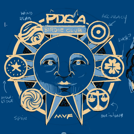
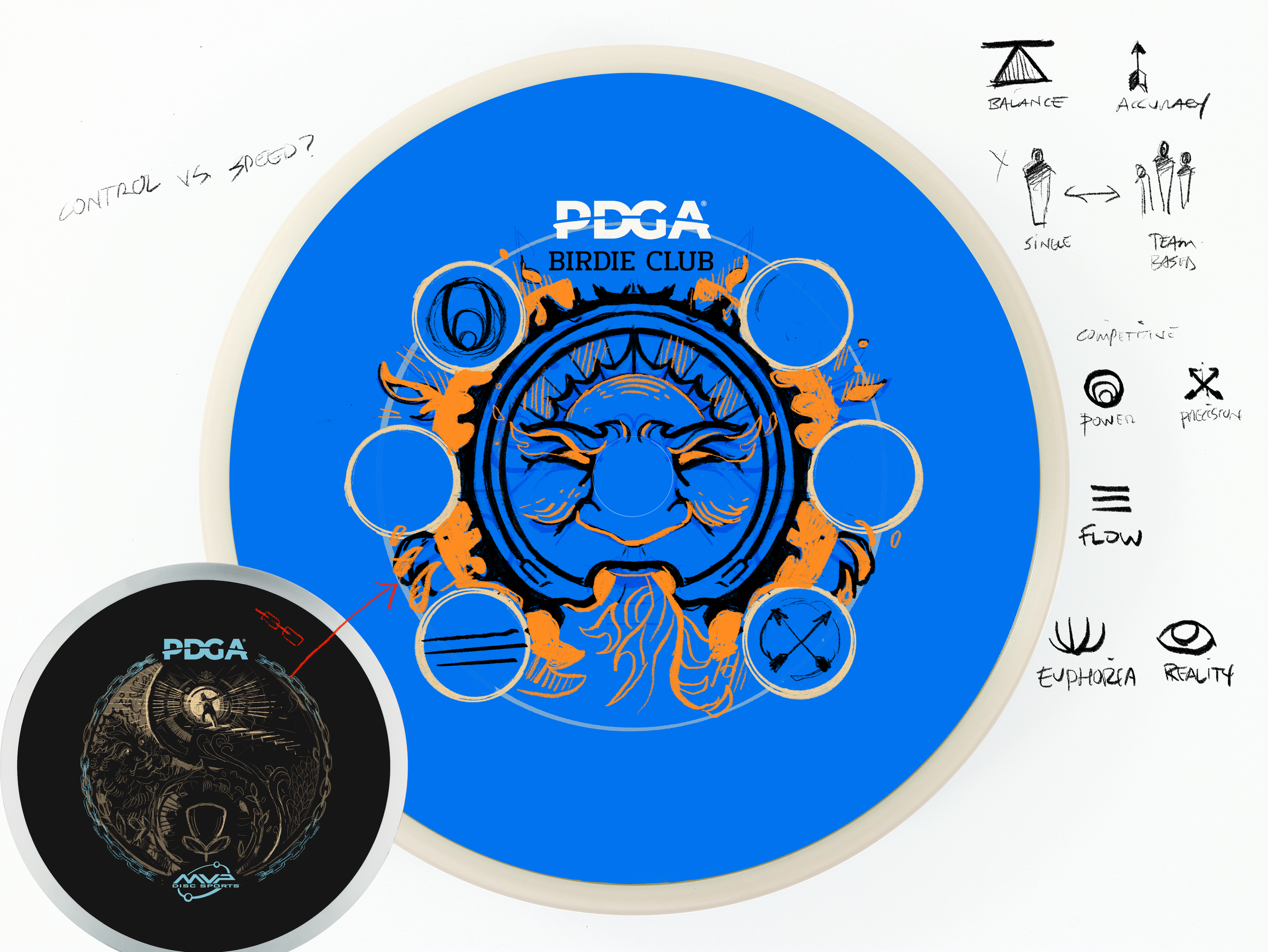
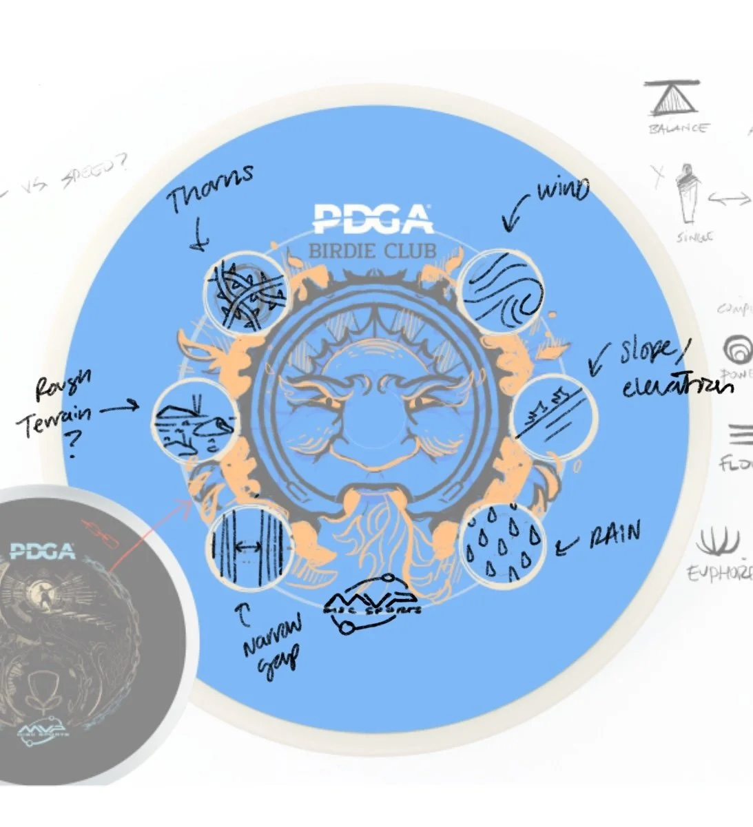
The Birdie Club design really clicked during the thumbnail and conceptual phase. Because the Membership and Ace Club discs had a more handcrafted direction, we made a few small tweaks here to make the design feel less "clean" and more textured:
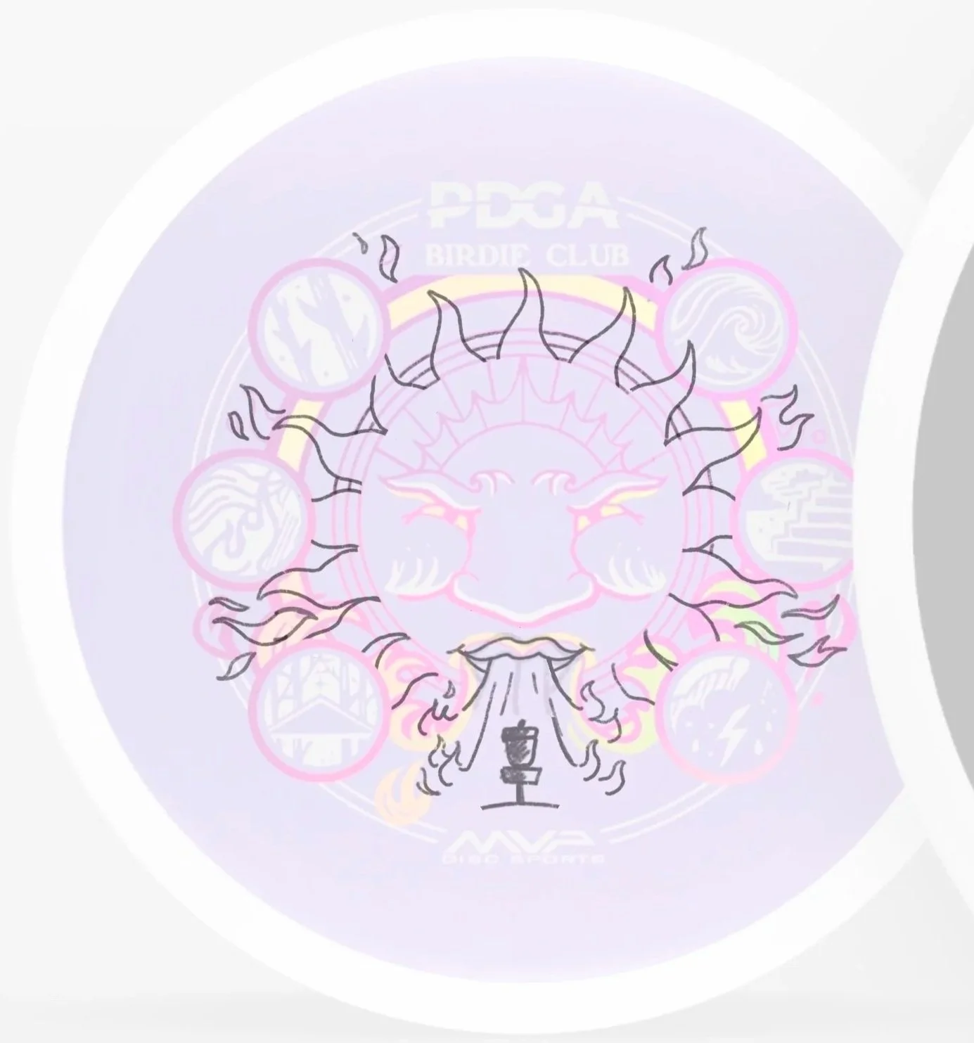
Representing the Game: I struggled to find enough dualities within disc golf to populate the border icons. My mistake was putting in too much time trying to make simplified shapes work. Ultimately, fully illustrating the unique elements helped it connect to the Membership and Ace Club hand-drawn feel. Featured around the sun are: Thorns, heat, gaps, inclement weather, elevation, and wind.
We wrapped up this design by fine-tuning the balance of the basket details, fire, and lower action lines.


2027 PDGA Ace Club:
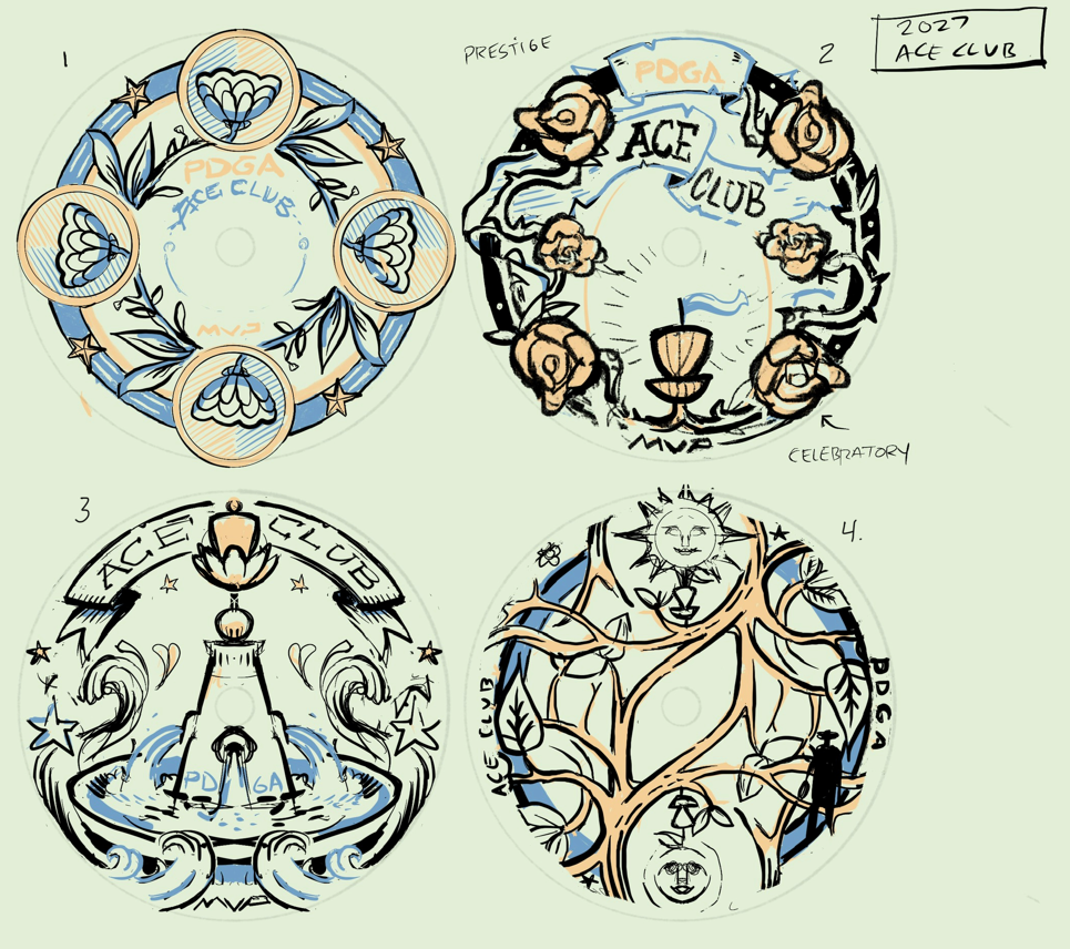
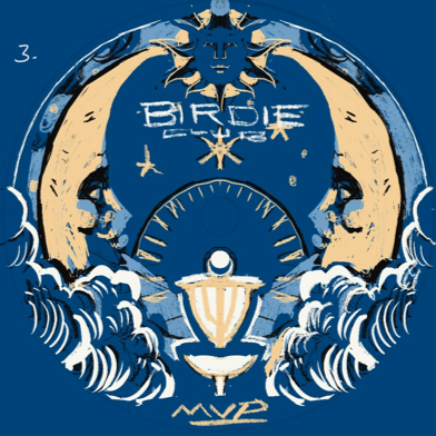
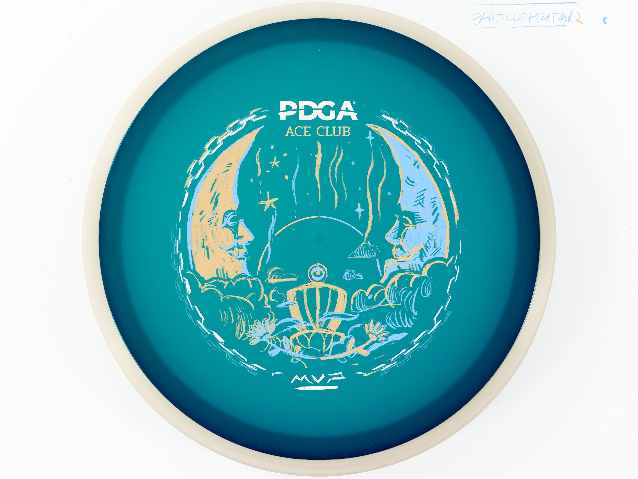
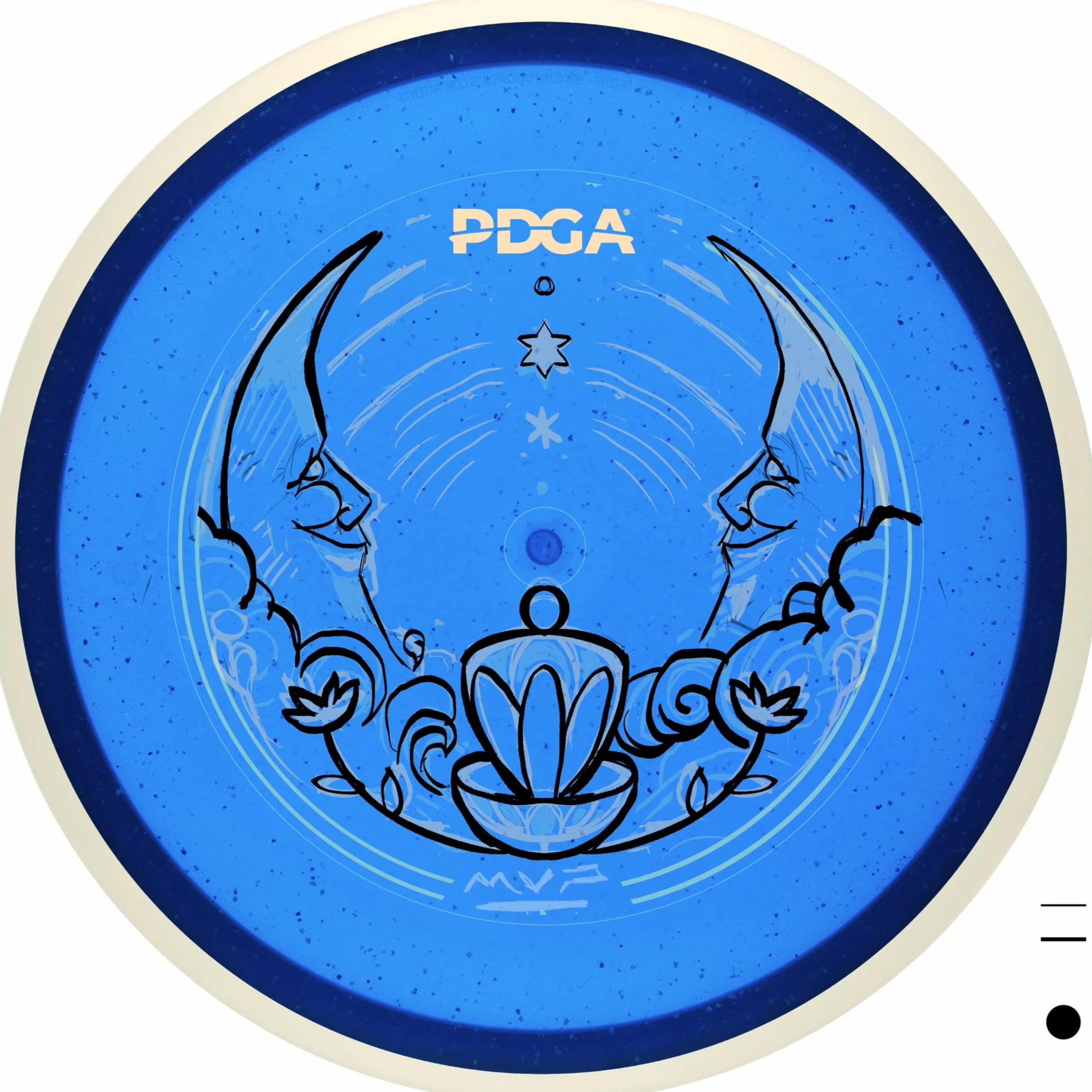
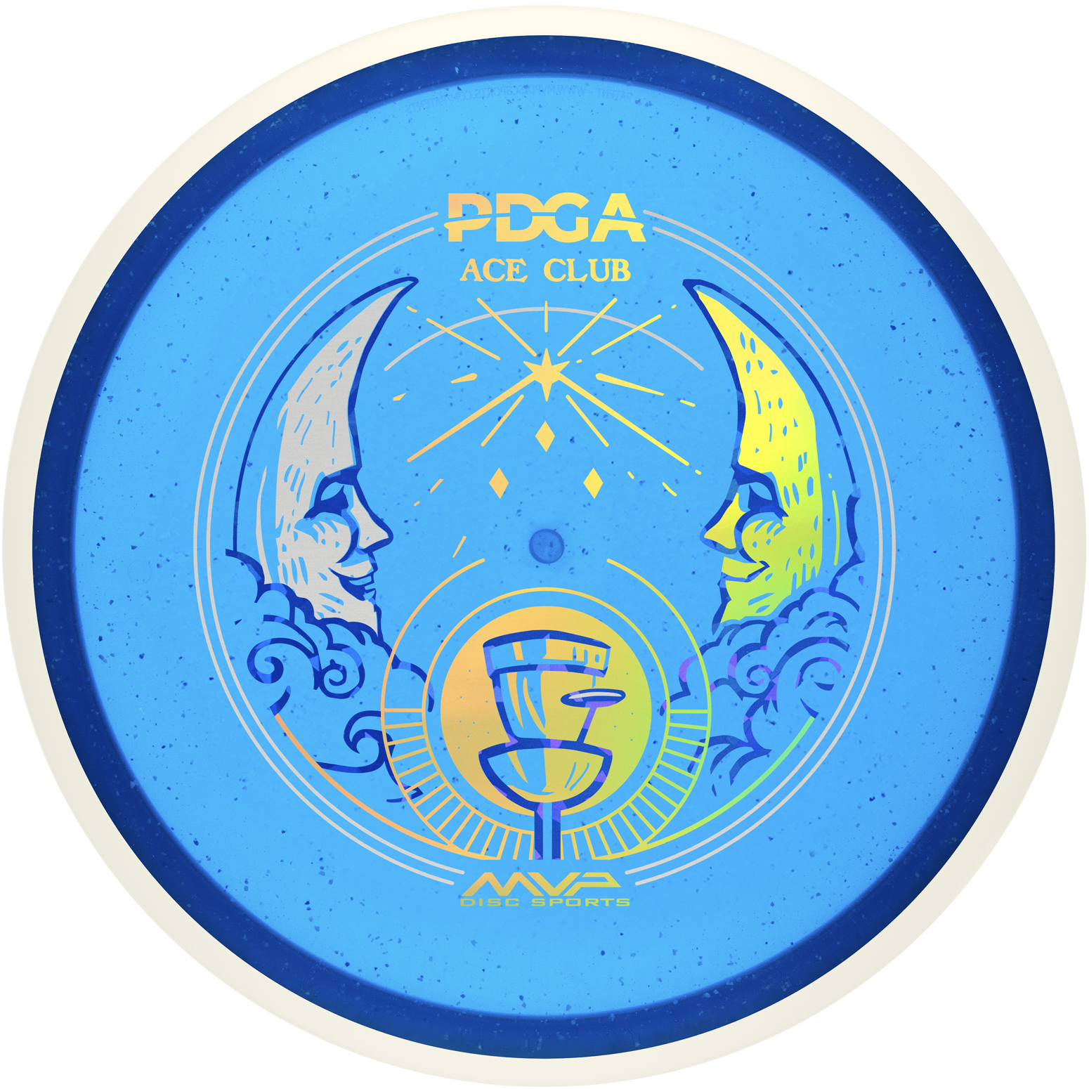
This design was penned while brainstorming the Birdie Club in the early thumbnail stages. I love the symmetrical and illustrative balance across all three stamps; using the sun and moon felt like a natural way to frame the collection.
Instinctive Sketching: As with the Birdie Club, early development was about “speed sketching”. Trusting my instincts without overthinking. Get the bad ideas out of the way and try different things. It’s the ability to move on to another small idea, then go back and further iterate.
Basket Consistency: Throughout the project, I experimented with various basket styles before refining them near the end of the development cycle to ensure all three stamps shared a consistent look and feel.
Designing for Glow Plastic: The Particle Proton plastic and its candle-like translucent appearance pushed me toward large areas of contrast and open space. Since players will use this during glow rounds, I wanted the viewing experience to be equally striking during the day and under night light.
The border elements and typography directly tie into the tarot deck theme, using the same layout structure as the Birdie Club to anchor the set. Gold Holographic and Flat Silver foil were used with intention. While the core membership disc is what most members will hold in hand, the Birdie and Ace Club discs need to receive the same level of care and artistic consideration.

Final Thoughts:
Overall, I’m thrilled to know these Membership discs will soon be arriving in PDGA members' mailboxes and on doorsteps worldwide. That’s what it’s all about for me! I love seeing the community post and share their thoughts. Working alongside Vic and Kaitlyn has been a pure joy. Their active collaboration makes all the iteration and fine-tuning that much more meaningful. My job is to bring their vision to life, and it’s an absolute honor to do that for the sport. I still pinch myself thinking about the PDGA’s global reach and how many players these designs will connect with.
Thank you for taking the time to read about the development of the 2027 membership collection! I’d love to hear your thoughts in the comments—which design or combination appeals to you most?