33rd Dogwood Crosstown Classic

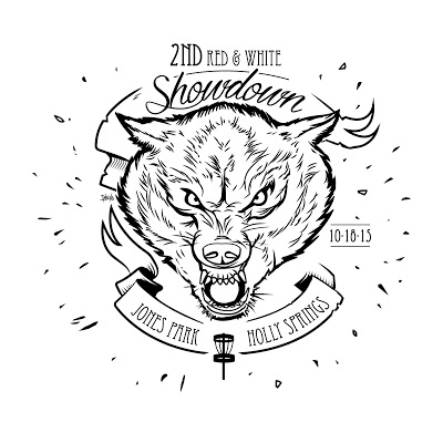
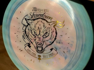
This year marks 33 YEARS! that the Dogwood Crosstown Classic would be up and running. That's just absolutely ridiculous. Since 1984. Not the longest run tournament in the country but certainly up there with the World Championships.

I got the call to do this years Crosstown from Assistant TD and Cary Area Disc League founder, Jay Pontier. He had an "X-Town/ comic" idea in mind. With the recent boom of Marvel and various comic movies out in theatres the initial idea was of an X-Men theme, some sort of battle between good vs evil. I did one idea on a sheet with a bunch of Dogwood ideas while waiting in the Jury Duty room at the courthouse. With something as unique as the dogwood tree, I just had to stick with the common theme. Maybe next year I can explore a bit more outside the box. This was my first time designing for this tournament and I appreciate Bobby Henn and Jay Pontier for letting this year's Crosstown stamp be in my hands. 

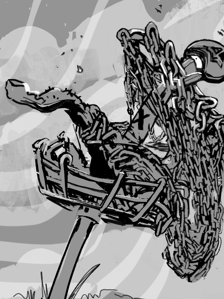
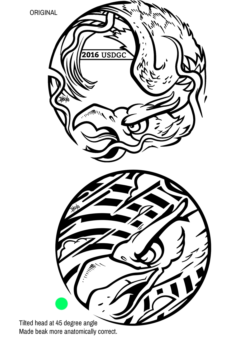
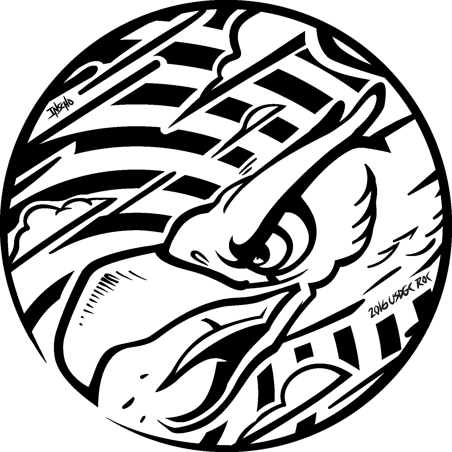
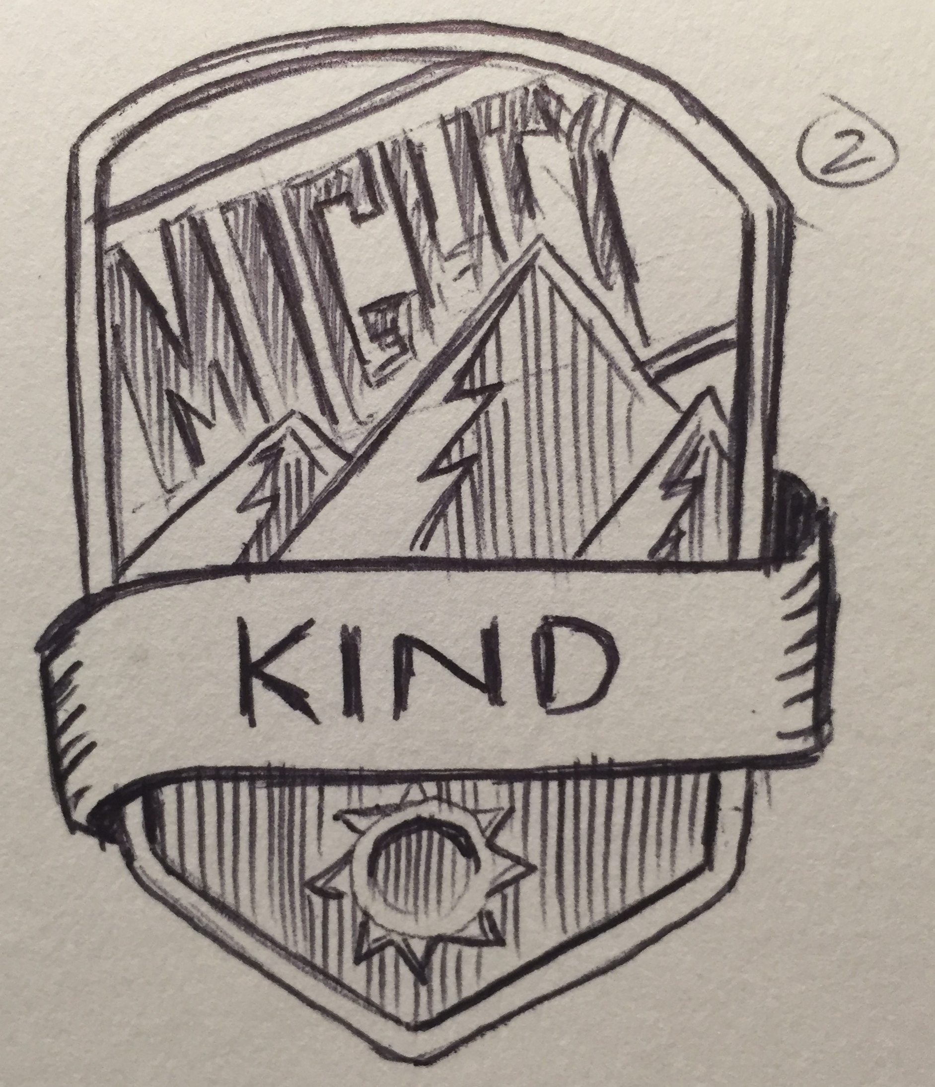
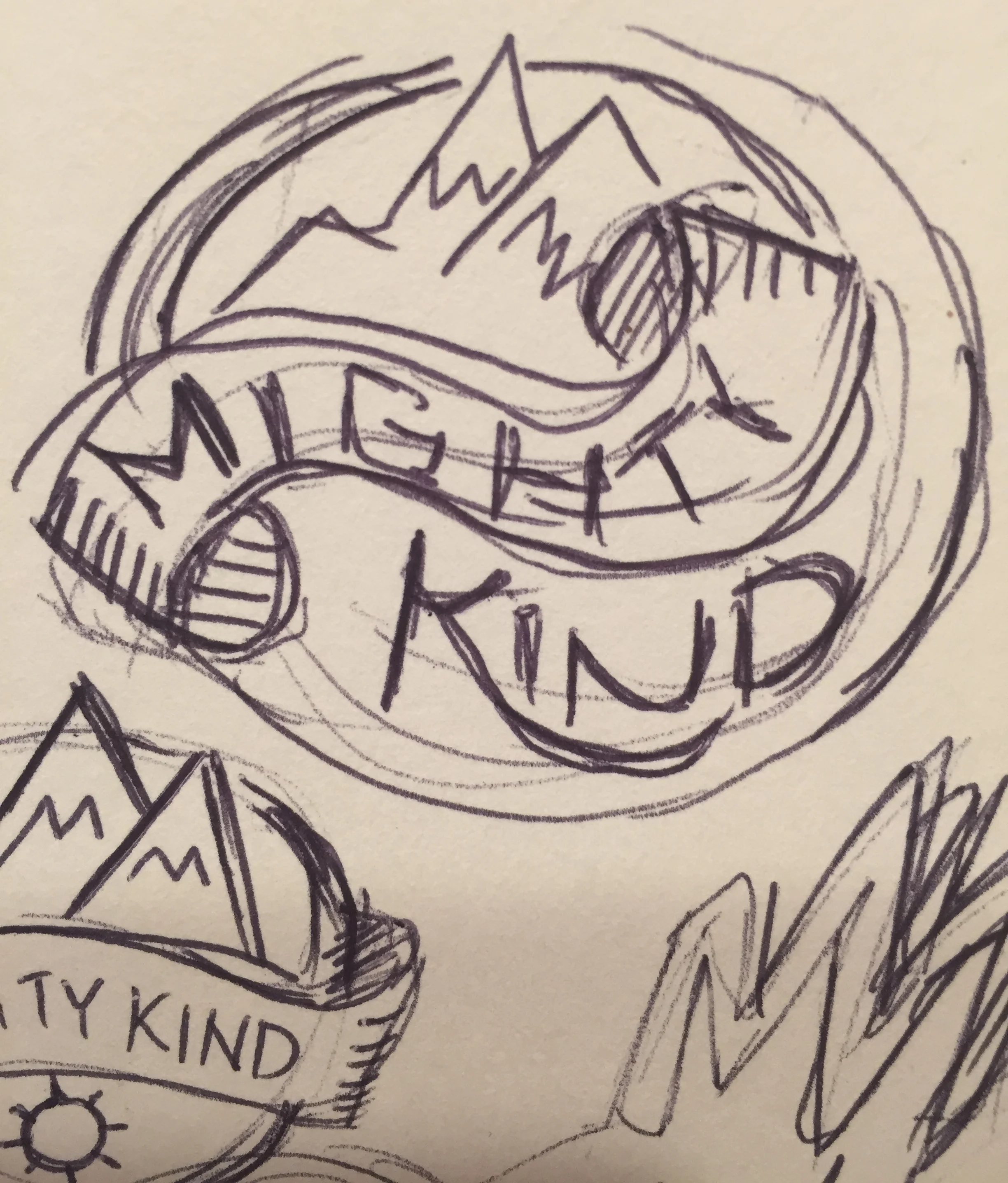
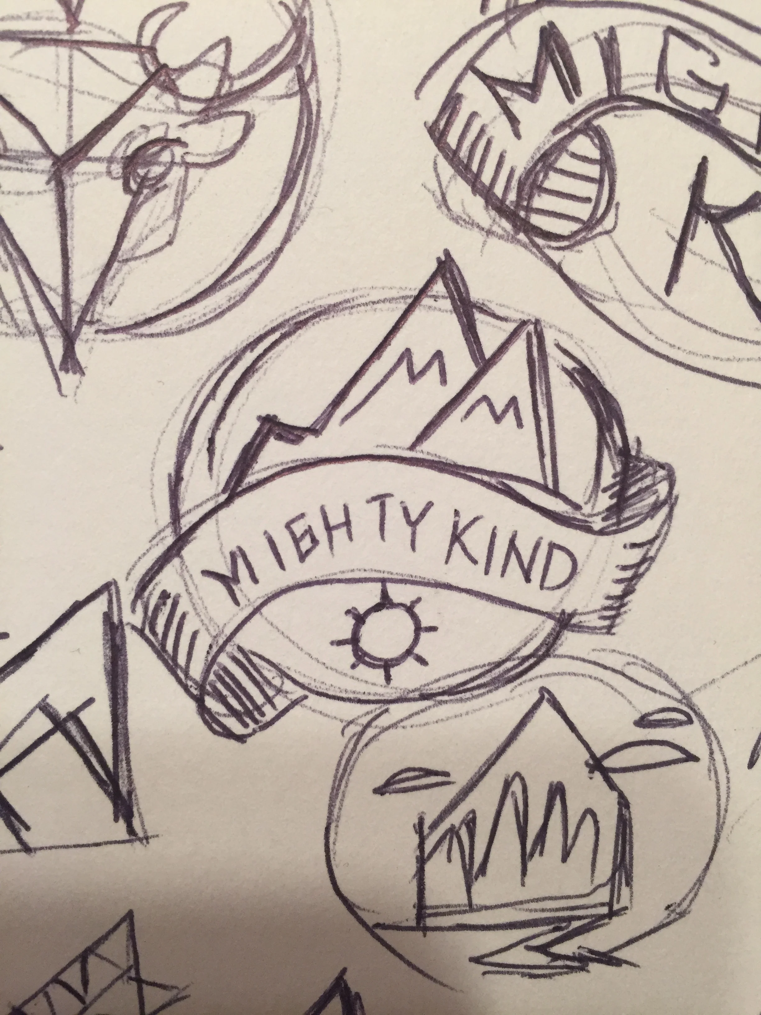
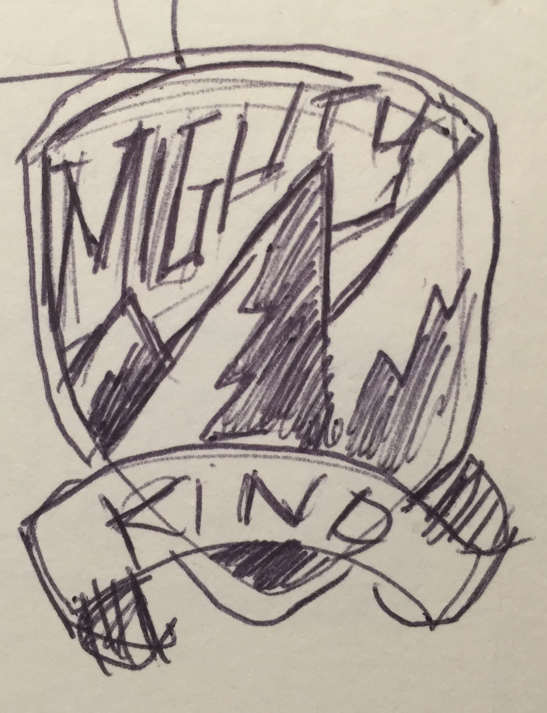
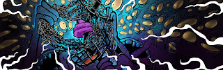
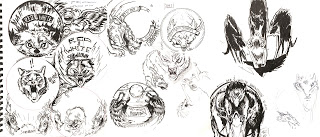
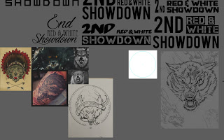
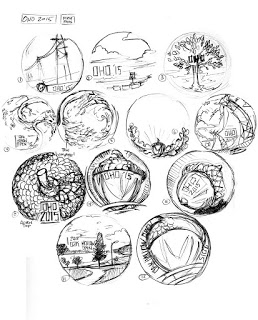
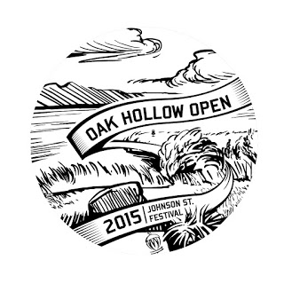
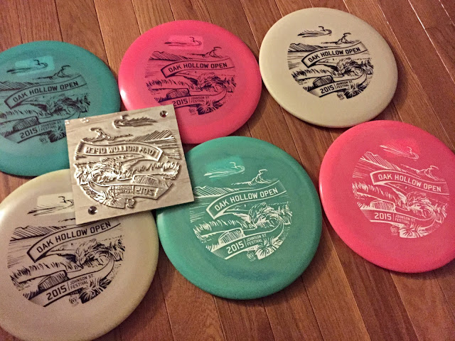
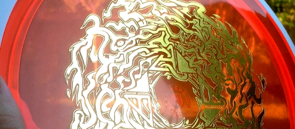
Below shows the steps we took from thumbnail to finished stamp. You'll see my first take on the initial idea. As soon as I started tree thumbnails sketches, it was the experimentation of asymmetrical versus centered tree and also circular and rectangular shaped stamps. The final stamp has 33 dogwood flowers spread on the ground, with the center Dogwood being one that's been used in past stamps. 

Thanks for taking a look! 

UFO Glow creation

Tim Robbins and Will Davis of Disc Hunt approached me for a product they were getting ready to market called UFO Glow. They loved the art I used for a disc golf doubles event last year called "Crazy Chain". I love creating that type of style and was happy to be aboard to help them all out.

After seeing early product prototypes, What instantly came to mind was something dealing with UFO's. There were also some other ideas to play around with like the Nuclear Power plant since we're based and live rather close to the Harris Nuclear Plant.  Not saying I've been abducted by aliens in the past but many of my family members can attest to my infatuation with Aliens. I knew this is what we had to do. 

I had to overcome a few obstacles after seeing that the low camera angle would not have shown off the UFO Glow tape like I was planning to. A friend of mine really helped me get it back to what really mattered. The product itself.  I had too much going on in the first initial roughs. Your eye focused more on the disc golf basket, and UFO while the intended focal point was left to be picked up as a secondary or third read. I took the idea into Google Sketchup, nailed the camera placement and took off from there. I needed to forced the field of view more and get the product and contrast working in the foreground. 

In the end, mixing the crazy chain style of illustration with that classic B movie/ Mars Attacks! influence was the right way to go. The customer couldn't have been any happier. 

2016 USDGC Roc Contest Winner

My friend, Alec Falzone tipped me off to the United States Disc Golf Championship (USDGC) design contest this year. I would have never known about it. So for that, Thank you Alec.  I don't typically do online contests. It's a huge gamble of your time but the flip side is if you're successful, you get your artwork seen by probably the biggest event in disc golf.

The USDGC Collector Roc series craze began in 2001 when Jonathan Poole found that people went nuts over their first Zone Driven Roc that began as a fundraiser for the Southeastern Classic in Charlotte. Jonathan mentions that they "were an overnight sensation, so to speak, and ultimately this paved the way for Innova's CFR program which is still kicking today."

The Roc is one of Innova Champion's most popular discs in its series. They sell these discs for fundraising the tournament each year. A few artists have been a staple to the Collector Roc series. This year, Innova wanted to run a contest to scope out upcoming artist to mix things up a bit. 

When you flip through the process shots of the "Air Raid" stamp, you'll understand that this design rooted from another option that I thought was going to stick. The original design felt too confined and awkward. I corrected the anatomy, created a black/white signal effect and tilted the head down 45 degrees. I drew a lot of inspiration from Judas Priests'  iconic "Screaming For Vengeance" album cover. It was created by the talented graphic artist Doug Johnson
After talking with Adrian Southern, from Innova, we pointed out the strengths of each initial idea and I worked over the next week to take that head style and place into a new direction. I hope you all enjoy. I want to thank all my friends who've helped critique the design from the ground up. I always appreciate it.

Jennifer Sawyer 2016 Tour Stamp

Team MVP Women's Pro: Jennifer "JSaww" Sawyer reached out to me for her first fundraising tour stamp. My first booked stamp of 2016!! The exploration process was fun! Her professional occupation is in construction so immediately our idea was to create some sort of saw graphic. The images below show the different stages of development.

After a few saw iterations, my mind jumped to Jennifer, as a human being. I've never met her so I asked questions about what she did in construction, her favorite movies, era's that she enjoyed.  1930's & 40's, vintage fashion, construction, & graphics from that era.  I wanted this stamp to be enjoyed by everyone but most importantly, reflect the person's name that's on the stamp. 

After a few ideas and conversations, the decision for a universal stamp was the ultimate winner and a full saw blade stamp would solidify and fit within the budget and timeframe. We were able to get a double stamp option in time, so breaking the stamp up into two different foil choices was the way to go. During the process of showing Jennifer the design update, I will quickly mock up what it would look like with two different types of foil. I think it's always important to see how the hot stamp looks in both a negative and positive form. I'm very happy with how the stamp came out and look forward to more opportunities down the road.  Thanks, Jen! 

To support her 2016 tour, you message her at:
jsawyer0211@yahoo.com

2015 In Review

The end of 2015 is near and it's been an adventure. After Christmas when all the stress is out the door, I like to think backward to January, 1 and think about all the projects I've been a part of. Did I truly maximize my output?  I know the answer is going to be no.  Every artist is going to tell themselves that. They'll try to build on lessons they've learned and continue pushing onward. 

I'm fortunate that I had a full-time position for a good 75% of this year. Freelance is tough. You won't ever realize until you're in the thick of it with no other assurance underneath you. It makes me want to thank all of those who gave me a kick in the ass this year. My friends who've stopped what they were doing to give me a fresh take on a 3rd logo attempt and pushing you to go forward instead of stalling out.  

I wouldn't be where I am today without them, without my wife's patience for all the late nights up in the office because of a quick deadline. To all the people who had faith in me to help them with a project, or an idea they needed me to see through.  Thank you. Here's to a more productive 2016!

2015 MVP Disc Sports Winter Stamp

MVP Disc Sports contacted me to produce their first limited edition Winter Stamp. The idea was explained as a special release to thank all of MVP's supporters this year. This would be an open ended project focusing on a Christmas theme or simple go the Winter/Snow route. Anything winter disc golf would be welcome. 

After seeing the new available foils to my disposal, and the confirmation that there would be sparkle/glitter in the pastic, I chatted with MVP Disc Sports Art Director/ Sales Manager, Zach Kelbaugh about a snow globe idea. Toward the end of our conversation, he brings up "Chemical structure snowflakes!"  I fed off our conversation and knew what I was aiming for. A snowglobe with a winter wonderland theme. Snowflakes of some sort/ possible chemical structured. MVP Disc Sports uses a process where they use chemical bonding to fuse a weighted overmold to a plastic core. I needed to keep in mind that two different foils would be in play. 

I'm really happy with how the final product turned out and want to thank them for having faith in me to create this stamp. It was ran in 3 main colors of Red Sparkle, Green and Blue with a few experimental effects. Below shows the process from small thumbnail ideas to a rough draft. An improvement and suggestions based on the first pass to a final stage. I've also included exclusive pictures of the test run discs that MVP stamped up before production began. While scrolling through the images, there will be brief descriptions on what point of the process I was at. I want to thank everyone involved that helped me with input and feedback. Here's to 2016! Have a safe holiday. 
 

2015 Tupelo Bay Open Hot Stamp

I received a call from Phil Lawrence, Tournament Director of most disc golf events up in Greensboro/ High Point area. He had an idea, but needed me to pull it off.  Working with a 5 inch radius, some of those ideas didn't make the cut. I fit in what I could, to make sure the stamp resemble the overall story. 

The annual Tupelo Bay Disc Golf tournament is set up on a professional golf course located at Tupelo Bay Golf Center in Garden City, South Carolina. 9 holes I believe, are permanent all year round. The rest of the course is set up with mobile baskets. It's one of the few events with an area so large, that participants are able to use golf carts.  At the end of the tournament there is a little competition to see who can grab the most baskets with their golf carts. 

The main idea was to have some of these items:
The name of the event/ golf cart/ baskets being transported/ a resemblance to the Tupelo Bay course/ and the Tournament Director, Kirk Yoo in the fairway with a measuring wheel.  You will see on some of the less successful attempts I try to cram all the ideas in the design but they always feel too busy.

I appreciate Kirk Yoo, Chris MacLeod, Mike Norris and Phil Lawrence for giving me trust in this tournament hot stamp design.

A lot of firsts.

I received my chance a few months ago. I inquired about being a feature artist for a First Friday event. The first Friday of each month showcases artists in the heart of downtown Raleigh. Atomic Salon and Drink Drank Drunk gave me the opportunity to get the acrylics out from storage and start painting traditionally again. Being slated for an October show at a cool venue, provided the stage to do what subject matter I love to do.

While Hurricane Joaquin was rearing his head off of Cuba, the rain continued to hit NC just days before the show. I thought for sure, nobody was going to come out in the muck. The turnout was incredible. It was really great to be introduced to so many cool people.

Thanks to everyone who had helped get my work on the walls and the one's who enjoyed my art enough to purchase a piece or two. I truly appreciate it. Feel free to visit Drink Drank Drunk and Atomic Salon from now till the end of October to see the remaining art still being shown. There are still pieces of art to be had.

Please contact me at

mikeinscho@gmail.com

if any remaining pieces interest you.

2nd Red and White Showdown Hot stamp

Opportunity has presented itself and I couldn't pass it up! Tournament Director for the 2nd Red and White Showdown, Alec Falzone asked me to help with his 1 day tournament event next month. I will admit this one was a challenge though.

Alec gave me an initial idea to try mix in NC State Wolfpack mascot "Tuffy" beating up on a Tarheel type of character. It was a great idea! BUT not being able to modify existing logo's that are used, seemed to slow down any thumbnail I tried. Looking back I probably should've worked a bit more with character development from the get go. This is why thumbnailing is so vital. You see a bunch of "what the?" and bad ideas but eventually you get your hand to actually draw something more relatable. It just takes a few more practice sketches and a little bit of reference. As you see from my thumbnail sketches. My brain said that a badger/cat looks close to a wolf. That's certainly not true

End result came out well and I'm really glad to have helped out Alec with his tournament. I wish him the best for the fundraiser. This is just one of the many fundraisers ran to get the NC State Disc Golf Team to the Annual U.S. Collegiate Championships. Thanks for checking out my blog.
Sketchbook development
Working Illustrator file
Stamp on Discmania S-FD


Oak Hollow Open 2015 Stamp

  Oak Hollow Open Tournament Director and friend of mine, Phil Lawrence reached out to me after seeing the recent Great 8 stamp. He told me to just "do what you do" and sent me past years event examples to get my wheels turning. As a fellow Graphic Designer/ Photographer/ all around graphics guy, he gets it.

The idea behind the stamp comes from memories of playing the temporary course as a motivated intermediate disc golfer back in 2010 or so. You see many new courses, new faces and make great memories playing the tournaments blind. I remember Festival Park. I remember it well. Driving into Festival offers you a beautiful hillside view of Oak Hollow Lake and wood dock for Hole 1.

Out of all the crazy ideas in the thumbnail process, the scene of Festival made the most sense. With the suggestion of Phil, we decided to use a scenic shot of the signature Hole 9. It's an elevated tee throwing over the water and tight landing zone onto the green. I wanted to create a sense of energy that was in the rough draft. To do that, I was able to live trace my pen drawing into Illustrator and then go back through and clean up trouble areas.

The end result came out killer and really speaks to why this tournament gets bigger and better every year. Thanks to Oak Hollow Disc Golf Club for giving me this opportunity!


Thumbnail session 
Final


17th Annual Great 8

I had the privilege this year to design the 2015 17th Annual Great 8 stamp for Cary Area Disc League. I appreciate the opportunity they gave me to just run wild and go off of my gut. The end result is something I am pretty proud of.

The final design was stamped on a limited number (100) Champion Fundraiser (CFR) Glow Roc3's. Here I am showing the general design process leading up to the final design. Not every pre-planning sketch is in here. It would take up too much space. Thanks for stopping by!

Final Design
Process Sketches


Morning sketch

Sometimes you look back at some weird images you created and wonder "to have a head with that many eyeballs,  would would the structure underneath look like? Is it possible to have a bone structure that could work?" Not sure if I solved anything, but it's a start on a better path.

Nothing more than a morning sketch. Main thoughts were:
1. Making sense of multiple eye sockets.
2. Roses covered in frost, possibly cold morning fog running through the design.

More to come with this idea.


Crazy Chain

I did this for a disc golf Secret Santa recently. The initial idea started on a simple iPad sketch. I took the disc golf basket into Photoshop and adjusted where needed. From there, it went into Illustrator where I cleaned up the line work. For the final step, I brought it back into Photoshop. I worked by using clipping masks to paint each section conveniently. It saved time as I was able to knock this out pretty quickly.

Final

Graffito: Steampunk Graphics


I received an email from Graffito Publishing one night. They were wanting to use an older piece of artwork that I created for a Steampunk: Myths and Legends online contest for CGSociety.  I gladly, told them "Sure!" and signed authorization forms and went on my merry way. This fall, Steampunk Graphics was released and I honestly thought there would be cuts to many of the art they were able to use.

Pretty cool to open up the book to the Individual Works section and get a two page spread of your art. Never thought that was going to happen.

I want to thank Graffito Books for reaching out and wanting to use my art in their book.

Graffito Books 


Sol Spinner

I was presented with a great opportunity. I play disc golf. It's a serious hobby of mine since back in 05'. MVP Disc Sports/ Axiom Discs (both operating under the same roof in Brown City, MI) approached with an idea to start an "Artist Series" where they would seek and find unique artists to create a stamp pertaining a certain theme. They would be able to chose what color combination to go with, to support the design. Pretty much I'm running the pilot for this new line and couldn't be happier. The idea was to release this in the summertime.
Anyone knows how blistering hot it gets here in the south. No one wants to leave their air conditioned living room on some days. That blistering sun is something trying to be captured in this design. I don't surf or skate but I've always had a love for the artwork making it's way on boards.  I want to thank Chad and Brad Richardson from MVP Disc Sports / Axiom Discs and ZAM.  Not only for the support but allowing me to be the first design coming off their press using gold foil. There were a lot of firsts with this one. 

This disc is a limited release (only a 1000 made) Axiom Clash. It sports an orange Proton flight plate/ white GYRO™ rim with gold stamping. It will be available on September 12th. 

Here she is!