Special Edition MVP Limit

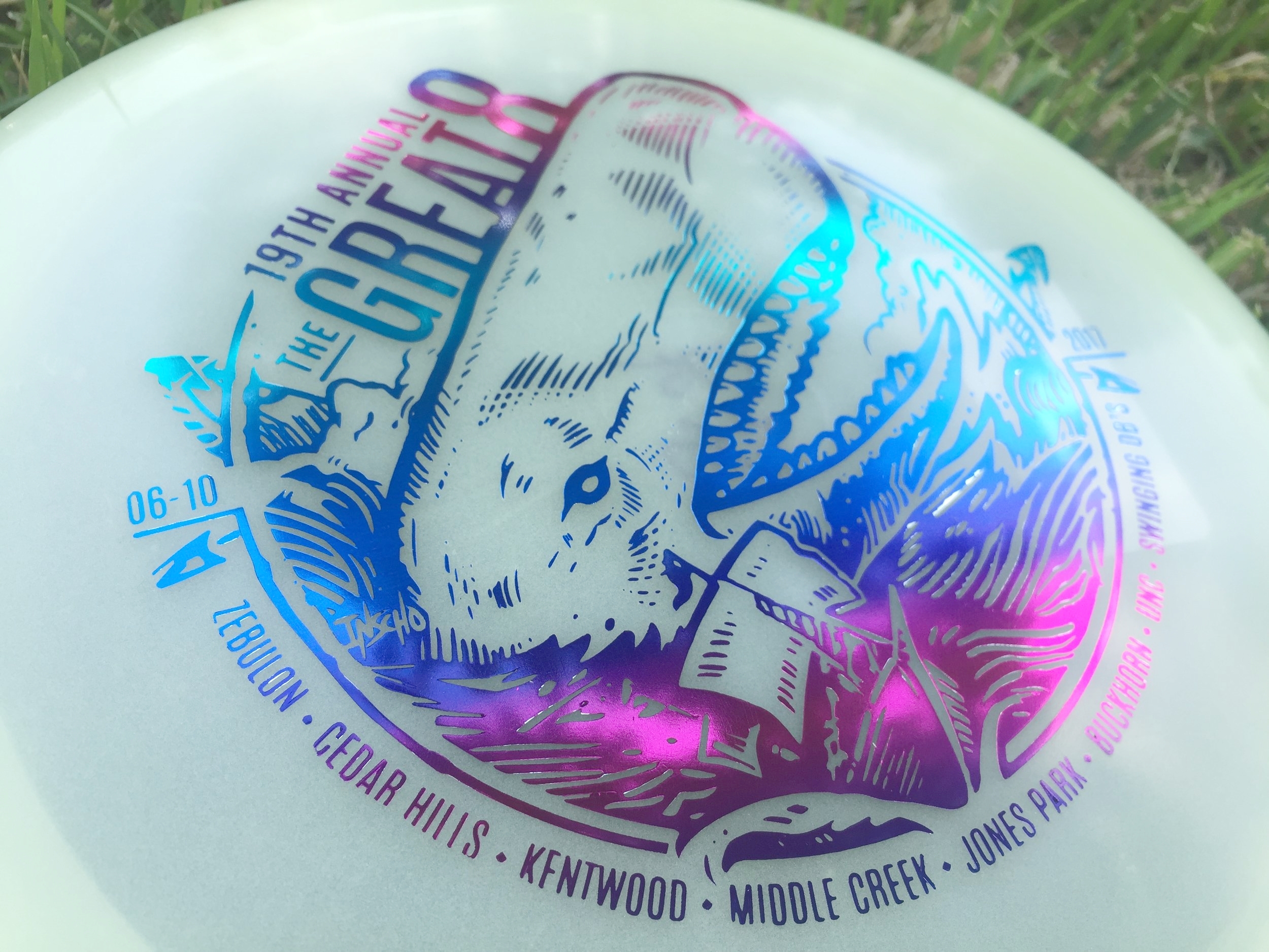
"Push it to the limit"

The MVP Limit is a 24.5mm High Speed Driver designed to be the fastest, most overstable disc in MVP's entire line up. My Art Director, Zachary Kelbaugh laid out a pretty good description to start planning behind:

"We talked about the conceptual intersection for the name... being the fastest, most overstable disc -- and the class as a whole refers to space travel, with the speed of light being the theoretical limit for speed in the universe. "

I had an opportunity to bust out my love for everything 80's. I changed into my jammer shorts and pulled out the 80's action playlist on Spotify! Getting started on this didn't take me much time at all. The initial idea was to mimic the typical action movie posters of the time (Rambo, Over the Top, Big Trouble Little China). Heroic character posed in the center with explosions, and commotion happening behind him/her. I even went so far down the rabbit hole and stumbled onto some retro-futurism which was really neat. None the less, for the scope of the project and how the release was playing out, We went with a retro-wave direction into the rough and final stages. As a team, we felt like keeping the design clean and tech felt more MVP without crossing into the Axiom Discs branding. 

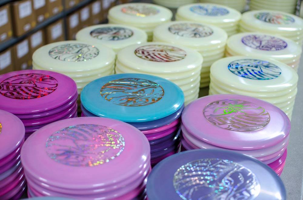
In the end, there are some things that you all aren't getting a chance to see. There were some really solid ideas in the thumbnail stage that just might poke their head up when a new project comes a long. A little bit out of my comfort zone but it takes experimentation like that to really grow as an artist. I hope you all enjoy. You can pick up this special edition and a bunch of online disc golf retailers. 

Warrior Transition Battalion-Stamp

Christopher Altman, a fellow Cary Area Disc League member, approached me to offer him some help. He wanted to host a tournament to get soldiers involved with disc golf. To do that, he was going to organize a tournament for the Warrior Transition Battalion (WTB) down at Ft. Bragg, NC. The overall goal of the WTB is to provide the commensurate quality of life, quality of healthcare services and quality of leadership which matches the quality of service and sacrifice made by our sick, injured and wounded warriors in transition and their families. 

The goal of the stamp was to include a mixture of 4 different elements. The WTB logo, St. Michael, and a soldier helping a wounded warrior off of the battlefield. Lastly, the words "Find New Strength". The only image supplied to me was the soldier helping another soldier. The Airborne's St. Michael artwork someone had previously done. The styling of St. Michael was inspired by religious iconography from both Google searching and my wife and I's trip to Rome and Greece a few years back. With the combination of 4 elements, It was my job to do the best I could to incorporate them into one design. 

In the end, it took a little bit to finish up. I was working on this design during my off time while working a full schedule. I'm very happy to support a great program and a great cause. I hope the tournament go'ers enjoyed this event and continue playing disc golf. 

30th Anniversary of the Roc

Excited is an understatement. Jeff Panis (Marketing Director of Innova Champion Discs) reached out quite a while ago when he assumed his new role. A lot of things were on his plate at the time, so we talked briefly and got back in touch a few months down the road. An opportunity was in place to design a commemorative stamp honoring 30 years of the Roc's existence. The Roc has been one of Innova's most popular molds without question. This was a huge opportunity that came with a lot of weight.

In the initial sketches I proposed, there were some good things to build off of. I had awesome friends who helped me out in critique. One of the main things I overlooked that they quickly pointed out was the silhouette strength of the head. My goal was to have this Roc reach a point of near weightlessness. For example, If you stretch your back out in your chair (I do this from time to time) , you arch the back, the chest protrudes out and your chin tips up. This pose is something I tried to capture. As Innova and I progress through the development of the stamp, The head tips back down a bit to give the bird more shape. The wings extend out to give some symmetry to the stamp. The body develops all the way to it's last and final version and the final is the result of of multiple revisions for the better.

If it wasn't for my friends and their fresh eyes to give me critique, the direction of Jeff Panis, Levi Wilcox and the crew to keep pushing this stamp, it would've honestly turned out to be less than what it should've been. What do you all think?  I'd love to hear your thoughts in the comments. Thanks for reading.

19th Annual Great 8

The Great 8 tournament is in its 19th year. It's a one day, 8 courses, from sun up to sun down event that only the crazy dare to do. I had the honor of doing this year's stamp and was really excited, even though it was down to the wire (totally on me). We've returned to the nautical themed roots to have something pair up well with the dual octopus stamp that was done a few years ago. 

The major hurdle with this stamp is what you can see in the early stages. I wanted the huge whale to be coming out of the water and landing on top of the ship. To make that read clearly was definitely a challenge. After much debate and great advice from my friends, the whale was flipped the other way. I couldn't agree more with the move. 

I want to thank Jay Pontier for always giving me an artistic freedom when it comes to doing these stamps. It makes it so enjoyable. 

MVP "Limited Edition" Teleport

The MVP Teleport is the first one out of the gates for MVP Disc Sports 24.5mm class of high-speed drivers. To commemorate the release of this disc, MVP came to me wanted a limited edition stamp.  My job was to portray teleportation while sticking with what MVP's brand identity is and to create this design using their three foil stamping abilities. 

Mathematics, science, and technology take the forefront of what MVP's graphics have always been about, My mind started there. How would I depict teleportation in a way that worked well? That was tough. If you take a look at my thumbnail process in the very first gallery image, you see the spectrum was pretty wide. Anything from math grids and charts to space pilots entering a warp tunnel. My main hurdles with this design were turnaround times and getting the funnel graphic and perspective to give off a disorienting point A and B. Hot stamping has a limit to line width that will be transferred to the disc successfully. What I wanted to do is convey these two portal entry's that disappeared to the disc color while keeping the main and important element (the Teleport name and MVP logo) bold and black. 

All in all, I'm super grateful for the opportunity and learn the most when I step outside my comfort zone. The Limited Edition stamp will be available through most major retailers that carry MVP Disc Sports merchandise. What do you all think? Does it keep with the brand? Leave me a note in the comment section. Thanks for stopping by. 

Out of Bounds Series #1

The Out Of Bounds Series was an idea drawn up by a fellow MVP Gyronaut by the name of Brian Sweet. He came to me with an interesting take that I've never thought about before. Tight fairways, landing areas and almost impossible pin placements exist somewhere in the disc golf world. His idea is to shed light on these situations. 

This idea stems from fantastical ideas about what lurks hidden, as your disc takes a plunge into the unknown. Out Of Bounds Series #1 explores the depths of an impossible landing area. The disc is now belonging the keeper. A mix of Cthulu/Kraken/Squid vibes. I wanted the eyes of the creature fixated to the onlooker. The eyes had to adjust from the sides of the beast to more in front to convey the idea. The introduction of the second foil to bring the viewers attention from the bottom of the stamp up toward the poor fellow on the cliff side. 

I want to thank Brian Sweet for having the faith to let me run with his napkin sketch and go for it. These are available in a dual foil set up exclusively on MVP/Axiom/Streamline Discs plastic.

Please let me know what you think in the comments and share with your friends! 

Axiom "Black Widow" Vanish

I've had the honor of working with MVP Disc Sports and Axiom Discs a lot this past year. They needed some reinforcements for this years Halloween themed stamp. Spider 2.0. Very first question I asked myself is how I'm going to stack up to the original design by hot stamp legend, ZAM.  

Expanding on the iconic black widow that was on the first release was the focus. I had a lot of fun and it was a definitely a stamp I learned from. With the core being lighter in color than expected, I had to shift focus off of just lighting hints from the initial plan and add black contrast to the spider. The stippling technique and use of the natural disc color, played a huge roll at the end. 

I want to thank Axiom Discs and MVP HQ this opportunity. During the rough phase, all the staff really helped to dial this in. Definitely was a group effort. It's a big release trying to follow up to their first Spider stamp. 

2016 Innova Pumpkin Design

Every year since 1996, Innova Champion has put out an annual "Pumpkin" edition stamp for the Halloween season. Every year.. until this year, they've kept the theme consistent with the standard jack o' latern. After doing a first set of sketches and teasing a few skull designs toward the end of the thumbnails, Adrian Southern over at Innova mentioned the de los muertos theme and sugar skulls. So many possibilities and to give it a chance and see what comes out of the experiment.

I worked closely with Zeb Campbell and Adrian over the course of multiple revisions and options. The general consensus was the love of the bat wing basket. The challenge with this design was to incorporate the detail you see with common sugar skulls but keeping it simple enough where carving it could be believable. 

Over the course of a few weeks, It led us down a few rough passes and we ended up Frankensteining parts of the final 4 to create one design.  Here is 2016's Pumpkin Design. Thanks to Innova, Adrian and Zeb for having confidence in me to put something out against the grain. Hope you all like. 

You can purchase them here: http://dgustore.com/index.php/specialty/holiday-discs.html

2016 USDGC "Paul McBeth Commemorative"

This stamp is a staple to every US Disc Golf Champion in years past. The following year an artist will be chosen to commemorate the champion on a Collector Roc disc. I was asked this year if I'd like to take a stab at designing Paul McBeth's 2015 win. There will be 700 of these discs made. 500 available to the USDGC Partners and 200 available at the USDGC in Rock Hill, SC. The few limited discs at the event will be an opportunity for McBeth to sign if the buyer chooses.

If you don't know who Paul is; He's the #1 Rated Player in the World, PDGA World Champion 2012, 2013, 2014, and 2015, 2015 Innova Team Captain, 2015 Grand Slam (All Majors), 3x Memorial Champion, 2x European Open Champion, 2014 European Masters Champion, 2013 Copenhagen Open Champion, 4X National Tour Champion.

Going into this design, I've never been more nervous. Busting out page after page of thumbnail ideas, a couple different directions with the rough phase and then tweaking the final until it was ripped from my hands. I felt that this design, more than anything, could be my biggest opportunity to show what I can do. At the beginning, the intent was to create a design encompassing Paul's Grand Slam achievement last year (5 Major tour wins). So going into it, I initially thought about 5 sided shapes, Paul himself, and something that encompasses the names of the events he won. 

The end result doesn't feature what a lot of the thumbnails had in them. The idea to honor McBeth as the 2015 US Disc Golf Champion felt a bit more important and fit with past years winners. Innova previous produced a "Grand Slam" stamp so it seemed fitting to make this a nod to his win. 

I want to thank Adrian Southern, Jonathan Poole, DGU, INNOVA and everyone involved in critiques for giving me these three shots at 2016 USDGC artwork. What a ride. 

2016 Solitude Open presented by MVP Disc Sports

Tournament Director, Brian Usher and MVP Disc Sports joined forces to present a PDGA Pro A-Tier and Amateur B-Tier event called the 2016 Solitude Open presented by MVP Disc Sports just outside of Salt Lake City, Utah. The event is hosted at Solitude Mountain Resort and features 18 holes down this beautiful mountainside. One, if not the best, mountain disc golf course in the country. Players will have to travel to the top using the ski lift and the tournament is a must for many top tier disc golfers in the region. While looking up reference of this mountain course, what instantly struck me were the beautiful aspen trees. Their texture, contrast and unique trunk lines allowed me to play around with shapes within the viewer. By using a simple two point perspective, it keeps the design simple and centers on the player's path, landscape and event logo. 

Brian came to me in full trust to illustrate everything and anything that spoke to me about Solitude and what the course offers. We worked closely together to explore a few ideas. A sense of vastness, trees & wind vs. player, clash vs. harmony. After a few thumbnailing sessions we landed on the idea of just how massive the Solitude disc golf course is in relation to the competitor. You will see in the development sketches that we explored the idea of having multiple figures in the stamp but it ultimately came down to the "you and the course ahead" mentality and I think it worked perfectly within the composition. I really enjoyed working on this design and was honored Brian and MVP teamed up to get these produced in a 2 foil set up. Black being the base color while an accent color is used for the Solitude Open event logo. It allows a good choice of variety to the event and player's packs. 

If you are interested in scoring one of these fundraiser discs for the 2016 Solitude Open, please get up with Brian Usher at brian@brianusher.com
https://youtu.be/eMdJqFPiSVo

The 18th Annual Great 8

This year's Great 8 presented by Cary Area Disc League didn't feature fighting Octopus or an anchor. It showed a unique twist on Fibonacci numbers and the "Golden Spiral." The popular sequence by both mathematicians and artist alike, features a spiral that grows or shrinks with every quarter turn. In non-mathematics vocabulary, it's an interesting equation that had the Freemasons absolutely obsessed and people scouring Google maps to find anything relating to the golden rule. It's fascinating and something you should dive down the rabbit hole while listening to Tool's "Lateralus".

Tournament Director of the event, Jay Pontier, had an idea in mind and it was my job to execute the "Disconacci Sequence". My initial thought was that of a nautilus shell to keep with the ocean theme of last years event. I quickly realized a more simple approach was the way to go. The spiral in itself speaks the intent. 

1 tournament 8 courses 144 holes.

I want to thank Jay Pontier and the Cary Area Disc League for giving me these opportunities over the past few years. 

2016 Champion Roc+

When the opportunity comes along, you don't pass it up. Innova gave me that chance by reaching out after the success of the first Collector Roc release just a month ago. 

Going into this design,  the window was pretty open. The must-have items were "USDGC 2016/ Champion Roc+"  I was able to come up with a few ideas on an initial thumbnail sheet that sparked a bit more exploration. Below is the entire beginning to end phase of design, implementation and cleanup.

Thanks to Innova Champion Discs for reaching out and giving me another opportunity to contribute to this year's United Disc Golf Championship Roc releases. The Roc+ art will be available to all Innova wholesale dealers worldwide! 

2016 Basket Bashers

Soon after I finished the Jen Sawyer "JSaww" stamp, I received a buzz from Jerry Pectol, owner of Basket Bashers Disc Golf. Jerry just wanted something that was going to spark interest within his community of clientele. Didn't matter what, but he mentioned the previous artwork that I've done and just had to stay tasteful, as his demographic stretched a wide variety. 

Going into this stamp, I wanted to improve upon his Basket Bashers logo immediately. I was lucky enough to hit it on the first go and it was smooth sailing from there. I want to thank Jerry for giving me the creative liberties few actually get. If you're interested in getting a disc with this image on it, please hit up Jerry at basketbashersdiscgolf@aol.com

33rd Dogwood Crosstown Classic

This year marks 33 YEARS! that the Dogwood Crosstown Classic would be up and running. That's just absolutely ridiculous. Since 1984. Not the longest run tournament in the country but certainly up there with the World Championships.

I got the call to do this years Crosstown from Assistant TD and Cary Area Disc League founder, Jay Pontier. He had an "X-Town/ comic" idea in mind. With the recent boom of Marvel and various comic movies out in theatres the initial idea was of an X-Men theme, some sort of battle between good vs evil. I did one idea on a sheet with a bunch of Dogwood ideas while waiting in the Jury Duty room at the courthouse. With something as unique as the dogwood tree, I just had to stick with the common theme. Maybe next year I can explore a bit more outside the box. This was my first time designing for this tournament and I appreciate Bobby Henn and Jay Pontier for letting this year's Crosstown stamp be in my hands. 

Below shows the steps we took from thumbnail to finished stamp. You'll see my first take on the initial idea. As soon as I started tree thumbnails sketches, it was the experimentation of asymmetrical versus centered tree and also circular and rectangular shaped stamps. The final stamp has 33 dogwood flowers spread on the ground, with the center Dogwood being one that's been used in past stamps. 

Thanks for taking a look! 

2016 USDGC Roc Contest Winner

My friend, Alec Falzone tipped me off to the United States Disc Golf Championship (USDGC) design contest this year. I would have never known about it. So for that, Thank you Alec.  I don't typically do online contests. It's a huge gamble of your time but the flip side is if you're successful, you get your artwork seen by probably the biggest event in disc golf.

The USDGC Collector Roc series craze began in 2001 when Jonathan Poole found that people went nuts over their first Zone Driven Roc that began as a fundraiser for the Southeastern Classic in Charlotte. Jonathan mentions that they "were an overnight sensation, so to speak, and ultimately this paved the way for Innova's CFR program which is still kicking today."

The Roc is one of Innova Champion's most popular discs in its series. They sell these discs for fundraising the tournament each year. A few artists have been a staple to the Collector Roc series. This year, Innova wanted to run a contest to scope out upcoming artist to mix things up a bit. 

When you flip through the process shots of the "Air Raid" stamp, you'll understand that this design rooted from another option that I thought was going to stick. The original design felt too confined and awkward. I corrected the anatomy, created a black/white signal effect and tilted the head down 45 degrees. I drew a lot of inspiration from Judas Priests'  iconic "Screaming For Vengeance" album cover. It was created by the talented graphic artist Doug Johnson
After talking with Adrian Southern, from Innova, we pointed out the strengths of each initial idea and I worked over the next week to take that head style and place into a new direction. I hope you all enjoy. I want to thank all my friends who've helped critique the design from the ground up. I always appreciate it.