2025 PDGA Membership Discs
Grant Zellner, Brand and assigned Project Manager for the Professional Disc Golf Association (PDGA), reached out in 2024 to help dial up a new plan for 2025’s Membership discs. I had been involved with the previous few Membership discs alongside John Dorn, and because the PDGA was signing a contract with MVP for this year’s release, they wanted to work with someone who was well-versed in MVP’s stamping standards. More importantly, they had the utmost desire to get their marketing and graphic design departments more involved and produce a much more meaningful and cohesive drop.
The objectives were:
• Make all 3 stamps feel related to one another. Whether it be by visual aesthetic, chosen subject matter, or both.
• To feel as if they were a set, or rather part of the same family, thus the overarching theme.
• Each design should also include gold foil as the primary layer in the triple-foil stamp.
• Subject matter should be representative of, or connect to, the sport of disc golf.
The idea pitched for the 2025 PDGA Membership discs was centered around the drawings & sketches of Leonardo da Vinci. It could include da Vinci-esque flying machines, spirals, or even the “anatomy of a disc golf basket”. The project pitch luckily allowed for a bit a creative freedom and fun. Grant and I’s first meeting went well. Throughout the entire call, while listening and getting to know Grant, my mind was already in overdrive thinking about how I was going to differentiate this da Vinci-like aesthetic from the heart and roots of Axiom Discs. This assignment proved to be a bit more challenging than I had initially assumed.
2025 Membership Discs: Reference and Thumbnail Sketches
First thought when you hear the name “da Vinci” - Go!
You think of The Last Supper, Mona Lisa, the Vitruvian man, a bona fide genius. I think about his obsessive notetaking. He’s the epitome of what a sketchbook is to a creative & constant thinker. Jotting down jolts of inspiration, study, theory, and wonder. With that, diving deeper than I ever did in college Art History class. Not nearly as da Vinci's obsession, but deep down the rabbit hole. I researched all 3 Codex Forster volumes, gathered images of most of his popular sketches within those books, and compiled other interpretations of his inventions in both physical and 3D form. You will see below the thumbnails of a winged flying machine filling these circular thumbnail drawings. I felt this could be the base and tone setter for the Birdie and Ace drawings.


2025 Membership Discs: Rough Drafts
This is where the puzzle pieces started to fit. My notebook looked like a crime detective’s clue wall. With feedback from Grant, internal stakeholders, and Kaitlyn Sapone, Graphic Designer Specialist for the PDGA, we further refined and launched our revisions based on the best elements of all three concept pitches. Kaitlyn was able to provide me with video feedback on each disc to help keep their thoughts and changes in a concise and logical order. I’ll start Membership and work my way to Ace Club:
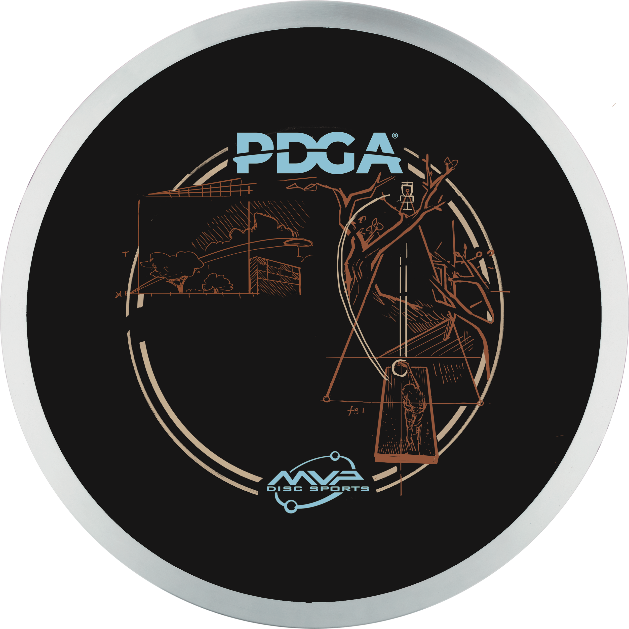
Membership Disc - As much as everyone liked the winged flying machines from the Membership pitch, the overall consensus felt that having the anatomy of the disc catching device as the main Membership offering was the better play. We took the thought of Axiom Discs’ flying machine-based stock stamp completely out of the question. There are only so many ways to try to fit that concept in a radial repeating pattern and keep it looking like da Vinci’s sketch drafts. We took the mechanical/ exploded view of Ace Club Thumbnail #1 and expanded on that. I needed to internally work out how this would fit into our MVP template and work these designs around our 1.5cm center sprue clearance.
We wondered as a design team, how would Leonardo illustrate this game if he had invented it? Would the baskets be much more ornate? I knew the compositions needed more than technical drawings. It needed the human element of notes and studies to bind it all together. The idea I pitched to Grant and Kaitlyn was that the backward text we do show would be predominantly there to fill negative space. The expectation of being able to read the small text after hotstamping was just an unrealistic expectation that would be irresponsible to set. We wanted to use the heading “keywords” that relate to each stamp design while providing text blocks that would help balance the stamp. It took a few rough revisions to move and strategically place elements and beef up text. The main issue was solving a lot of the space within the chain rack. Our united goal was to submit to MVP Custom Stamping without any major changes needed. Because of the number of elements, it was important to establish the logos and border of the Membership Disc as the gold holofoil. Silver or gold holofoil is a great choice to provide prestige and highlight the importance of the parent. Parent through the relationship of the elements within the graphic illustration.
Birdie Club Disc - The key goals with this rough were to connect on the importance of nailing that previous throw and setting yourself up to get that birdie shot. Initially, the message was much simpler. Focusing on the chain link while lining up your crucial putt. We would clean up, remove some non-essential elements, and abstract geometry. The rough draft feedback from Grant and Kaitlyn was to bring in more relatable imagery to further paint the story. Circle I and II charting, wind reading, loft, and trajectory. It was the Birdie Club disc that had us swap the standard serif for something that connects and blends with the artwork. Making sure there is a hierarchy to how the keywords/ text are used and weighted. I like how the chain link frames the left side of this design, with the concentric circles highlighting a focus point for the putter.
Ace Club Disc - This design took the most work overall, but worth the effort to get it there. The rough laid out the story of this idea of stepping up, assessing the line and launch angles. The journey of the disc from the teebox to the basket. We moved elements from this rough to other stamp layouts and inserted the tee pad/ figure to bring in more of the human equation. Is he the Vitruvian Man? I wanted the figure on the teebox to look like he was from the early Reniassance era. More importantly, I wanted the foil to resemble the look produced by techniques and drawing tools he had available to him at that time. Silverpoint, pen & ink, chalk, and watercolor all contributed to his vast array of loose-leaf drawings and ideas. MVP Disc Sports had quite a few options of this reddish shade that we would experiment with in our stamping trials. I’m pleased with how the copper foil came out. The Ace Club design helped reinforce and provide that circular border that would be consistent across the lineup. Gold Holofoil would be the decided universal foil across all 3 as well. I felt the PDGA logo and lower MVP logo, and border were the highest hierarchy.


If you’ve managed to stick with me this far in one of my longest and most detailed development blogs, I’ll leave you with a few little nuggets of insider info and wisdom that I’ve learned along the way. Here’s all the text that I initially created to fill those nooks and empty spaces. Keep in mind the original thought process and creative intent behind these words! Looking back on these captivating stamps, I’m genuinely proud of how they ultimately turned out. The unique sketchbook and notes font, with its sweeping lowercase letters and wonderfully intersected points, had me feeling pretty confident that none of this text would be remotely legible. In hindsight, I should have written out all the text portions in a clearer format and had an editor review them before expanding the outline of the text block. So remember, don’t try to write backwards, thinking you’ve typed it correctly, because it can lead to some surprises!

Membership Disc:
Target - Centripical rings centered on a vertical pole. Impac [t energy is]<—outside 14cm max art diameter
taken out by the absorbency of the chain rack an [d ring]<—outside 14cm max art diameter
Fig 2 - When disc hits chain rack, energy is dissipated and energy is absorbed. Allows disc chance to stay within target
Fig 1 Catching mechanism is broken into 3 parts. Chain rack, bucket, center pole and band.

Birdie Club:
Disc Golfer completes a hole in one stroke less than the par. For example, if a hole is a par four, and a golfer competes it in three strokes, they have achieved a birdie.
Approach
Flying object using a plate with curved nose and underside. Air allows the plate to remain afloat while spinning. High inertia keeps plate steady [durin]<—outside 14cm max art diameter g high spin.

Ace Club:
An ace is a disc golf term that refers to when a player throws their disc and makes it into the target in one shot. For those who are newer to the sport, this is very similar to a hole in one in golf of pure joy!
The Line
Good shots are rewarded. The game requires high mental ability and coordination. Take careful consideration of terrain characteristics.
Fig 1
surface is even anda leveled. Keeps na even ground with competition settings. Needs regualar maintenance to sensure upmost quality of play.


In conclusion, this project turned out to be quite a challenge, but one that I thoroughly enjoyed tackling. Without the amazing and constructive feedback from Kaitlyn, along with the incredible patience and enthusiasm from Grant Zellner, this project simply wouldn’t have reached the remarkable potential that it did. They provided me with a fresh perspective as well as an invaluable pair of eyes to help make these whimsical designs truly come together cohesively. I deeply appreciate all the hard work they invested toward our unified goal for 2025. It was genuinely an honor to collaborate with the PDGA again this year. While this project was indeed an endeavor, I began crafting this blog draft shortly after the public started to see it through their membership purchase or yearly renewal option. I’m glad I had the opportunity to look back at my PDGA brief, design notes, and my chicken scratches to share with you a little bit of the behind-the-scenes fun.
So, which of the three designs did you enjoy the most, and what made it stand out to you?