Design, Disc Golf, hotstamp Mike Inscho 6/3/25 Design, Disc Golf, hotstamp Mike Inscho 6/3/25 2025 PDGA Membership Discs Read More Design, Disc Golf, hotstamp Mike Inscho 7/10/24 Design, Disc Golf, hotstamp Mike Inscho 7/10/24 2024 Simon Lizotte Team Series Read More Disc Golf, Design, Illustration, hotstamp Mike Inscho 6/22/24 Disc Golf, Design, Illustration, hotstamp Mike Inscho 6/22/24 2024 PDGA Ace Club Disc Read More Disc Golf, hotstamp, Design Mike Inscho 6/11/24 Disc Golf, hotstamp, Design Mike Inscho 6/11/24 2024 PDGA Membership Disc Read More Design, Disc Golf, hotstamp Mike Inscho 1/19/24 Design, Disc Golf, hotstamp Mike Inscho 1/19/24 Eagle McMahon 2024 Team Series "Rebirth" Read More hotstamp, Disc Golf, Design Mike Inscho 6/7/23 hotstamp, Disc Golf, Design Mike Inscho 6/7/23 Simon Lizotte - Leapin' Lizottl' 2023 Tour Series Read More Design, Disc Golf, hotstamp Mike Inscho 11/15/22 Design, Disc Golf, hotstamp Mike Inscho 11/15/22 2023 PDGA Membership Discs Read More hotstamp, Illustration, Disc Golf, Design Mike Inscho 10/25/22 hotstamp, Illustration, Disc Golf, Design Mike Inscho 10/25/22 2022 Gyropalooza Total Eclipse Proxy Read More Design, Disc Golf, hotstamp, Illustration Mike Inscho 10/24/22 Design, Disc Golf, hotstamp, Illustration Mike Inscho 10/24/22 Neutron Terra: Special Edition Read More Design, Disc Golf, hotstamp Mike Inscho 8/31/22 Design, Disc Golf, hotstamp Mike Inscho 8/31/22 MVP Nomad - James Conrad Special Edition Read More Disc Golf, Design, logo Mike Inscho 2/1/22 Disc Golf, Design, logo Mike Inscho 2/1/22 Raven Newsom - Branding Read More Design, Disc Golf, hotstamp Mike Inscho 8/20/21 Design, Disc Golf, hotstamp Mike Inscho 8/20/21 Cameron Beck 2021 MVP Tour Series Read More hotstamp, Design Mike Inscho 7/31/20 hotstamp, Design Mike Inscho 7/31/20 Fission Wave Special Edition Read More hotstamp, Design Mike Inscho 6/10/20 hotstamp, Design Mike Inscho 6/10/20 MVP Ohm-Special Edition Read More logo, Illustration, Design Mike Inscho 3/10/20 logo, Illustration, Design Mike Inscho 3/10/20 Basket Bashers- Rebranding Read More hotstamp, Design Mike Inscho 2/18/20 hotstamp, Design Mike Inscho 2/18/20 Gyroscope 2020 Read More Design, hotstamp Mike Inscho 2/13/20 Design, hotstamp Mike Inscho 2/13/20 Schrock-A-Doodle-Doo Read More hotstamp, Design Mike Inscho 2/12/20 hotstamp, Design Mike Inscho 2/12/20 MVP Proton Deflector Read More hotstamp, Design Mike Inscho 2/10/20 hotstamp, Design Mike Inscho 2/10/20 Axiom Cosmic Neutron - Stock Read More hotstamp, Design Mike Inscho 2/6/20 hotstamp, Design Mike Inscho 2/6/20 MVP Cosmic Neutron Read More Older Posts
Design, Disc Golf, hotstamp Mike Inscho 6/3/25 Design, Disc Golf, hotstamp Mike Inscho 6/3/25 2025 PDGA Membership Discs Read More
Design, Disc Golf, hotstamp Mike Inscho 7/10/24 Design, Disc Golf, hotstamp Mike Inscho 7/10/24 2024 Simon Lizotte Team Series Read More
Disc Golf, Design, Illustration, hotstamp Mike Inscho 6/22/24 Disc Golf, Design, Illustration, hotstamp Mike Inscho 6/22/24 2024 PDGA Ace Club Disc Read More
Disc Golf, hotstamp, Design Mike Inscho 6/11/24 Disc Golf, hotstamp, Design Mike Inscho 6/11/24 2024 PDGA Membership Disc Read More
Design, Disc Golf, hotstamp Mike Inscho 1/19/24 Design, Disc Golf, hotstamp Mike Inscho 1/19/24 Eagle McMahon 2024 Team Series "Rebirth" Read More
hotstamp, Disc Golf, Design Mike Inscho 6/7/23 hotstamp, Disc Golf, Design Mike Inscho 6/7/23 Simon Lizotte - Leapin' Lizottl' 2023 Tour Series Read More
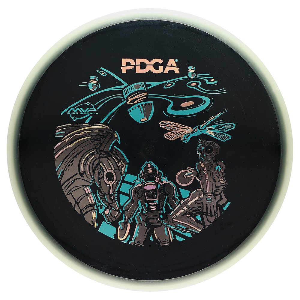
Design, Disc Golf, hotstamp Mike Inscho 11/15/22 Design, Disc Golf, hotstamp Mike Inscho 11/15/22 2023 PDGA Membership Discs Read More
hotstamp, Illustration, Disc Golf, Design Mike Inscho 10/25/22 hotstamp, Illustration, Disc Golf, Design Mike Inscho 10/25/22 2022 Gyropalooza Total Eclipse Proxy Read More
Design, Disc Golf, hotstamp, Illustration Mike Inscho 10/24/22 Design, Disc Golf, hotstamp, Illustration Mike Inscho 10/24/22 Neutron Terra: Special Edition Read More
Design, Disc Golf, hotstamp Mike Inscho 8/31/22 Design, Disc Golf, hotstamp Mike Inscho 8/31/22 MVP Nomad - James Conrad Special Edition Read More
Disc Golf, Design, logo Mike Inscho 2/1/22 Disc Golf, Design, logo Mike Inscho 2/1/22 Raven Newsom - Branding Read More
Design, Disc Golf, hotstamp Mike Inscho 8/20/21 Design, Disc Golf, hotstamp Mike Inscho 8/20/21 Cameron Beck 2021 MVP Tour Series Read More
hotstamp, Design Mike Inscho 7/31/20 hotstamp, Design Mike Inscho 7/31/20 Fission Wave Special Edition Read More
hotstamp, Design Mike Inscho 6/10/20 hotstamp, Design Mike Inscho 6/10/20 MVP Ohm-Special Edition Read More
logo, Illustration, Design Mike Inscho 3/10/20 logo, Illustration, Design Mike Inscho 3/10/20 Basket Bashers- Rebranding Read More
Design, hotstamp Mike Inscho 2/13/20 Design, hotstamp Mike Inscho 2/13/20 Schrock-A-Doodle-Doo Read More
hotstamp, Design Mike Inscho 2/12/20 hotstamp, Design Mike Inscho 2/12/20 MVP Proton Deflector Read More
hotstamp, Design Mike Inscho 2/10/20 hotstamp, Design Mike Inscho 2/10/20 Axiom Cosmic Neutron - Stock Read More