Basket Bashers- Rebranding
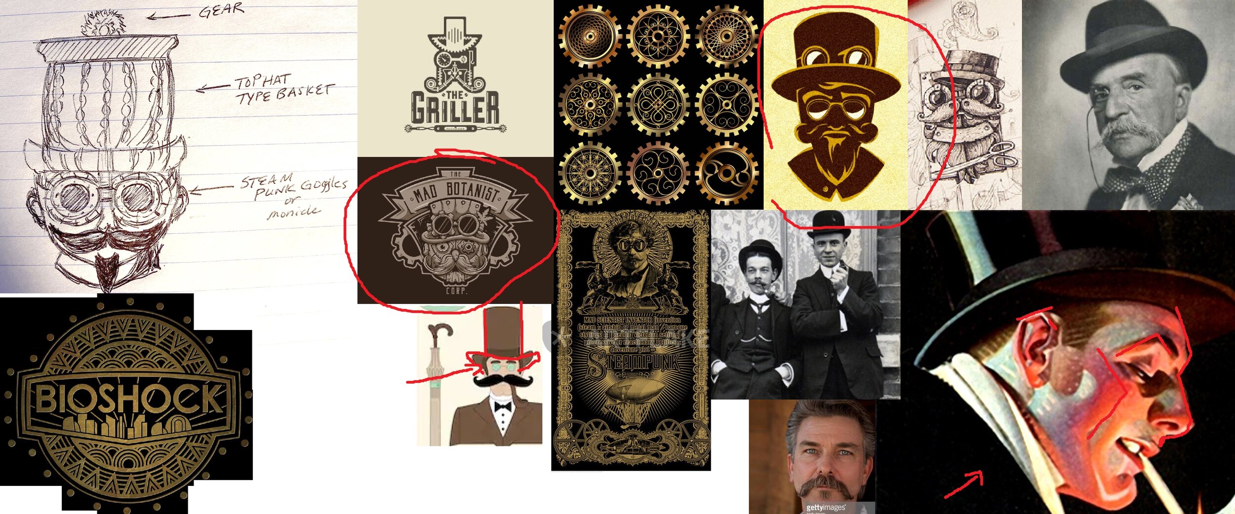
Wow! What a journey. I remember not too long ago I was doing some freelancing work for Jerry Pectol (previous owner of Basket Bashers Disc Golf) when I went to full time. Since then, Jerry had recently decided to hang it up. Good local friends, Logan & Stacy acquired the Basket Bashers company and approached me to create their new logo to revive the brand. Initial talks led down a path of doing something more with an illustrative tone. Letting the highly, eye-catching artwork attract people into wanting to wear it on various merchandise. We went through a few ideas and pushed and pulled to what we thought a logo should be.
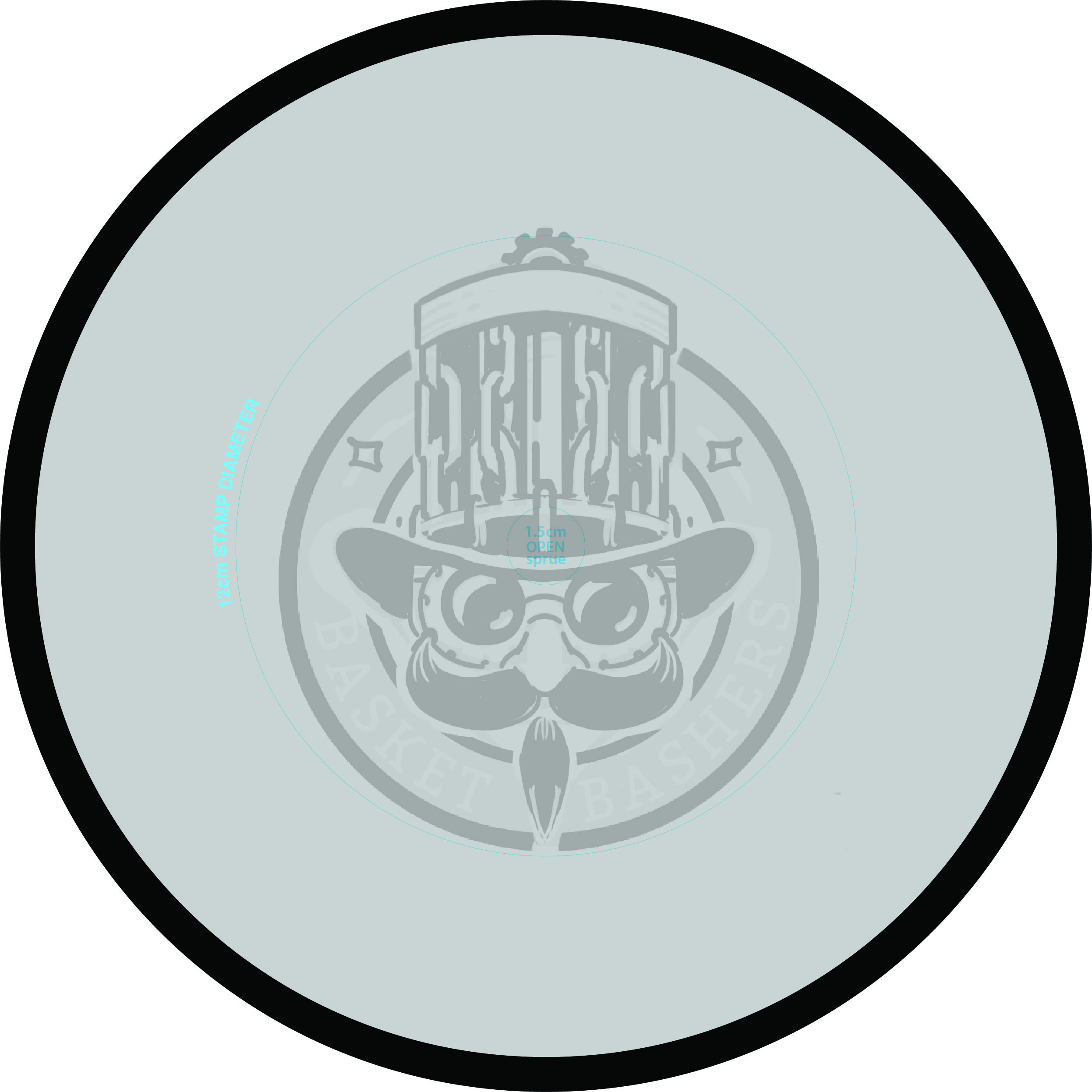
The common direction was initiated by Stacy and it really got this project headed toward the finish line. It was a rough napkin sketch but it revitalized everyone. That initial image is located in the far upper left of the reference sheet. I used that as a stepping stone and put together 3 ideas of what it could be. These felt really good and I knew any one of them would’ve transitioned well into final form. Another design requirement lead me to continually test this design as a full-sized stamp in MVP’s stamping template. Those parameters were constantly reminding us of what we could and could not do as far as logo layout.
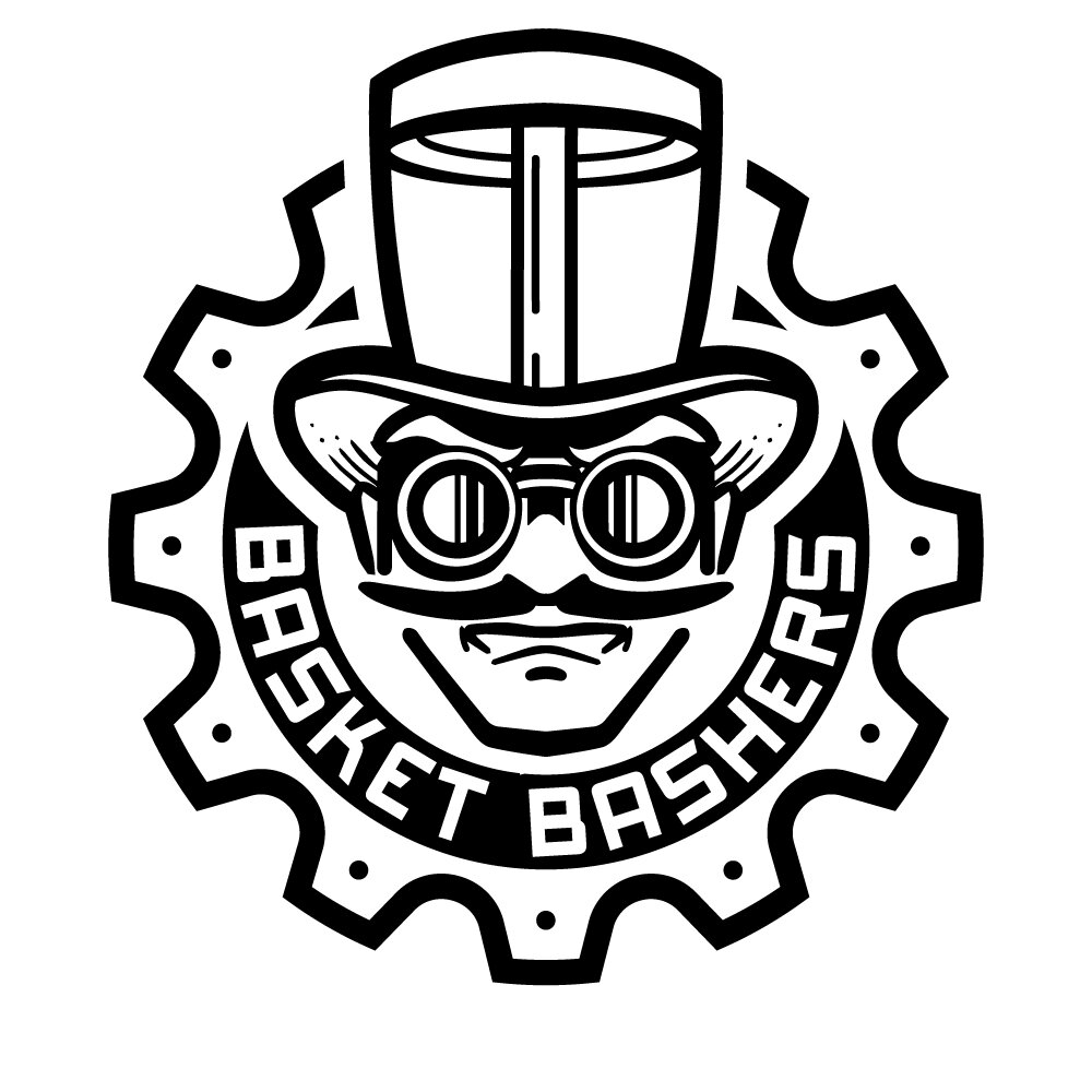
After a few rough passes, it was safe to start bringing the idea into vector form. In closing, I can’t stress how important a company logo is. To be able to educate while working through these passes; we ended up in a really good spot with further room to expand on the branding. I look forward to helping them out even more with future endeavors.
Check out their Facebook and website for the latest updates!