hotstamp, Illustration, Disc Golf, Design Mike Inscho 10/25/22 hotstamp, Illustration, Disc Golf, Design Mike Inscho 10/25/22 2022 Gyropalooza Total Eclipse Proxy Read More Disc Golf, hotstamp, Illustration Mike Inscho 10/18/22 Disc Golf, hotstamp, Illustration Mike Inscho 10/18/22 Raven Newsom - 2021 Tour Series Read More Disc Golf, hotstamp, Illustration Mike Inscho 7/18/22 Disc Golf, hotstamp, Illustration Mike Inscho 7/18/22 Firm Electron Envy - Special Edition Read More hotstamp Mike Inscho 11/12/20 hotstamp Mike Inscho 11/12/20 Dan Fairhurst Loki II Read More hotstamp, Design Mike Inscho 7/31/20 hotstamp, Design Mike Inscho 7/31/20 Fission Wave Special Edition Read More Design, hotstamp Mike Inscho 2/13/20 Design, hotstamp Mike Inscho 2/13/20 Schrock-A-Doodle-Doo Read More hotstamp Mike Inscho 8/6/19 hotstamp Mike Inscho 8/6/19 Robokitty 2.0 Read More hotstamp Mike Inscho 7/26/19 hotstamp Mike Inscho 7/26/19 Prism Proton Pyro - Special Edition Read More hotstamp Mike Inscho 3/18/19 hotstamp Mike Inscho 3/18/19 2019 Jomez Pro Read More hotstamp, Illustration Mike Inscho 2/6/19 hotstamp, Illustration Mike Inscho 2/6/19 Tyler Schrock- The Schloth Read More hotstamp, Illustration Mike Inscho 4/27/18 hotstamp, Illustration Mike Inscho 4/27/18 Schrocktopus Read More hotstamp Mike Inscho 8/21/17 hotstamp Mike Inscho 8/21/17 Special Edition MVP Limit Read More hotstamp Mike Inscho 5/15/17 hotstamp Mike Inscho 5/15/17 MVP "Limited Edition" Teleport Read More hotstamp Mike Inscho 10/3/16 hotstamp Mike Inscho 10/3/16 Axiom "Black Widow" Vanish Read More hotstamp Mike Inscho 8/11/16 hotstamp Mike Inscho 8/11/16 2016 Solitude Open presented by MVP Disc Sports Read More Mike Inscho 8/29/14 Mike Inscho 8/29/14 Sol Spinner Read More
hotstamp, Illustration, Disc Golf, Design Mike Inscho 10/25/22 hotstamp, Illustration, Disc Golf, Design Mike Inscho 10/25/22 2022 Gyropalooza Total Eclipse Proxy Read More
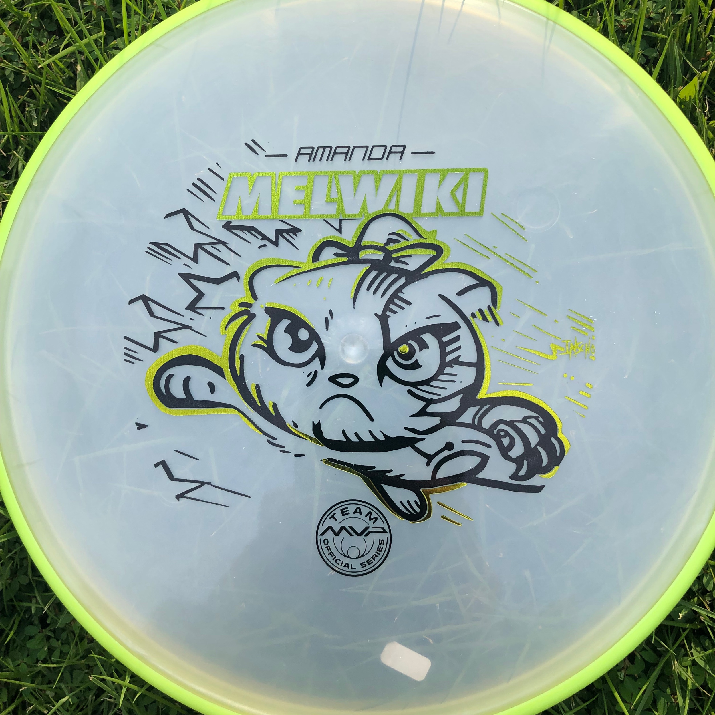
Disc Golf, hotstamp, Illustration Mike Inscho 10/18/22 Disc Golf, hotstamp, Illustration Mike Inscho 10/18/22 Raven Newsom - 2021 Tour Series Read More
Disc Golf, hotstamp, Illustration Mike Inscho 7/18/22 Disc Golf, hotstamp, Illustration Mike Inscho 7/18/22 Firm Electron Envy - Special Edition Read More
hotstamp, Design Mike Inscho 7/31/20 hotstamp, Design Mike Inscho 7/31/20 Fission Wave Special Edition Read More
Design, hotstamp Mike Inscho 2/13/20 Design, hotstamp Mike Inscho 2/13/20 Schrock-A-Doodle-Doo Read More
hotstamp Mike Inscho 7/26/19 hotstamp Mike Inscho 7/26/19 Prism Proton Pyro - Special Edition Read More
hotstamp, Illustration Mike Inscho 2/6/19 hotstamp, Illustration Mike Inscho 2/6/19 Tyler Schrock- The Schloth Read More
hotstamp, Illustration Mike Inscho 4/27/18 hotstamp, Illustration Mike Inscho 4/27/18 Schrocktopus Read More
hotstamp Mike Inscho 8/11/16 hotstamp Mike Inscho 8/11/16 2016 Solitude Open presented by MVP Disc Sports Read More