2017 Solitude Open Presented by MVP Disc Sports

The 2016 Solitude Open stamp is arguably (in my mind) one of the better stamp designs I've done over the course of these few years. I was able to get a return client this year and that means a great deal to me. Going into 2017's design process, I knew topping last years was not going to be easy.

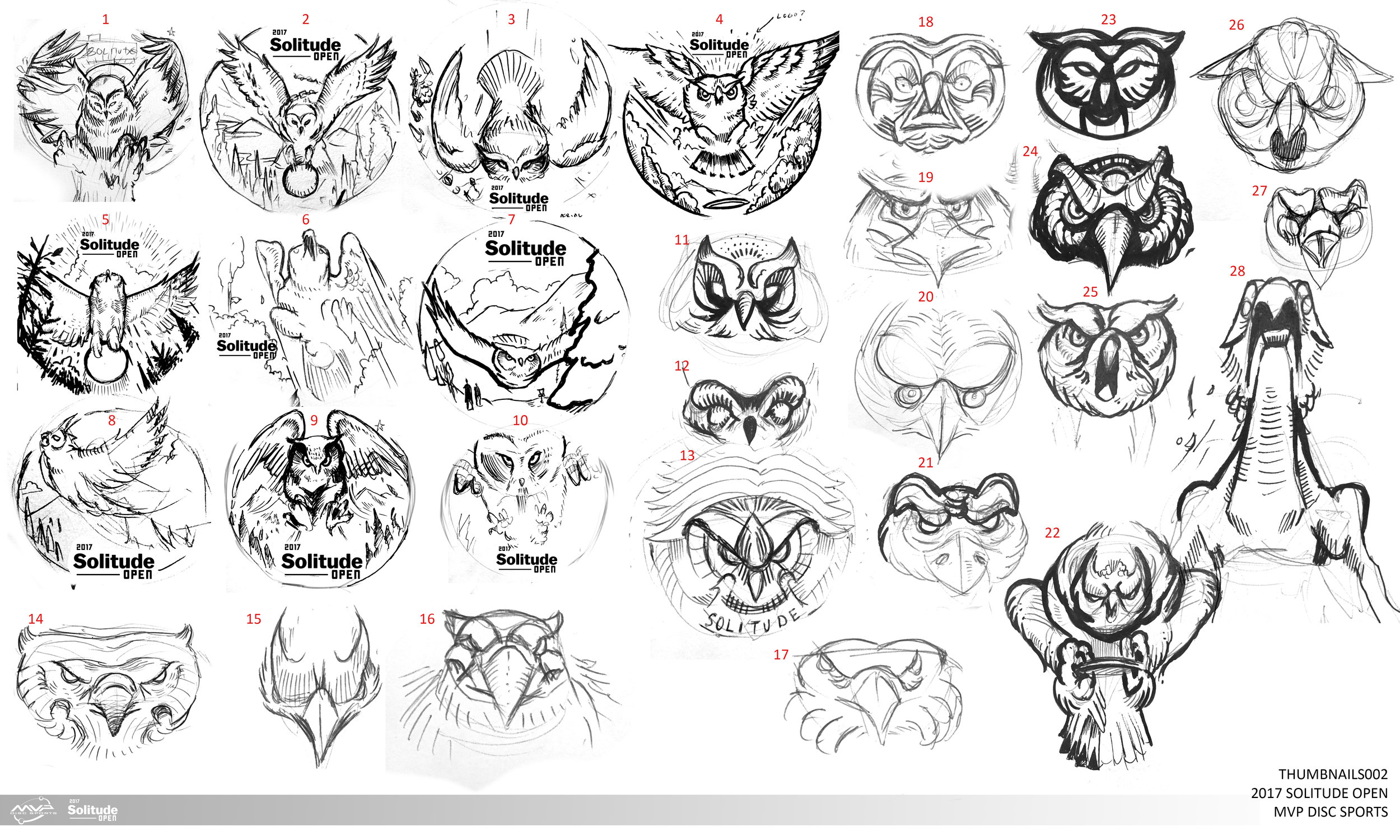
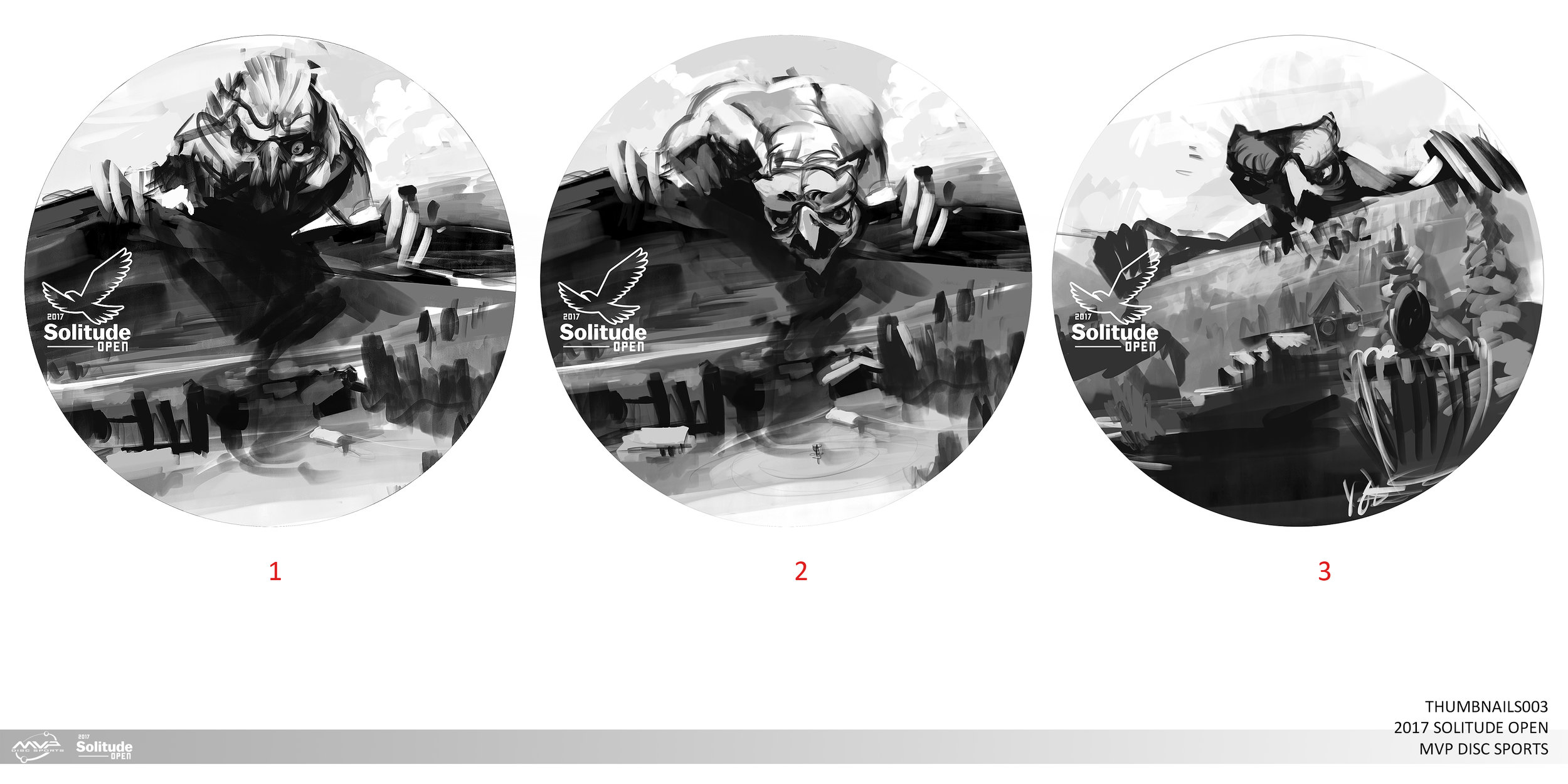
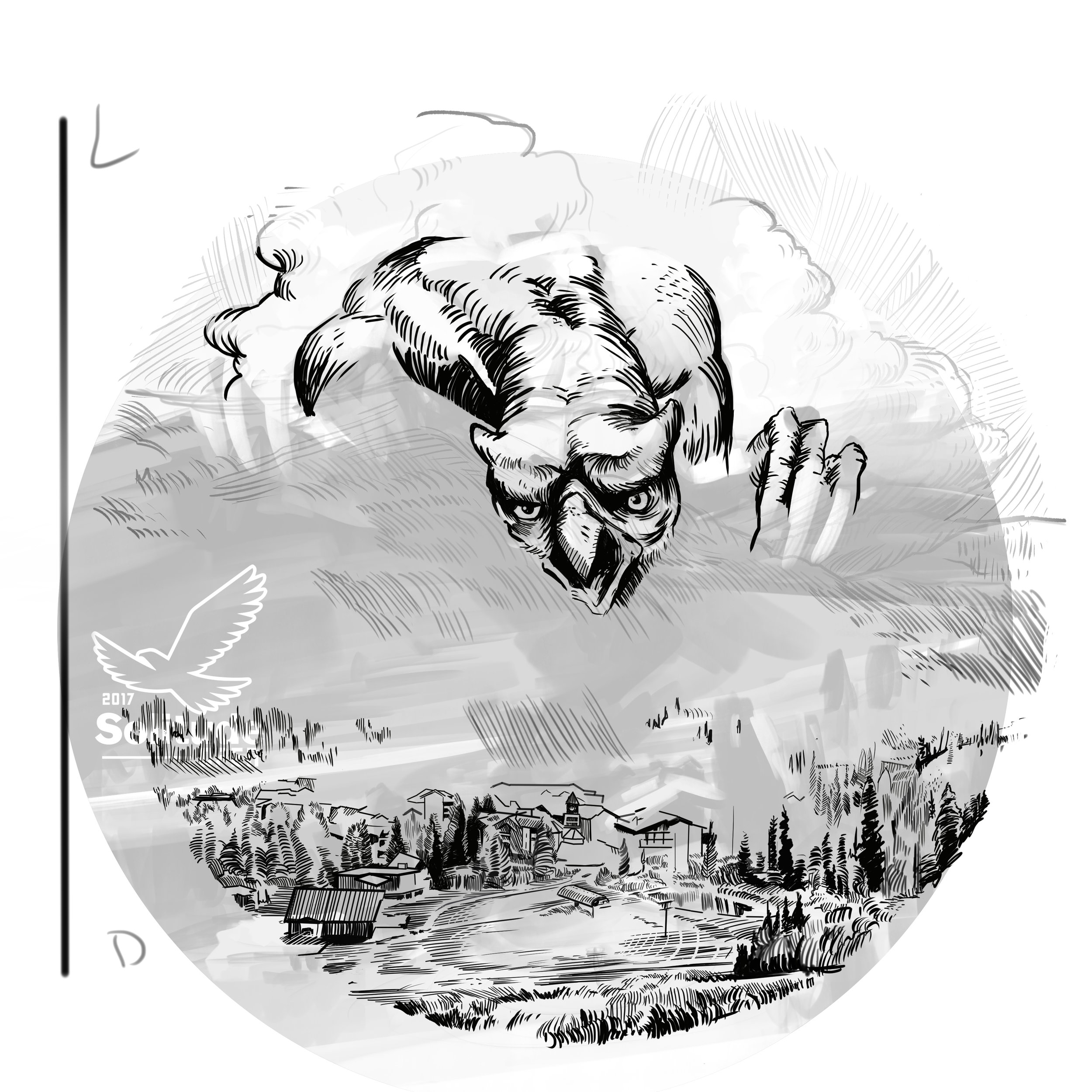
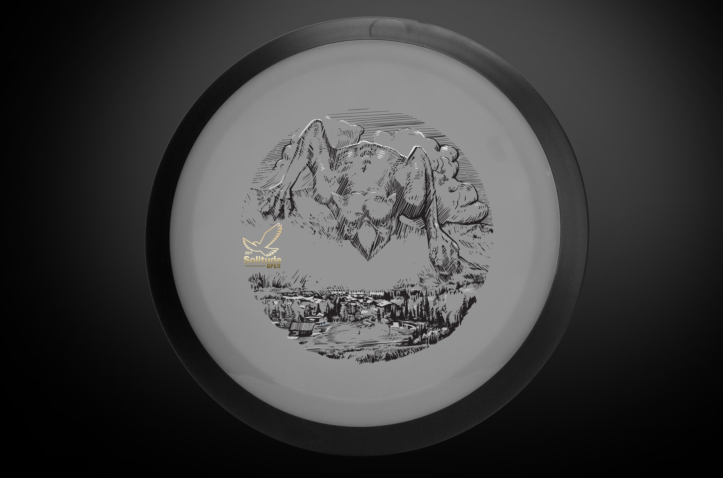
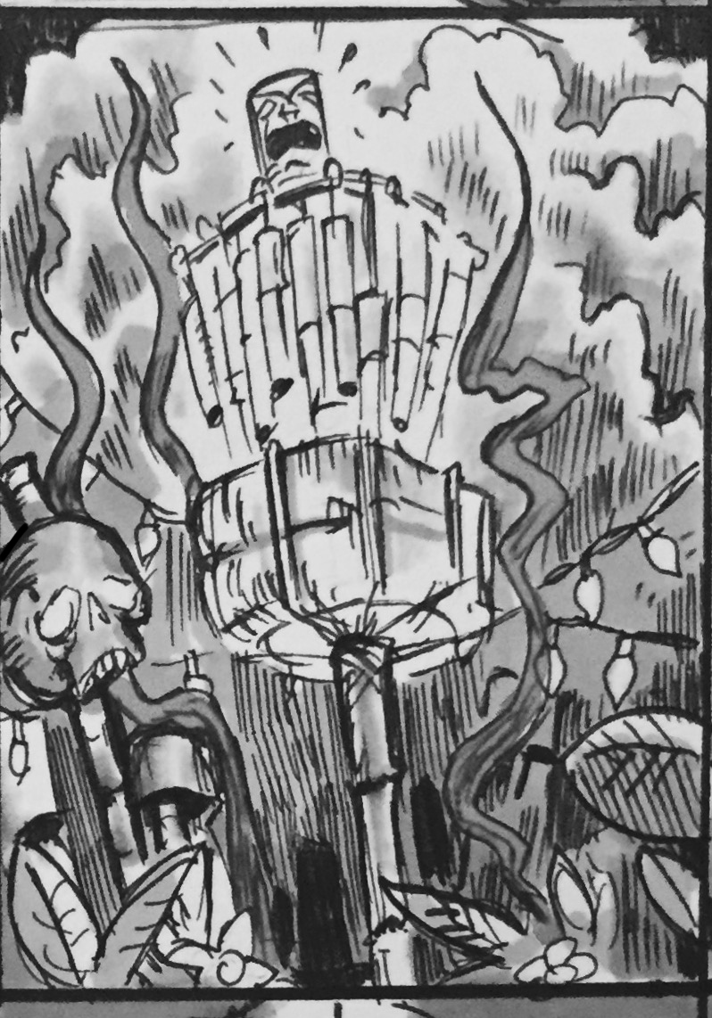
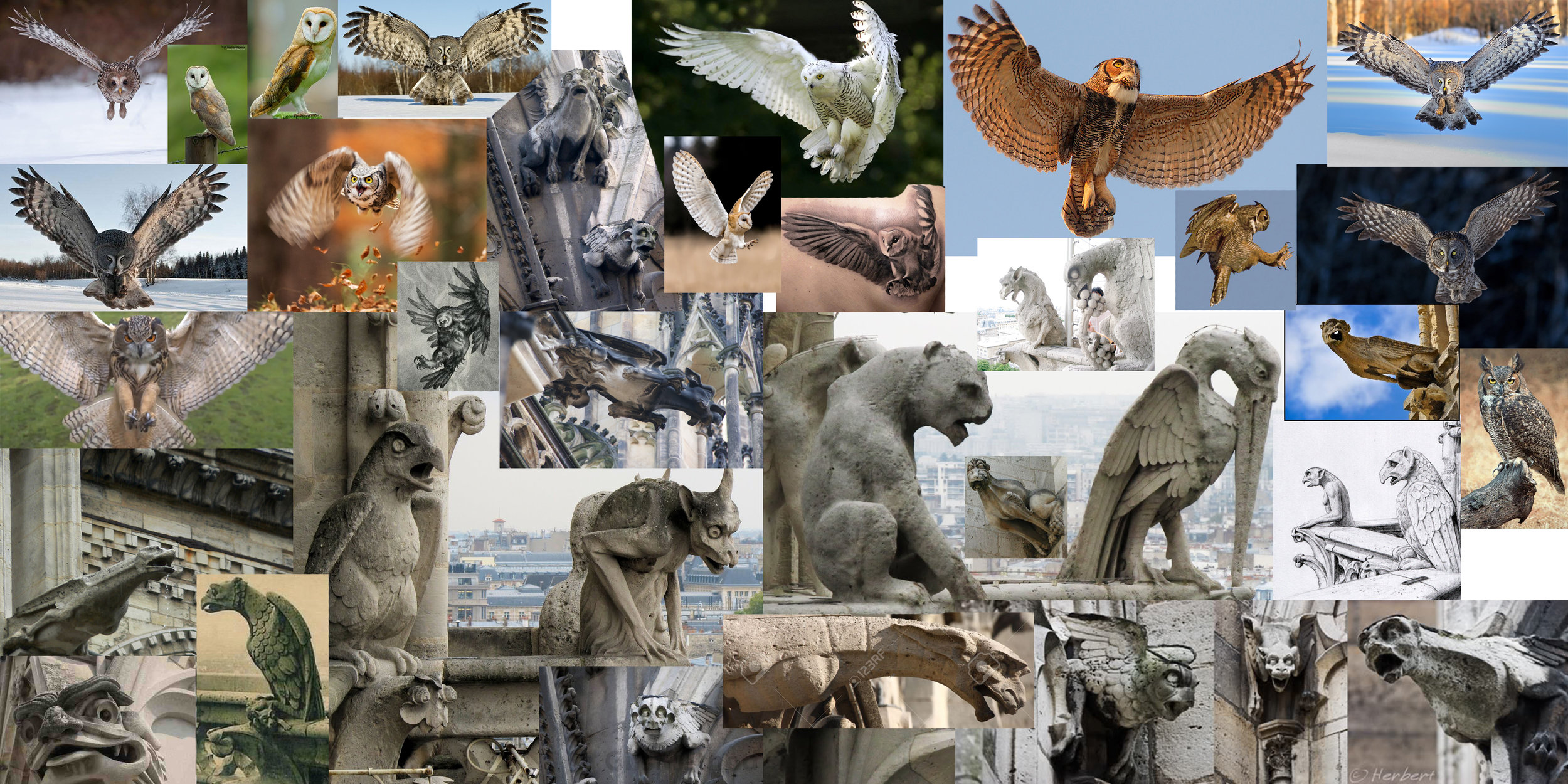
Just before being able to get to this stamp, the TD of the event got into a workplace accident. When we finally got to talk about this year's ideas, he already had something in mind. It came from a vision he had. Whether it be the medication he was under or the amount of creative energy this guy has, I'm not sure. We hit the ground running with the idea of a hybrid animal of sorts rocketing out of a tree canopy clutching a disc golf disc. The process moved and transitioned from a rocketing bird to more of a look of Notre Dame gargoyles. The idea was this hybrid animal is overlooking one of many signature Solitude holes, Hole 18. We most importantly, wanted the beast to be locked onto the viewer. I've never been to Solitude, but i'm pretty sure you can't replicate the feeling of first seeing this enormous hole. 

The beast development changed a bit from each draft. I felt that the lurking creature that was created before the final was too shy, and not imposing enough. I took a hard look at some of the more dynamic gargoyles at Notre Dame. I felt like reducing the musculature and having the beast cresting the mountain helped create that uneasy feeling. 

In the end, it was great to really dig into a different sketch style and really play around with more of a traditional approach. If you're interested in purchasing one of these fundraising discs, please contact Brian T. Usher at brian@brianusher.com

Special Edition MVP Limit

"Push it to the limit"

The MVP Limit is a 24.5mm High Speed Driver designed to be the fastest, most overstable disc in MVP's entire line up. My Art Director, Zachary Kelbaugh laid out a pretty good description to start planning behind:

"We talked about the conceptual intersection for the name... being the fastest, most overstable disc -- and the class as a whole refers to space travel, with the speed of light being the theoretical limit for speed in the universe. "

I had an opportunity to bust out my love for everything 80's. I changed into my jammer shorts and pulled out the 80's action playlist on Spotify! Getting started on this didn't take me much time at all. The initial idea was to mimic the typical action movie posters of the time (Rambo, Over the Top, Big Trouble Little China). Heroic character posed in the center with explosions, and commotion happening behind him/her. I even went so far down the rabbit hole and stumbled onto some retro-futurism which was really neat. None the less, for the scope of the project and how the release was playing out, We went with a retro-wave direction into the rough and final stages. As a team, we felt like keeping the design clean and tech felt more MVP without crossing into the Axiom Discs branding. 

In the end, there are some things that you all aren't getting a chance to see. There were some really solid ideas in the thumbnail stage that just might poke their head up when a new project comes a long. A little bit out of my comfort zone but it takes experimentation like that to really grow as an artist. I hope you all enjoy. You can pick up this special edition and a bunch of online disc golf retailers. 

Warrior Transition Battalion-Stamp

Christopher Altman, a fellow Cary Area Disc League member, approached me to offer him some help. He wanted to host a tournament to get soldiers involved with disc golf. To do that, he was going to organize a tournament for the Warrior Transition Battalion (WTB) down at Ft. Bragg, NC. The overall goal of the WTB is to provide the commensurate quality of life, quality of healthcare services and quality of leadership which matches the quality of service and sacrifice made by our sick, injured and wounded warriors in transition and their families. 

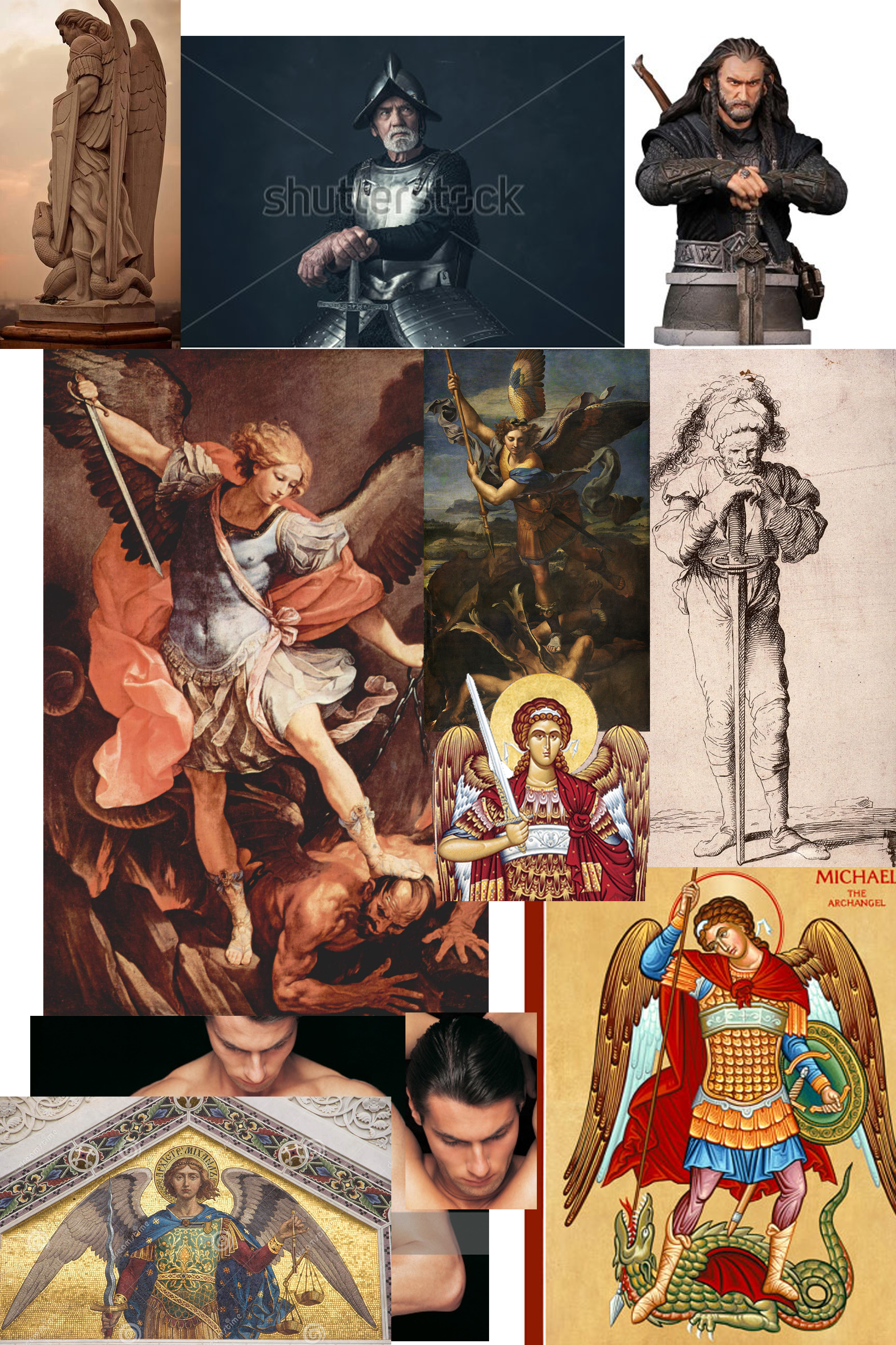
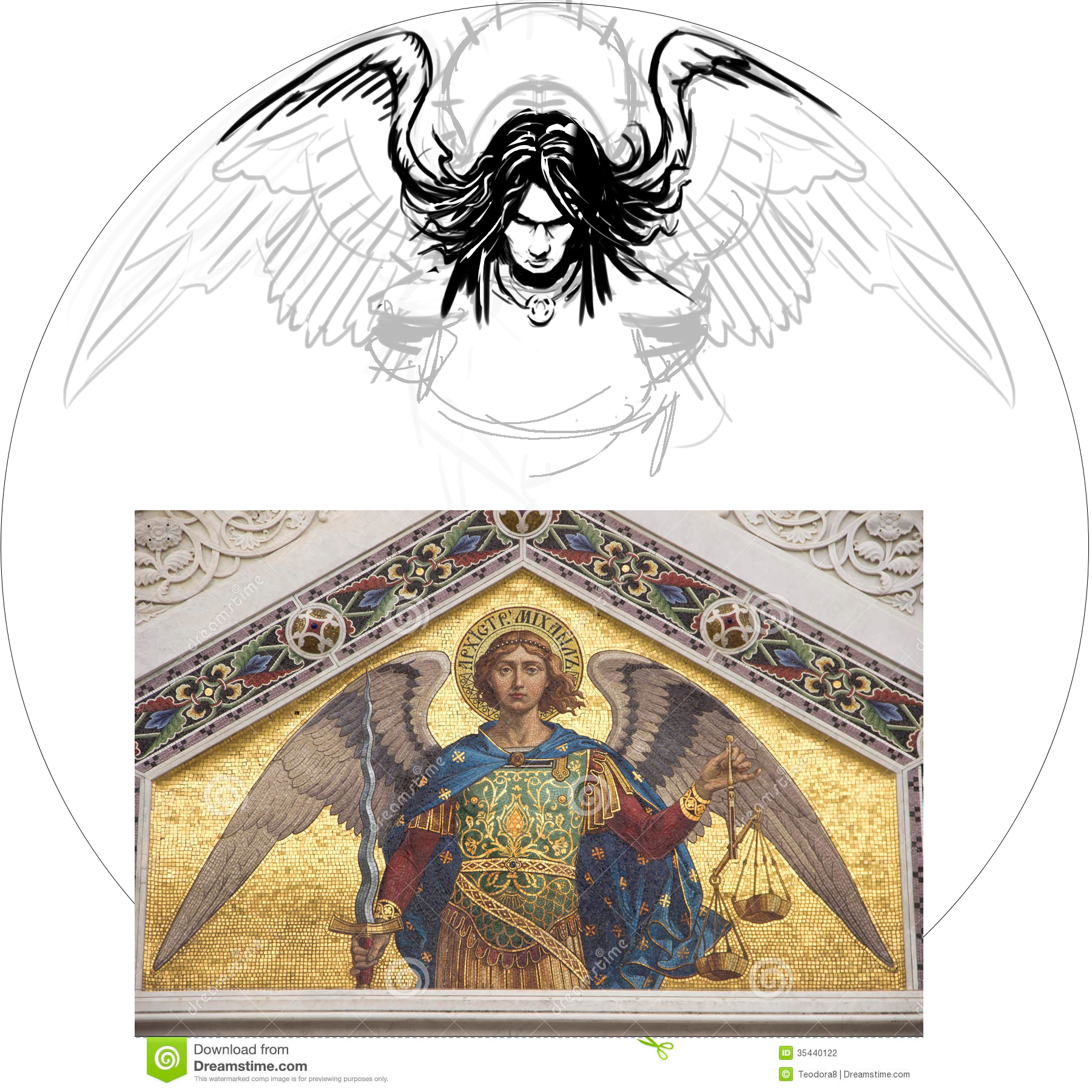
The goal of the stamp was to include a mixture of 4 different elements. The WTB logo, St. Michael, and a soldier helping a wounded warrior off of the battlefield. Lastly, the words "Find New Strength". The only image supplied to me was the soldier helping another soldier. The Airborne's St. Michael artwork someone had previously done. The styling of St. Michael was inspired by religious iconography from both Google searching and my wife and I's trip to Rome and Greece a few years back. With the combination of 4 elements, It was my job to do the best I could to incorporate them into one design. 
In the end, it took a little bit to finish up. I was working on this design during my off time while working a full schedule. I'm very happy to support a great program and a great cause. I hope the tournament go'ers enjoyed this event and continue playing disc golf. 

Central Coast Disc Golf Collaboration

Central Coast Disc Golf has been putting out some wicked nice video footage and covering some great events. I was lucky enough to be a part of an MVP Disc Sports and Central Coast Disc Golf collaboration. It was my job to create a custom stamp for Ian and crew for specific use on MVP discs. Ian is a fan of the MVP Ion so it's only fitting that there will be a few of those ran.

I think the major hurdle with this design was to do something that was going to look good in 3 foil stamping. We tried a few ideas but what stuck was a thumbnail I did of the central coast. When deciding the use of a specific foil, I really try to keep in mind the original intent of the design. Promoting CCDG was in the forefront so I tastefully split up the horizontal logo into the 3rd foil choice and the accent foil.

I hope CCDG and the rest of you all dig it. Please let me know your opinions and thoughts in the comments. Please share this post if you feel so inclined! 

30th Anniversary of the Roc

Excited is an understatement. Jeff Panis (Marketing Director of Innova Champion Discs) reached out quite a while ago when he assumed his new role. A lot of things were on his plate at the time, so we talked briefly and got back in touch a few months down the road. An opportunity was in place to design a commemorative stamp honoring 30 years of the Roc's existence. The Roc has been one of Innova's most popular molds without question. This was a huge opportunity that came with a lot of weight.

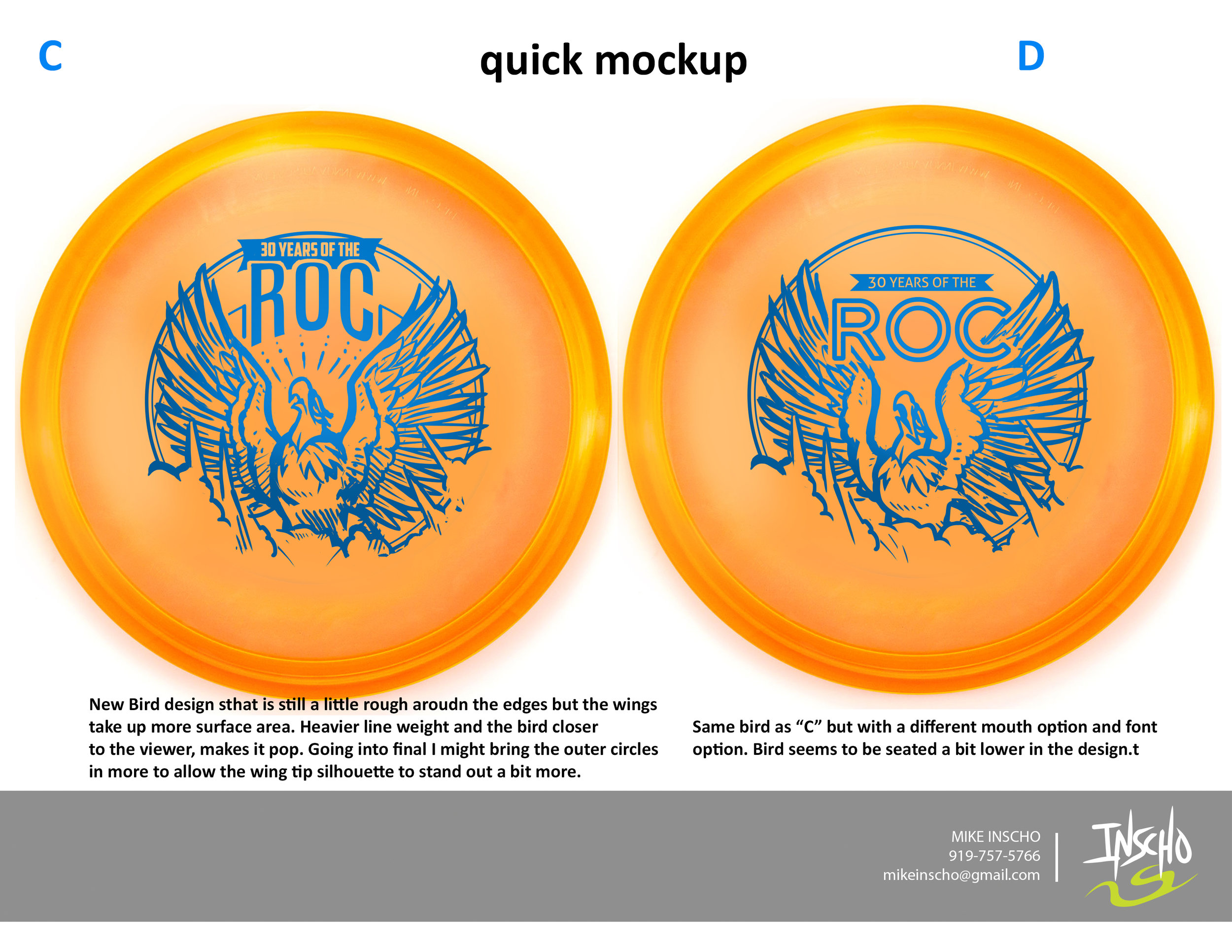
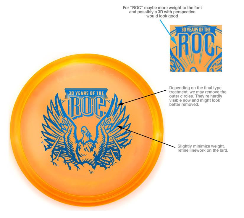
In the initial sketches I proposed, there were some good things to build off of. I had awesome friends who helped me out in critique. One of the main things I overlooked that they quickly pointed out was the silhouette strength of the head. My goal was to have this Roc reach a point of near weightlessness. For example, If you stretch your back out in your chair (I do this from time to time) , you arch the back, the chest protrudes out and your chin tips up. This pose is something I tried to capture. As Innova and I progress through the development of the stamp, The head tips back down a bit to give the bird more shape. The wings extend out to give some symmetry to the stamp. The body develops all the way to it's last and final version and the final is the result of of multiple revisions for the better.

If it wasn't for my friends and their fresh eyes to give me critique, the direction of Jeff Panis, Levi Wilcox and the crew to keep pushing this stamp, it would've honestly turned out to be less than what it should've been. What do you all think?  I'd love to hear your thoughts in the comments. Thanks for reading.

19th Annual Great 8

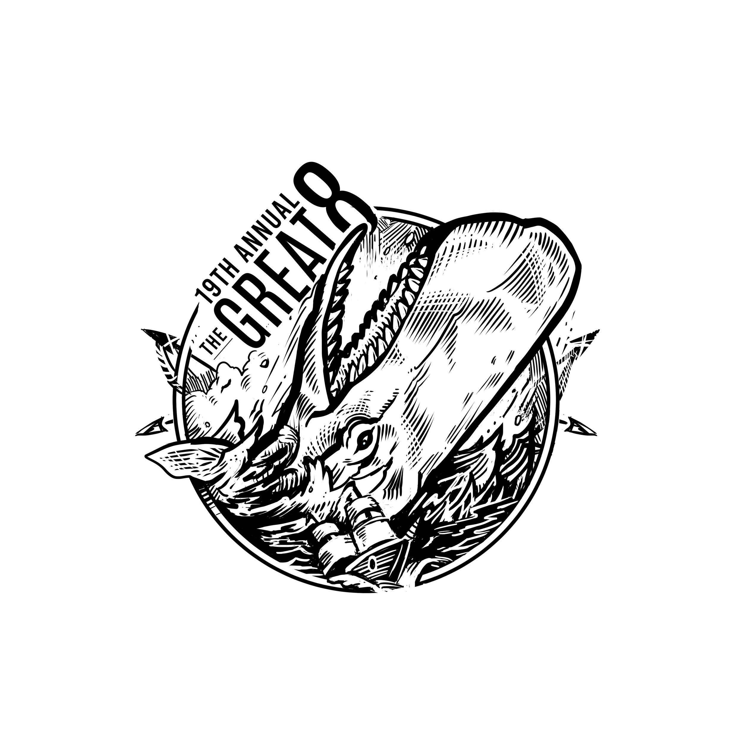
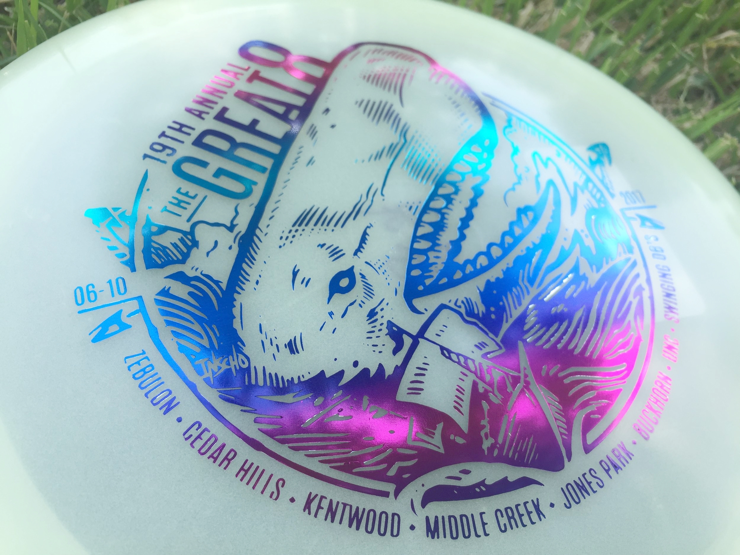
The Great 8 tournament is in its 19th year. It's a one day, 8 courses, from sun up to sun down event that only the crazy dare to do. I had the honor of doing this year's stamp and was really excited, even though it was down to the wire (totally on me). We've returned to the nautical themed roots to have something pair up well with the dual octopus stamp that was done a few years ago. 

The major hurdle with this stamp is what you can see in the early stages. I wanted the huge whale to be coming out of the water and landing on top of the ship. To make that read clearly was definitely a challenge. After much debate and great advice from my friends, the whale was flipped the other way. I couldn't agree more with the move. 

I want to thank Jay Pontier for always giving me an artistic freedom when it comes to doing these stamps. It makes it so enjoyable. 

MVP "Limited Edition" Teleport

The MVP Teleport is the first one out of the gates for MVP Disc Sports 24.5mm class of high-speed drivers. To commemorate the release of this disc, MVP came to me wanted a limited edition stamp.  My job was to portray teleportation while sticking with what MVP's brand identity is and to create this design using their three foil stamping abilities. 

Mathematics, science, and technology take the forefront of what MVP's graphics have always been about, My mind started there. How would I depict teleportation in a way that worked well? That was tough. If you take a look at my thumbnail process in the very first gallery image, you see the spectrum was pretty wide. Anything from math grids and charts to space pilots entering a warp tunnel. My main hurdles with this design were turnaround times and getting the funnel graphic and perspective to give off a disorienting point A and B. Hot stamping has a limit to line width that will be transferred to the disc successfully. What I wanted to do is convey these two portal entry's that disappeared to the disc color while keeping the main and important element (the Teleport name and MVP logo) bold and black. 

All in all, I'm super grateful for the opportunity and learn the most when I step outside my comfort zone. The Limited Edition stamp will be available through most major retailers that carry MVP Disc Sports merchandise. What do you all think? Does it keep with the brand? Leave me a note in the comment section. Thanks for stopping by. 

Out of Bounds Series #1

The Out Of Bounds Series was an idea drawn up by a fellow MVP Gyronaut by the name of Brian Sweet. He came to me with an interesting take that I've never thought about before. Tight fairways, landing areas and almost impossible pin placements exist somewhere in the disc golf world. His idea is to shed light on these situations. 

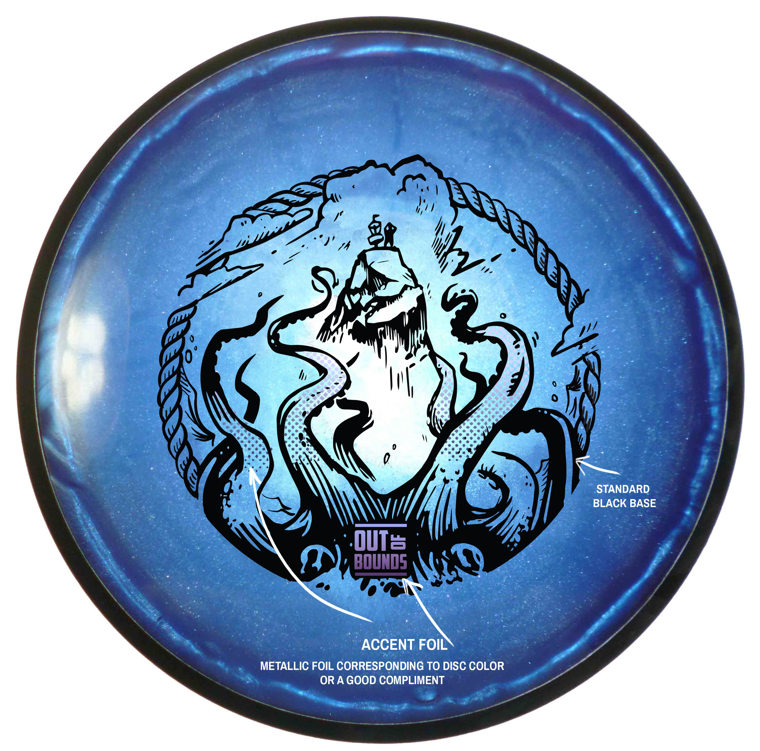
This idea stems from fantastical ideas about what lurks hidden, as your disc takes a plunge into the unknown. Out Of Bounds Series #1 explores the depths of an impossible landing area. The disc is now belonging the keeper. A mix of Cthulu/Kraken/Squid vibes. I wanted the eyes of the creature fixated to the onlooker. The eyes had to adjust from the sides of the beast to more in front to convey the idea. The introduction of the second foil to bring the viewers attention from the bottom of the stamp up toward the poor fellow on the cliff side. 

I want to thank Brian Sweet for having the faith to let me run with his napkin sketch and go for it. These are available in a dual foil set up exclusively on MVP/Axiom/Streamline Discs plastic.

Please let me know what you think in the comments and share with your friends! 

Carolina Hurricanes-Homegrown Poster #2

I can't say enough about the first poster experience . The Hurricanes were super accommodating and a absolute joy to work with. It was such an honor to be a part of the Homegrown Series not once but twice this year. As an artist, I really appreciate the concept that The Hurricanes have incorporated into their games. Reaching out into the public and calling on local musicians and artists to be a part of the games really showcases North Carolina's diverse talent and creates a sense of community, that is something that I love being a part of.

Kyle Fowlkes gave me another ring and invited myself and another artist by the name of George Hage to have the opportunity to do one more poster for this year. I wanted to stick to something I've really enjoyed over the years and that's more of a scenic landscape type of painting.

My goal was to create a calm yet uneasy feeling as you're looking toward the iconic PNC Arena. I wanted to convey the energy of the storm brewing. For me, this also translates into the energy of the players and the fans, those pregame jitters. I also wanted the opponents to look at the poster and feel that same energy, that determination that our players will exude once they step onto the ice.

What do you all think? Please leave a comment and feel free to share!

Exeter "Non Sequitur" Album Art

The last opportunity I had to design an album cover was from Exeter's "Prolepsis" album in 2007. I was still in art school, still learning the many things about digital painting and one of my side kicks since, Adobe Photoshop. My friend came to me this past spring and wanted to know if I'd love to design their album cover for their upcoming album "Non Sequitur". 

Non Sequitur: a conclusion or statement that does not logically follow from the previous argument or statement.

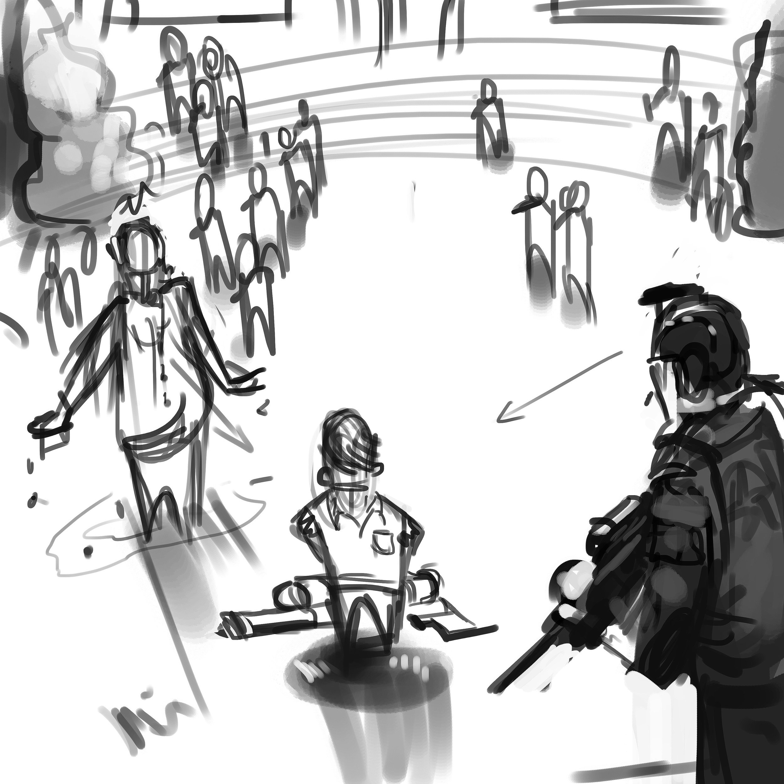
I learned quickly that the general sentiment of this album, vastly different from their first effort (hence the album title), was to express the band's strong libertarian leanings, and in particular showed an anti-authoritarian bent.  The cover itself was intended to critique what the band sees as an overt and perhaps overly aggressive and reactionary militarization of American police forces.  These are, according to the band, POLICY issues, not intrinsically policing issues.  The first thing he asked was if I was going to be comfortable doing album art with such strong political meaning. My job as an artist is to give the client what they want. I wanted to push the bar a bit more than they were expecting. The design process took a little bit to finish but I'm glad they were patient and let me finish this for them. 

I experienced some challenges during this illustration. The direction was to show the protagonist/antagonist (depending on one's view) center screen with his class peers in uniform garb, looking on from a distance. It had to be clearly read that the kid only had a super soaker-like squirt gun. The victim, in this case a faceless administrator, had to be shown that he was dowsed in water and have them surrounded by a police presence.  That's a lot to fit into one image. I focused on the kid first and came up with a composition that would work to facilitate everything they wanted in the main image. The background reference I gathered came straight from a school I attended from 4th to 10th grade. It's not meant to be a message to my hometown but the band wanted a rural, low key type of school yard setting. These older school that were built in the 40's-60's had a certain type of charm and aesthetic that I wanted to portray in the background imagery. 

Working through a thumbnail to rough pass, I was able to show different angles and quick lighting scenarios to the band. The reference helped show the real world influence. It truly helps bring in a more accurate human element that would not of been achieved by purely relying on memory. Your memory can only remember so much and I urge other artists to always have reference. I can't stress that enough. 

Halen, Luke & Dave, thank you very much for the opportunity to design this cover. You can purchase the album through these venues: 
https://www.cdbaby.com/cd/exeter3
https://itunes.apple.com/us/album/non-sequitur/id1150069777
https://play.google.com/store/music/album/Exeter_Non_Sequitur?id=Blmytyabwcyqjolsye6ci4uzy4a&hl=en
https://www.amazon.com/Non-Sequitur-Explicit-Exeter/dp/B01M02LK8E

Mercury Lounge

The beginning of the year has started off strong and I apologize for the lack of updates. Here is one of the many projects I can share from January.

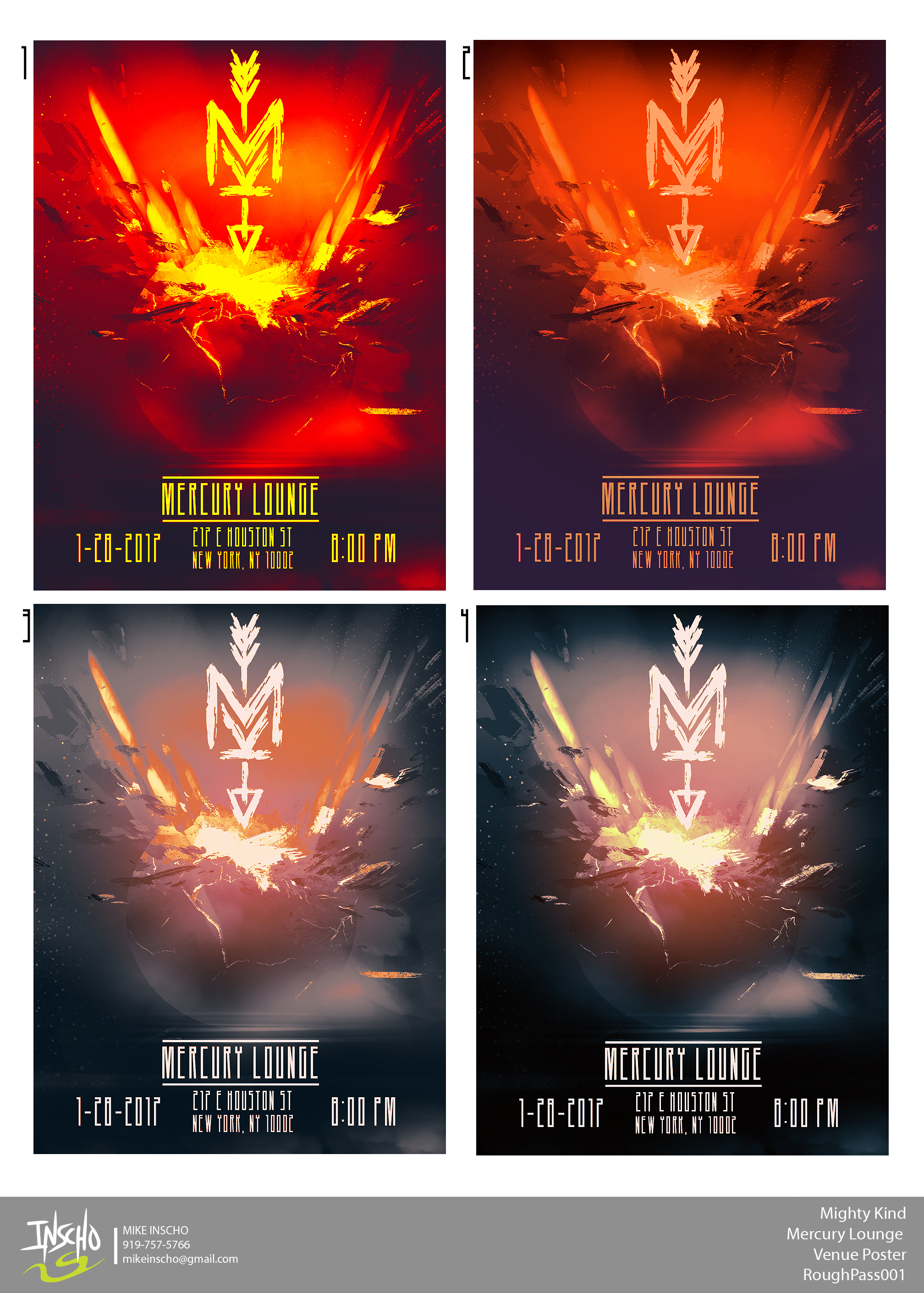
I've been working with the band Mighty Kind for the past year. I've helped them through their logo design and various show posters. Starting 2017 right, I was offered the chance to created their first show venue poster of 2017. The common theme up to this point has been the "MK" logo smashing into either the venue or something that relates to the showplace. Mike Murray (drummer for the band) states that "the band always jokes about how our sets are going to destroy the venue, because we feel that we pack a whollop of rock n' roll punch into each set and performance."  He goes onto state that the smashing theme helps to convey the power that they bring to each show. 

As soon as I got the go on a space theme and Mercury. I couldn't wait to jump in and paint some destruction. Illustrating an impact of this magnitude took a lot of reference gathering and it's something I don't paint often. I wanted the viewer to be drawn to the arrow tip impacting the top of Mercury. I wanted the lighting of the earth's core and spray to feel real and contain the energy the band thrives on. I am super stoked on how this came out and again, can't thank Mighty Kind for trusting in me to do this work for them. 

I am always willing to grow as an artist. I'd love to see your comments and hear your thoughs on what you like or dislike about this poster!

Carolina Hurricanes-Homegrown Poster

It's crazy how brief conversations turn into potential gigs down the road. To be able to be among other elite Raleigh artists and contribute to the new Homegrown Series, feels pretty freaking cool. It's Carolina's way of bringing together different local artisans, beer, design, music and food to each of their 8 Homegrown Series games. I think it's a great idea. 

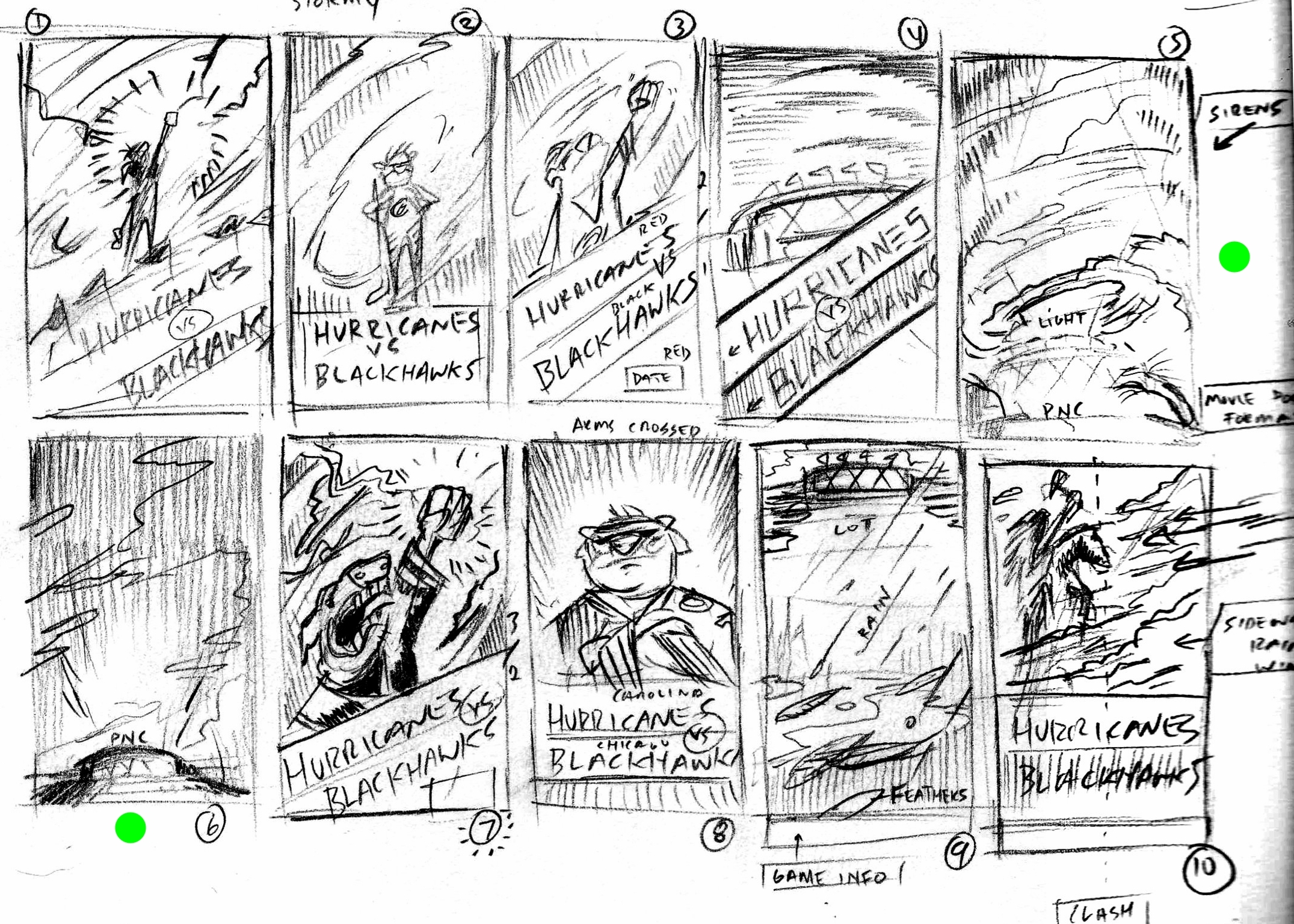
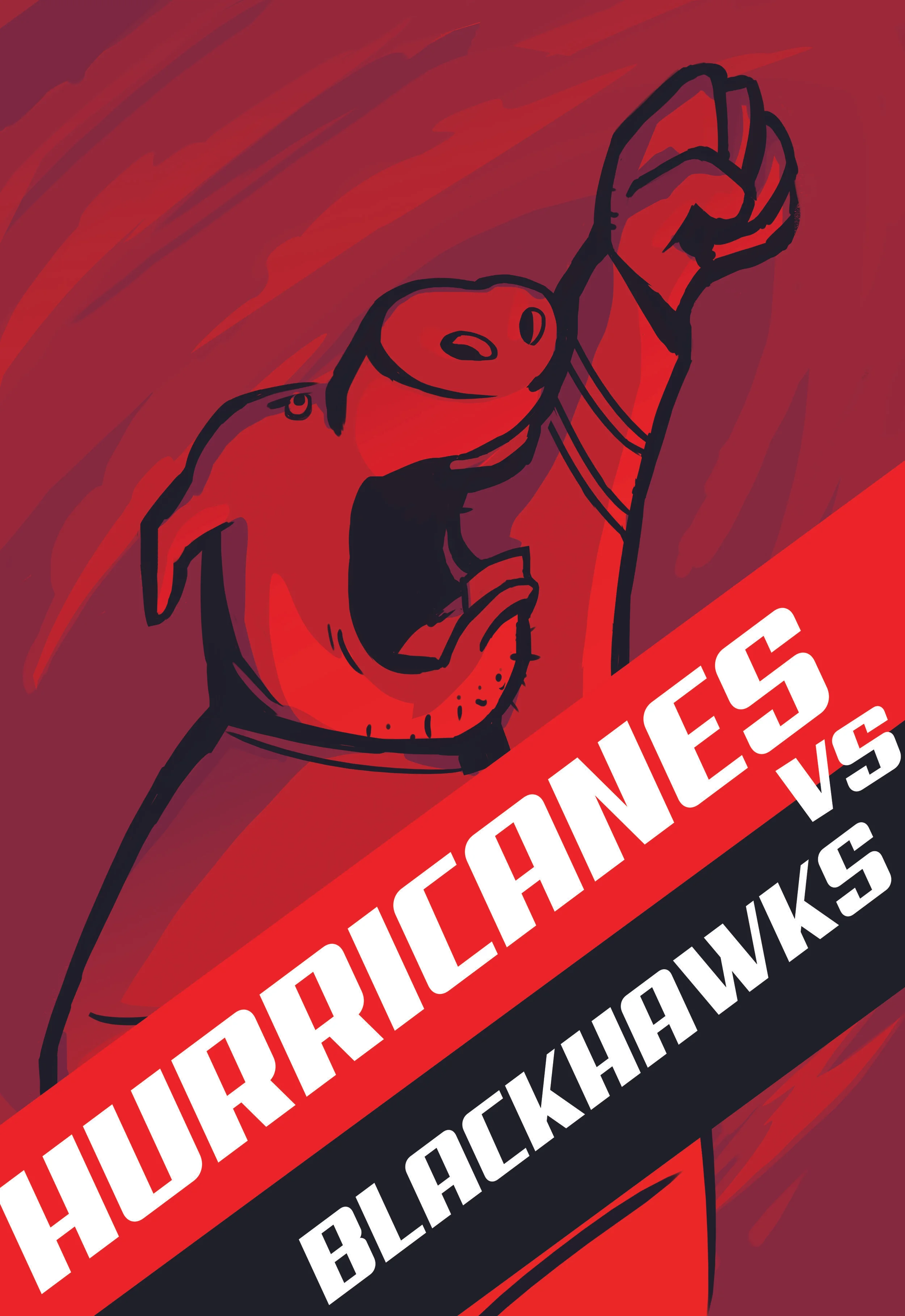
Here's the process on developing a poster for the Hurricanes vs Blackhawks matchup on December 30th. From the get go, I wanted to do Stormy the Ice Hog (Carolina's mascot). I've seen pictures but knew if I wanted to make this poster appealing, I'd have to change up the design and approach a bit differently. I started out a character design that I thought I was going to take to the end. Late one night, I pulled a 180 and designed the Ice Hog rendition that seems more up my alley. 

The "REDVOLUTION" is their motto this year. I wanted to illustrate Stormy out front, leading the charge. Hurricane winds brewing in the background. I knew I wanted to get some dynamic lighting as well. 

All in all, I'm pleased with what I was able to brew up. I hope I get another chance to do this series for them. I want to thank Kyle Fowlkes and the Carolina Hurricanes for giving me this opportunity and complimentary game tickets.

2017 Fantasy Disc Golf Calendar

After seeing the 2016 Fantasy Disc Golf calendar with work of disc golf artists, John Dorn and Manuel Trujillo; I knew I had to inquire to see what it'd take to get on the 2017 team. the 2017 team of artists included John Dorn, Manuel Trujillo, Benjamin Hopwood, Duncan "Skulboy" Crawford, Steven Colatriano, Cooper Harkins and myself. 

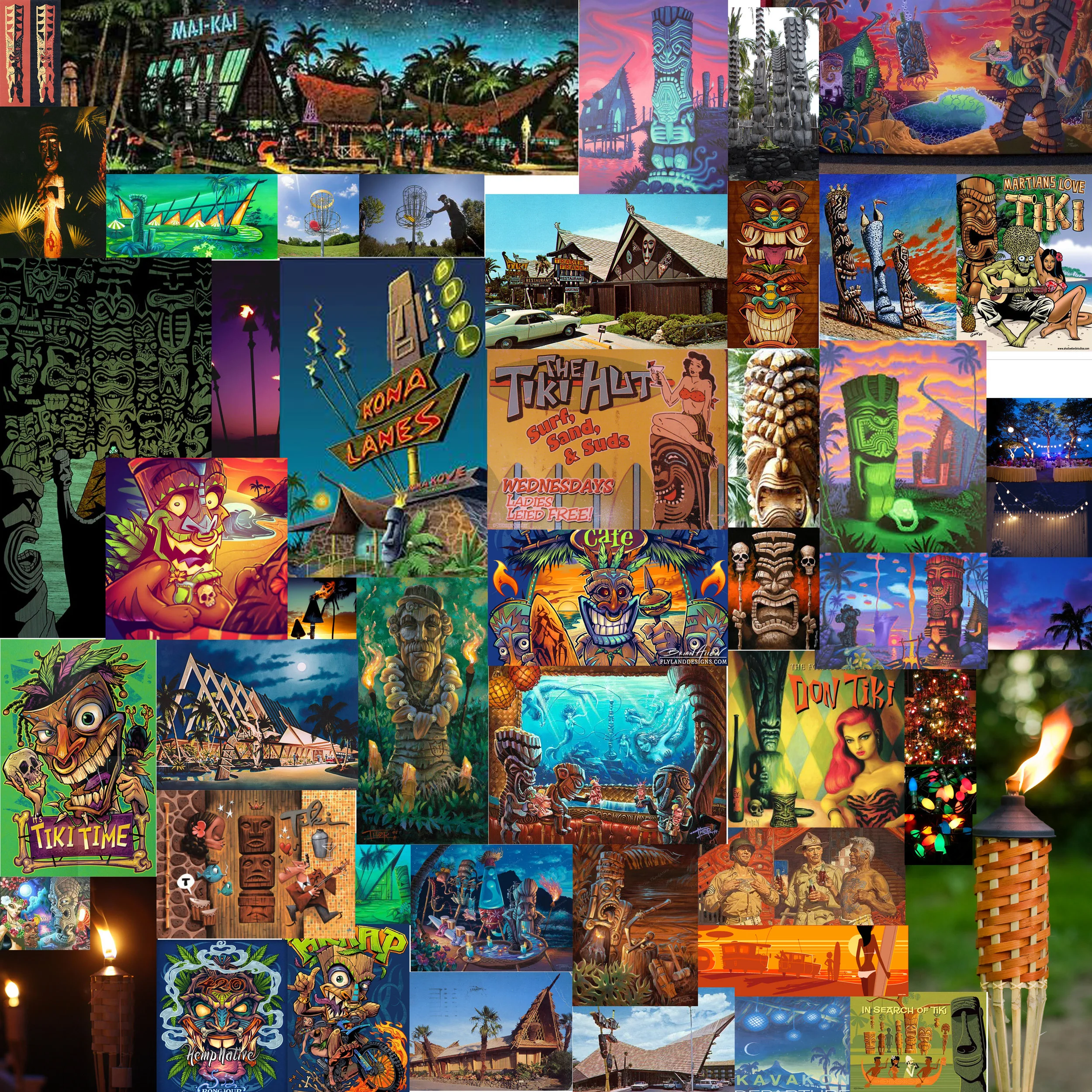
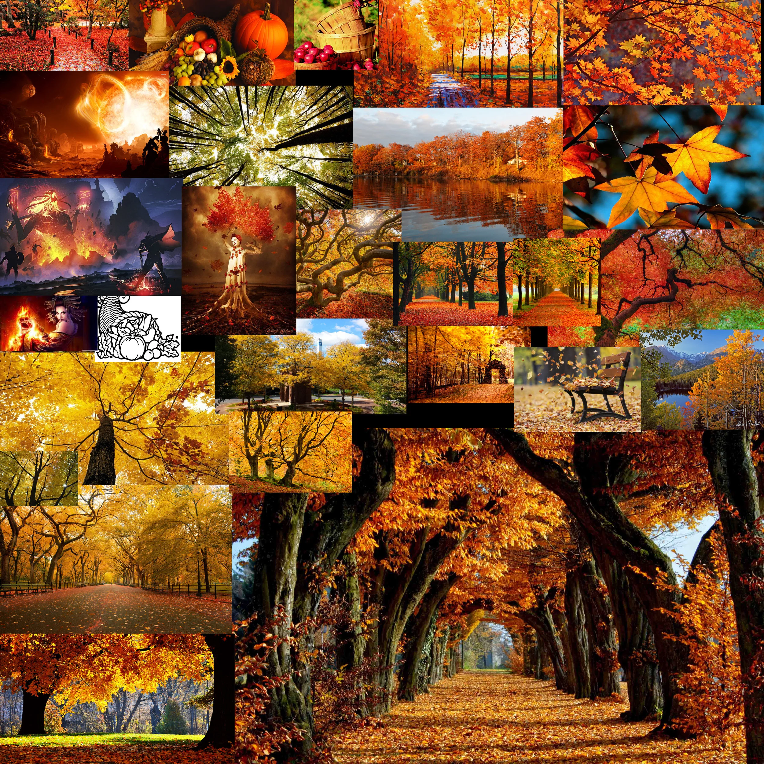
I was assigned the months of August and November. I've always wanted to do more themed disc golf illustrations. I appreciate John giving me the chance. August (Summer) got me interested in revisiting some Tiki artists I found while I was researching for a mural project years ago.  Brad "Tiki Shark" Parker and Tom Thordarson really inspired this tiki piece. November early sessions had cornucopia themes in mind but as soon as I saw great fall reference, I switched to a forest scene with stirring foliage. I found these neat fire tornadoes while searching as well. One thing led to another. Really pleased with how both pieces turned out.

This is exciting and new for me. My prints are available here!!:
High Quality Archival Prints
More affordable option

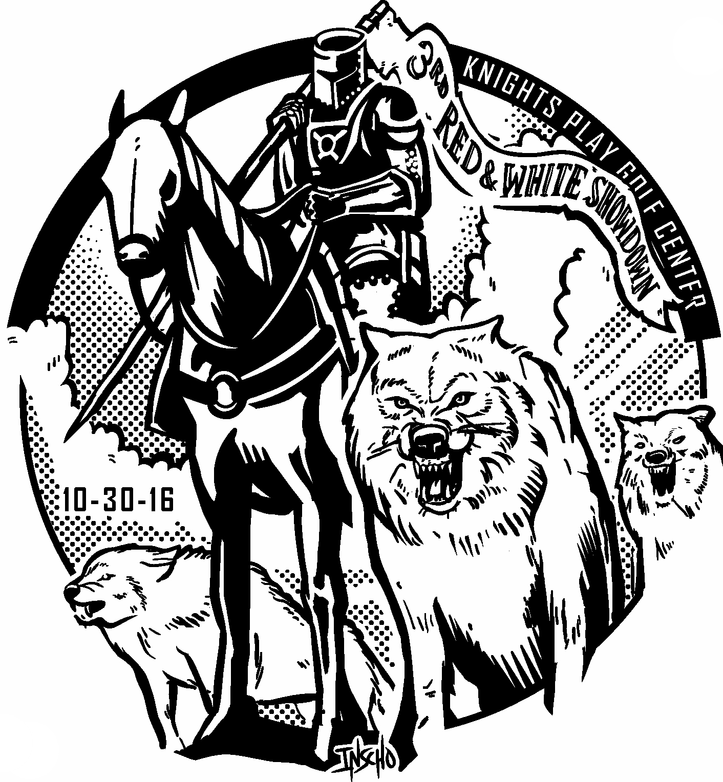
3rd Red & White Showdown

Every year, the Disc Golf Club at NC State hosts fundraiser tournaments to gain funds to go to the Collegiate Championships. I was called up this year to do the stamp again and wanted to best my attempt from last year.  Nash Stalling reached out to me and let me know that this year they had an exciting plan to host the tournament at Knight Play Golf Center in Apex, NC. It's in the top 100 practice facilities in the nation. This is a supreme spot with beautiful grounds for disc golf. The whole course is lit so hopefully disc golf can facilitate during the winter months. 

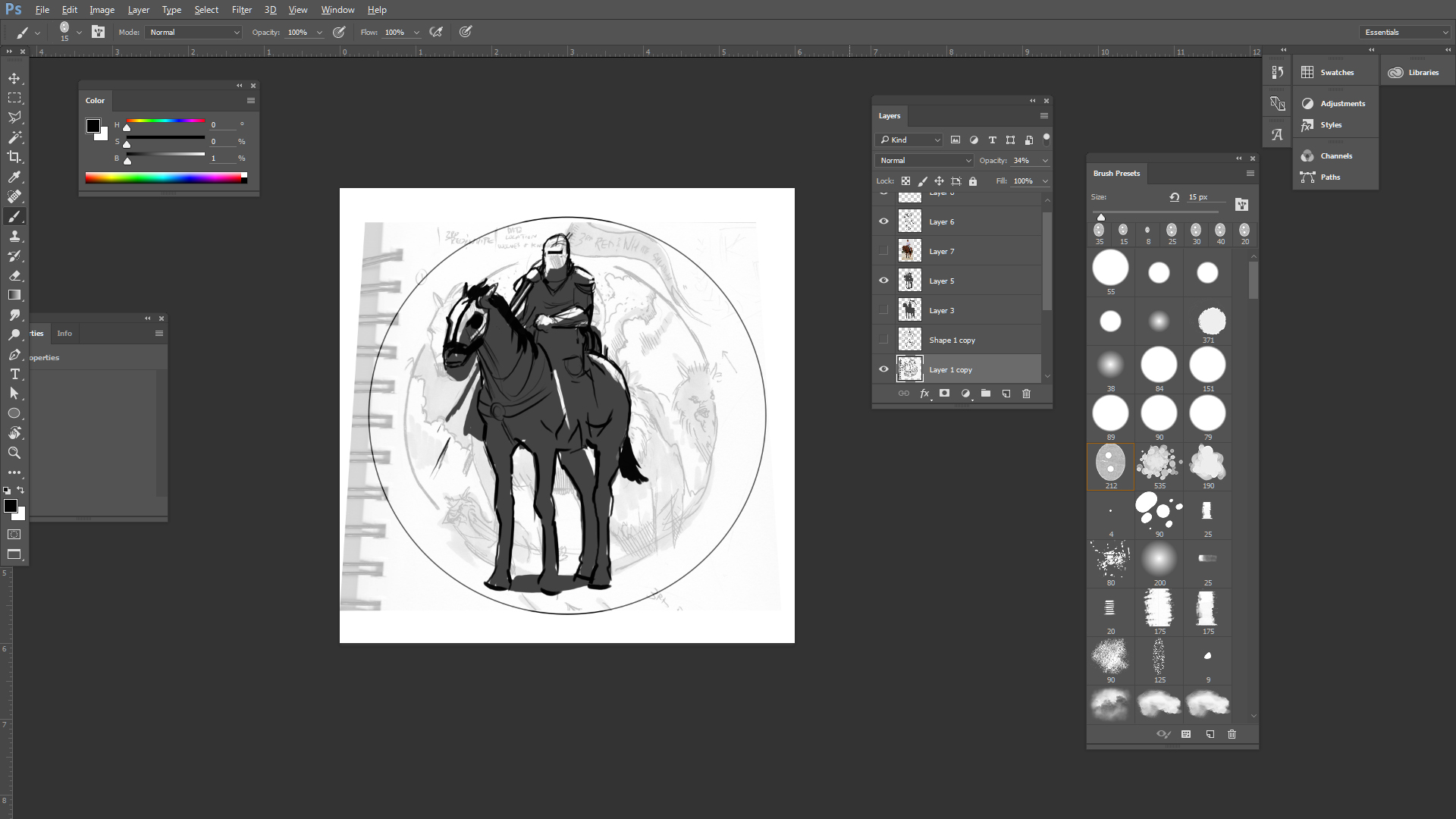
Since Knights Play is a first, we wanted to play off the combination of a knight and wolf. My direction from the club was to combine the two. Right away my mind went to one of the most influential fantasy painters; Frank Frazetta and his piece called "Death Dealer". The painting frames the horses strong silhouette. He looks sinister with his eyes beaming out the shadows. It's personally one of the most iconic Frazetta images so I knew I couldn't reference it directly.  My initial two sketches were enough to get me rolling. I wanted the Knight mounted upon his horse with the wolves flanking to his side. 

In the end, we chose option 1. It doesn't capture the movement like the second option but I love that the leader of the pack is out in front. Which brings the importance of the Wolf pack and the whole reason I'm able to do this stamp for them. I hope the tournament is a hit and will definitely be out playing the temp course if it's available again. Here's where you can sign up and you only have till the end of the 28th to do so!
 http://www.discgolfunited.com/disc-golf-tournaments/event-detail.cfm/tourn_id/4203

Axiom "Black Widow" Vanish

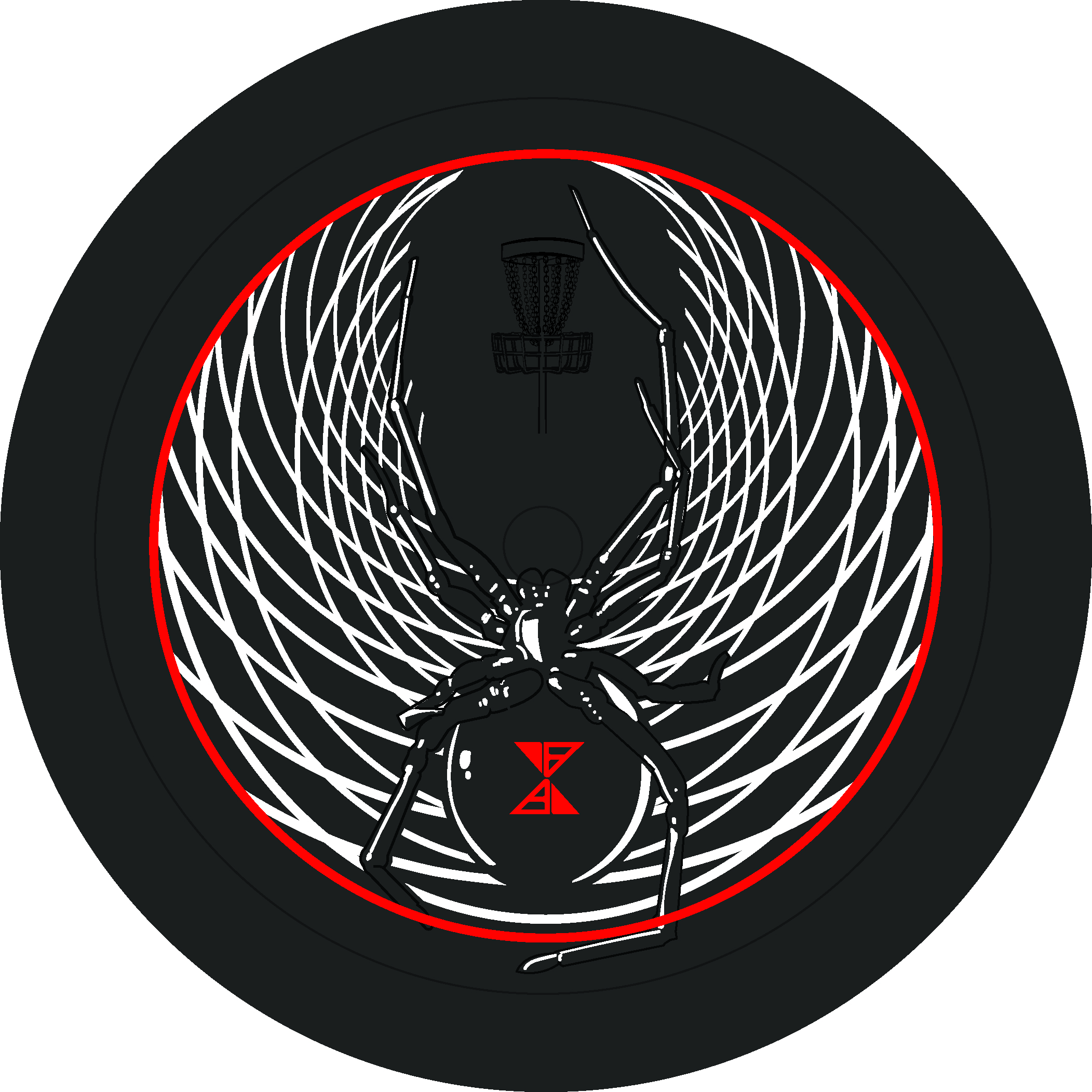
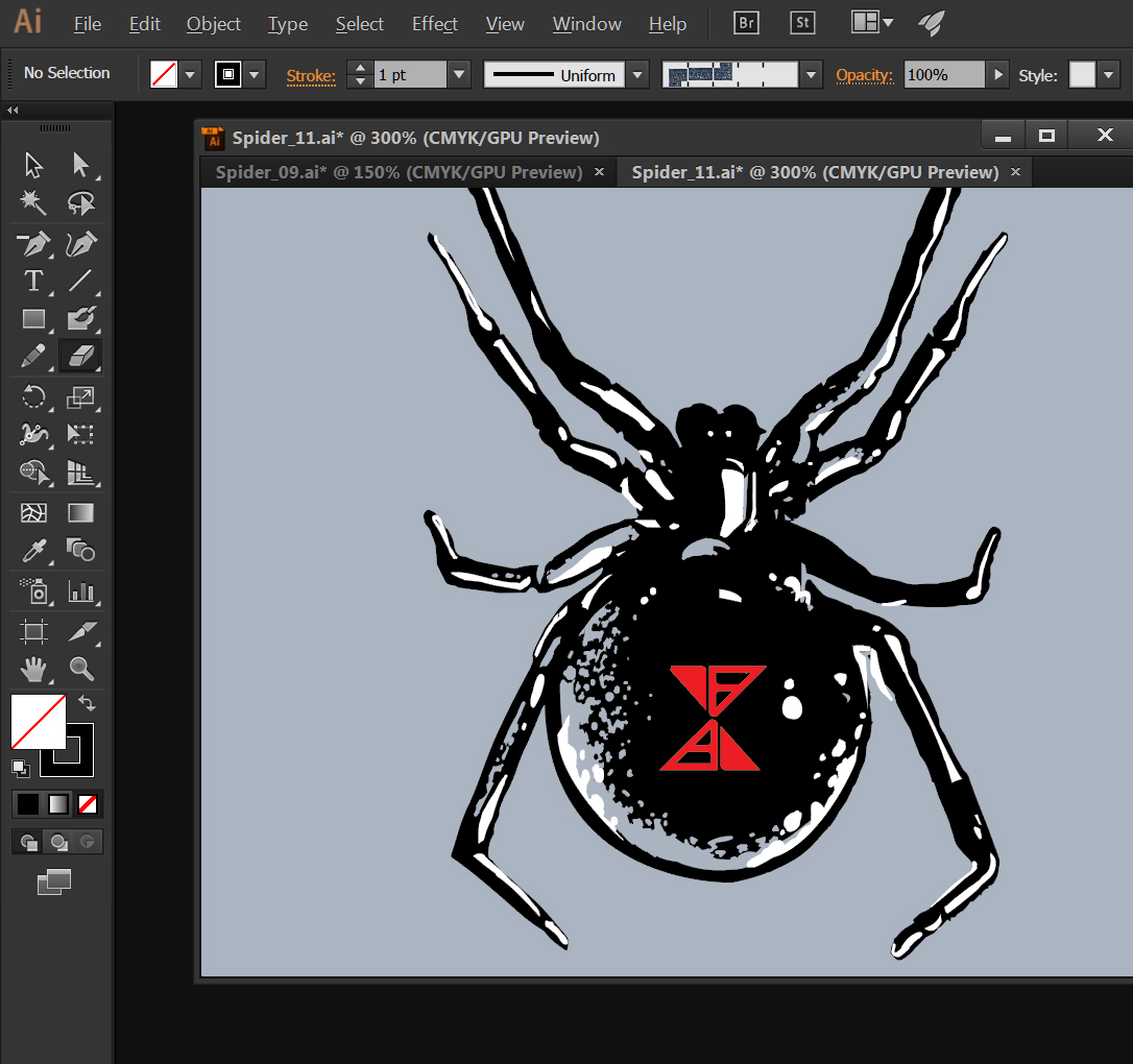
I've had the honor of working with MVP Disc Sports and Axiom Discs a lot this past year. They needed some reinforcements for this years Halloween themed stamp. Spider 2.0. Very first question I asked myself is how I'm going to stack up to the original design by hot stamp legend, ZAM.  

Expanding on the iconic black widow that was on the first release was the focus. I had a lot of fun and it was a definitely a stamp I learned from. With the core being lighter in color than expected, I had to shift focus off of just lighting hints from the initial plan and add black contrast to the spider. The stippling technique and use of the natural disc color, played a huge roll at the end. 

I want to thank Axiom Discs and MVP HQ this opportunity. During the rough phase, all the staff really helped to dial this in. Definitely was a group effort. It's a big release trying to follow up to their first Spider stamp. 

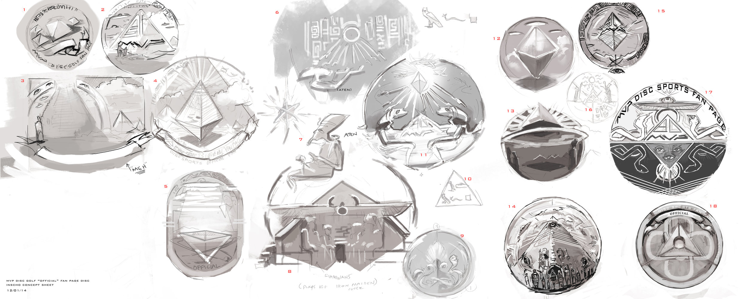
2016 MVP Fan Page Stamp

A collaborative stamp between Skulboy, ZAM and I, that started brewing in a Facebook chat with Brad and Chad Richardson from MVP & the MVP Fan Page Facebook group leaders. Initial conversations started around November 11th 2014. 

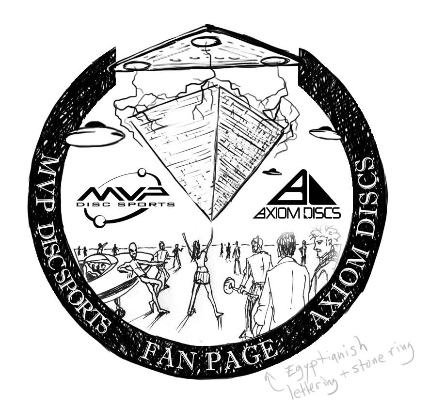
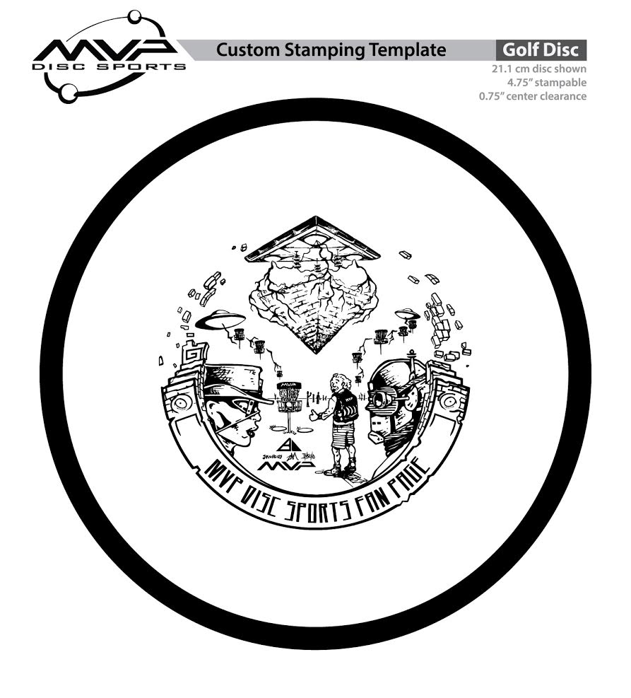
The initial idea I pitched when ZAM and I were brought on to the special project was to immediately ask Skulboy if he wanted in. ZAM has played a huge roll in MVP Disc Sports and Axiom Discs. He's created most of the artwork, website and creative work coming out of Marlette, Michigan. To bring in Skulboy would create a 3 piece. So right off the bat we came up with the pyramidal design. Fans of the page have been also combining the MVP and Axiom vinyl on their vehicle to create a pyramidal theme too. This HAD to be it. 

We all decided we wanted to place things within the stamp that only die hard MVP fans would get. These are the kind of people around the world that make up the fan page. Displaying the sense of community within the design, essentially. Doc Volt, Aliens, Tesla, Einstein and other tie ins made the cut. ZAM said this about the stamp:

"Tesla brought his mother-ship to lift the pyramid and the brother saucers are delivering a 9-hole course of Portals.  Einstein sinks a huge birdie while Madame Wrath and Doc Volt are like ".......this guy with his science"."  

 I'm really happy all 3 of us came together, found time and finished this. 

In the end, While none of us could make the event, the live stream MVP posted on Facebook got us close enough. Definitely glad the stamp was a hit within the MVP Fan Page community. 

2016 Innova Pumpkin Design

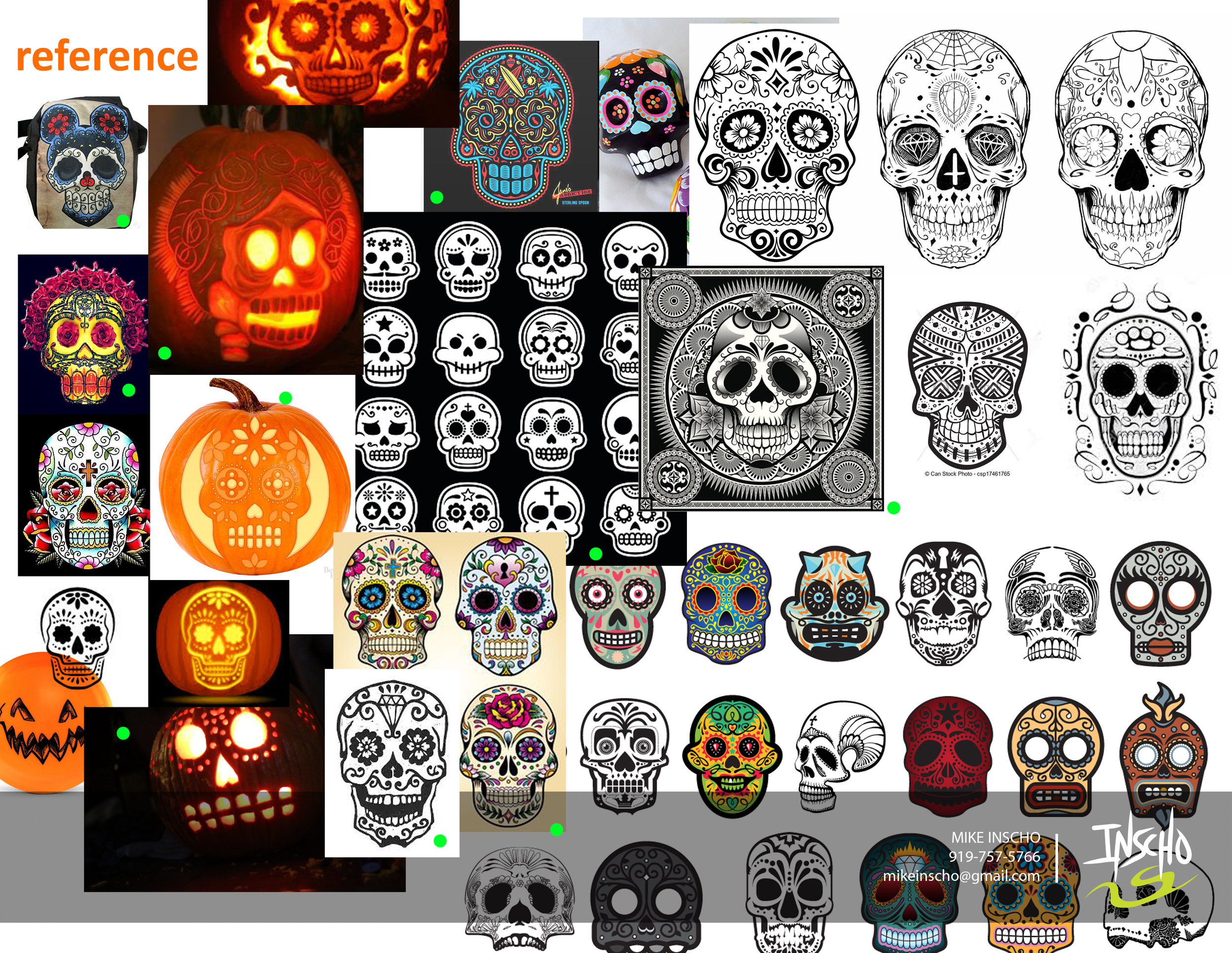
Every year since 1996, Innova Champion has put out an annual "Pumpkin" edition stamp for the Halloween season. Every year.. until this year, they've kept the theme consistent with the standard jack o' latern. After doing a first set of sketches and teasing a few skull designs toward the end of the thumbnails, Adrian Southern over at Innova mentioned the de los muertos theme and sugar skulls. So many possibilities and to give it a chance and see what comes out of the experiment.

I worked closely with Zeb Campbell and Adrian over the course of multiple revisions and options. The general consensus was the love of the bat wing basket. The challenge with this design was to incorporate the detail you see with common sugar skulls but keeping it simple enough where carving it could be believable. 

Over the course of a few weeks, It led us down a few rough passes and we ended up Frankensteining parts of the final 4 to create one design.  Here is 2016's Pumpkin Design. Thanks to Innova, Adrian and Zeb for having confidence in me to put something out against the grain. Hope you all like. 

You can purchase them here: http://dgustore.com/index.php/specialty/holiday-discs.html

2016 USDGC "Paul McBeth Commemorative"

This stamp is a staple to every US Disc Golf Champion in years past. The following year an artist will be chosen to commemorate the champion on a Collector Roc disc. I was asked this year if I'd like to take a stab at designing Paul McBeth's 2015 win. There will be 700 of these discs made. 500 available to the USDGC Partners and 200 available at the USDGC in Rock Hill, SC. The few limited discs at the event will be an opportunity for McBeth to sign if the buyer chooses.

If you don't know who Paul is; He's the #1 Rated Player in the World, PDGA World Champion 2012, 2013, 2014, and 2015, 2015 Innova Team Captain, 2015 Grand Slam (All Majors), 3x Memorial Champion, 2x European Open Champion, 2014 European Masters Champion, 2013 Copenhagen Open Champion, 4X National Tour Champion.

Going into this design, I've never been more nervous. Busting out page after page of thumbnail ideas, a couple different directions with the rough phase and then tweaking the final until it was ripped from my hands. I felt that this design, more than anything, could be my biggest opportunity to show what I can do. At the beginning, the intent was to create a design encompassing Paul's Grand Slam achievement last year (5 Major tour wins). So going into it, I initially thought about 5 sided shapes, Paul himself, and something that encompasses the names of the events he won. 

The end result doesn't feature what a lot of the thumbnails had in them. The idea to honor McBeth as the 2015 US Disc Golf Champion felt a bit more important and fit with past years winners. Innova previous produced a "Grand Slam" stamp so it seemed fitting to make this a nod to his win. 

I want to thank Adrian Southern, Jonathan Poole, DGU, INNOVA and everyone involved in critiques for giving me these three shots at 2016 USDGC artwork. What a ride. 

9/11/2001: What were you doing?

I've told this story before and will likely share it to my grandkids and great grandkids. 

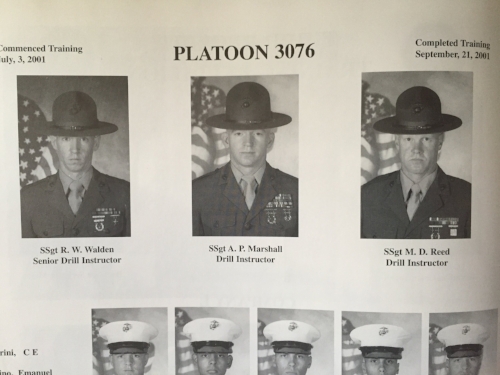
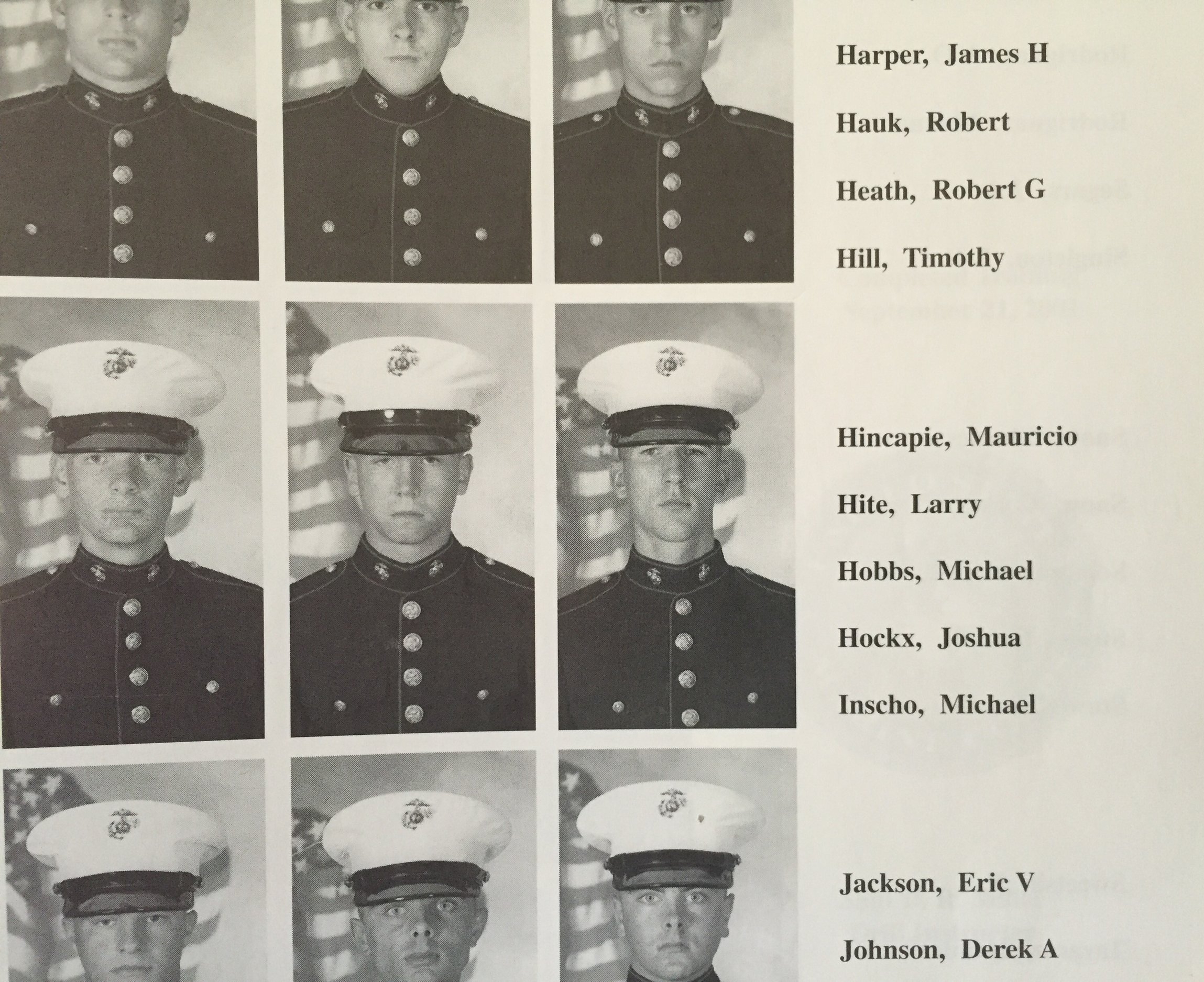
9/11/01: Where were you?- I was oblivious to anything happening that day. "The Crucible" is a last and final test of every Marine recruit. That's where I was. Marine Corps Recruit Depot-Parris Island. We were on the outskirts of somewhere, tired, cut off from anything in the world. I remember the next early morning after 9/11 we were woken up early like recruits before us. Dog tired, dragging ass. 

We completed our morning obstacles and all the recruits were brought into one place to eat lunch. There was a silence among everyone. We were used to that. We were hardened at this point. Well disciplined & tired.

The Battalion Commanding Officer and Sergeant Major made a visit. I honestly thought this was part of this whole experience. The pep talk before the final push. The Sergeant Major simply held up the front page newspaper. You could hear a pin drop. You could tell they were distraught, tired, pissed off and confused like the rest of America. Not only were we told about the World Trade Center but also the Pentagon and Flight 93 events. I think everyone sitting near that old air strip thought we were going to be on a plane heading somewhere as soon as we graduated. 

3076 and the rest of the graduating class carried on and finished the Crucible. America carried on but we will never forget. Thoughts always go out to the thousands, if not millions, of families affected by 9/11 and the aftermath. 


2016 MVP Circuit Series-Raleigh

This design has been in the works since 2015. The goal was to get the new MVP Circuit established as a major hub in Raleigh, NC. Three known MVP artists would have the go ahead to create custom stamps for their events around the U.S. Skulboy out of California, ZAM in Texas and myself following up in the Carolina's. 2015 passed and honestly, I did more talking than action. Fast track to 2016 & I had this stamp kicking on the back burner. Disc Hunt rose to the challenge to make the circuit happen! 

The design inspiration roots from multiple sources. I grew up watching "Short Circuit" and the star of the movie, Johnny 5. His actions in the film when discovering new life outside of the escaped NOVA laboratory, is what I remember most. Goro Fujita also draws a huge inspiration to this design with his famous robot characters. His ability to strip away the baggage and create simple, beautiful and bold illustrations made a lasting impression. I wanted to start this series with the "City of Oaks" acorn correlation. 

Below is the scratchy sketches to final draft. I want to thank Disc Hunt, Jay Pontier and everyone else that stepped up to get the MVP Circuit Series started in Raleigh.